What Is Regular Script in Chinese Calligraphy
Pick up any Chinese textbook, glance at a street sign in Taipei, or open a document on your phone set to a Chinese typeface. The characters you see are almost certainly rendered in regular script chinese calligraphy, the writing style that has served as the visual backbone of the Chinese language for over 1,800 years.
What Regular Script Means in Chinese Calligraphy
Regular script is known in Chinese as 楷書 (kǎishū). The character 楷 (kǎi) carries the meaning of "model," "standard," or "example worth imitating." Put together, kai shu translates directly to "model script" — a name that tells you exactly what role it plays. This is the script held up as the benchmark for correct, legible, and aesthetically balanced handwriting across all Chinese-speaking education systems.
Unlike older forms that evolved primarily for speed or ceremonial engraving, kaishu was designed for clarity. Each character sits within an invisible square frame, with every stroke distinctly separated from the next. The Smithsonian's National Museum of Asian Art describes it as combining "distinct, individual strokes in visually sophisticated and complicated forms" — balanced, legible, and endlessly adaptable. It remains the first script taught to schoolchildren and the typeface behind most modern printed materials.
So when you encounter the term "kai chinese meaning" in a calligraphy context, think of it as shorthand for the gold standard. Kaishu is not just one style among many. It is the reference point against which all other scripts are measured.
Why Regular Script Is the Starting Point for All Learners
Imagine learning to play piano by starting with jazz improvisation. You would have no sense of timing, finger placement, or musical structure. Regular script functions like classical scales for the calligrapher. Every single stroke is written deliberately, with a clear beginning, a controlled middle, and a defined ending. There is no shortcutting, no blending one stroke into the next. You lift the brush, reposition, and begin again.
This deliberate pace builds something irreplaceable: brush control. You learn how pressure creates thickness, how speed affects ink distribution, and how the angle of your wrist shapes a stroke's character. These micro-skills transfer directly into every other script style you might explore later, from the flowing connections of running script to the radical abbreviations of cursive.
心正则笔正 — When the heart is upright, the brush is upright.
This classical principle, attributed to the Tang dynasty master Liu Gongquan, captures something deeper than posture advice. It reflects the philosophical belief that calligraphy is a mirror of inner character. A scattered mind produces unsteady strokes. A calm, focused practitioner produces balanced, harmonious writing. For centuries, this idea has made regular script practice as much a form of self-cultivation as an artistic discipline.
That philosophical depth, combined with its structural precision, is exactly why kaishu has remained the universal starting point. It teaches you not just how to write, but how to see — how to notice proportion, rhythm, and the energy contained within a single brushstroke. And those strokes? They follow a system so elegant it fits inside a single character.
Historical Origins from Han Dynasty to Tang Dynasty
Every writing system carries the fingerprints of the era that shaped it. Regular script did not appear fully formed one morning on a calligrapher's desk. It emerged gradually, driven by practical needs — faster writing, clearer communication, and eventually, the demands of an empire that needed a standardized hand for governing millions.
From Han Dynasty Origins to Wei-Jin Refinement
The story begins in the late Eastern Han dynasty (25-220 CE), when scribes working in clerical script (隶书 lìshū) started simplifying their strokes. Clerical script had served the Han bureaucracy well, but its signature flourishes — dramatic horizontal tails that swept outward like wings — slowed the hand. Writers began containing those sweeping endings, pulling energy inward rather than flinging it outward. Stroke endings became precise and compact. Angular turns replaced the rounded arcs inherited from seal script.
This shift was not a single inventor's breakthrough. It was a collective drift, visible across hundreds of bamboo slips and stone inscriptions from the period. The evolution from clerical to regular script involved straightening strokes, squaring off character frames, and eliminating the decorative "wave-like" endings that defined Han dynasty calligraphy. Where clerical script spread characters horizontally, the emerging kaishu shifted toward a more balanced, upright proportion.
During the Wei-Jin period (220-420 CE), this transitional form matured. Calligraphers like Zhong Yao (钟繇 Zhōng Yáo, 151-230 CE) — often called the "father of regular script" — refined the new style into something recognizably distinct from its clerical ancestor. His small regular script still carried traces of clerical influence in its horizontal strokes, but the overall architecture was unmistakably kaishu: square, upright, each stroke individually articulated.
The Wang family of the Jin dynasty pushed refinement further. Wang Xizhi (王羲之 Wáng Xīzhī, 303-361 CE) and his son Wang Xianzhi (王献之 Wáng Xiànzhī, 344-386 CE) are best remembered for running and cursive scripts, but their regular script work — particularly Wang Xianzhi's small kaishu — demonstrated what the National Palace Museum describes as forms that "no longer retain vestiges of clerical script," with force expanding horizontally then becoming vertical. This was regular script reaching maturity: a fully independent system, no longer a simplified version of something older.
The Tang Dynasty Golden Age of Kaishu
If the Wei-Jin period was regular script's adolescence, the Tang dynasty (618-907 CE) was its prime. What transformed kaishu from one style among several into the dominant formal script of Chinese civilization? The answer lies in institutional pressure.
The Tang court perfected the imperial examination system (科举制 kējǔ zhì), creating a standardized pathway into government service that demanded flawless handwriting. Candidates were assessed not only on their knowledge of the Confucian Classics but also on their calligraphy (书 shū) — the quality of their brushwork was an explicit evaluation criterion. A brilliant essay written in sloppy hand could cost a candidate his career. This single institutional requirement created an entire culture of disciplined kaishu practice across the empire.
The result was an explosion of innovation within strict formal boundaries. Tang masters did not rebel against regularity — they competed within it, each developing a distinctive structural approach while maintaining the legibility and precision the court demanded. Yan Zhenqing (颜真卿 Yán Zhēnqīng, 709-785 CE) produced the celebrated Duobao Pagoda Stele (多宝塔碑 Duōbǎo Tǎ Bēi), a landmark work of regular script that demonstrated bold, muscular strokes within perfectly balanced compositions. This paragon tablet became one of the most copied models in calligraphic history, studied by generations of students learning to control brush pressure and structural proportion.
The Tang period also saw kaishu applied to monumental stone inscriptions — tombstone script and commemorative steles that demanded large-scale precision. These carved works preserved the masters' brushwork in stone, creating permanent copybooks that survived centuries of political upheaval. The Sui dynasty monk Zhiyong (智永 Zhìyǒng, ca. 510-610 CE) had already bridged the gap between Wei-Jin elegance and Tang discipline with his "Thousand-Character Essay in Standard and Cursive Script," but it was the Tang masters who codified kaishu into a system rigorous enough to train an empire's bureaucrats.
By the mid-Tang period, regular script had achieved something remarkable: it was simultaneously the most practical writing style for daily governance and the most demanding artistic discipline for personal cultivation. That dual identity — functional tool and spiritual practice — is what carried kaishu forward through every subsequent dynasty and into the modern classroom. The masters who forged that identity each left a distinct structural signature, and their differences reveal just how much creative range exists within a single script style.
The Eight Principles of Yong and Basic Calligraphy Strokes
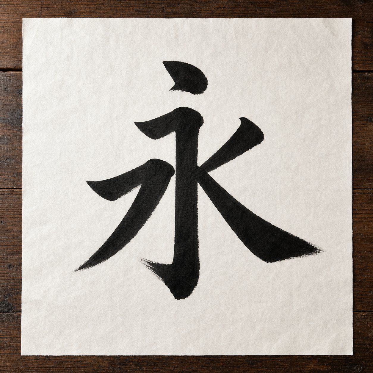
A single character containing the DNA of an entire writing system. Sounds impossible? In regular script, the character 永 (yǒng, meaning "eternity") does exactly that. Known as the Eight Principles of Yong (永字八法 yǒngzì bāfǎ), this teaching framework distills the basic calligraphy strokes of kaishu into one elegant package — eight distinct brush movements packed into just five written strokes. Calligraphy masters have used it as a training tool since at least the late Han dynasty, and it remains the single most efficient entry point for anyone picking up a brush for the first time.
The concept likely emerged during the Sui and Tang dynasties when regular script flourished, though the Tang calligraphy theorist Zhang Huaiguan traced its origins back to Cui Ziyu of the Later Han, noting it was "passed down through Zhong and Wang" — referring to Zhong Yao and Wang Xizhi. Regardless of its exact origin, the principle behind it is straightforward: learn to write 永 well, and you hold the building blocks for every other character in the script.
The Eight Fundamental Strokes Explained
Each stroke in the character 永 carries a metaphorical name that hints at how it should feel under the brush. These are not arbitrary labels — they describe the energy, direction, and spirit each movement demands. Here is a complete breakdown of all eight principles:
- Ce 側 (Dot) — "Ce" means tilted or slanted. The dot leans at an angle, like a massive boulder standing at a slant — powerful and commanding. Begin by touching the brush tip to the paper at a slight angle, press down briefly to create weight, then lift with a quick directional flick. If the dot lies flat or stands completely upright, it becomes dull and lifeless. In 永, the dot finishes with an exposed tip that connects visually to the horizontal stroke below, creating continuous rhythm.
- Le 勒 (Horizontal Stroke) — Think of a rider pulling tight on a horse's reins. The horizontal slants slightly upward from left to right, with force directed inward. Start by concealing the brush tip (a technique called "hidden entry"), move steadily rightward with even pressure, then pause and retract at the end. If written lying flat or slanting downward, it appears weak and powerless. The controlled tension gives this stroke its structural authority.
- Nu 弩 (Vertical Stroke) — "Nu" means forceful, like a drawn bow standing upright. The vertical maintains an inwardly straight yet outwardly curved position — although it may appear slightly curved, it contains infinite strength within. Enter from the top with a concealed tip, press downward with steady, firm pressure, and finish with a contained ending. An overly straight vertical resembles dead wood planted in the ground — upright but lifeless.
- Ti 趯 (Hook) — "Ti" shares the meaning of "leap." When making the hook, first press the brush down at the base of the vertical to build momentum, then quickly lift and release the tip in a flowing upward motion. Imagine a person preparing to jump — they must first crouch to gather strength, then suddenly spring upward. The tip does not exit horizontally because it needs to connect visually with the upward flick stroke that follows.
- Ce 策 (Upward-Left Flick) — This "ce" means whip, but here refers to coordination. The upward flick angles from lower-left to upper-right, balancing against strokes on the opposite side of the character. In 永, it extends slightly horizontally to coordinate with the short left-falling stroke, creating harmony between staggered, asymmetrical elements. The brush moves with a quick, decisive snap — like cracking a whip — with pressure releasing toward the tip.
- Lue 掠 (Downward-Left Sweep) — "Lue" means to brush or sweep. Writing this stroke should feel like brushing your hand across a surface. The brush gradually accelerates as it moves from upper-right to lower-left, and the ending is light and swift compared to the right-falling stroke. This creates an elegant, clean appearance. The critical requirement: force must reach all the way to the tip. Otherwise, the stroke appears unsteady and weak at its conclusion.
- Zhuo 啄 (Short Downward-Right Stroke) — "Zhuo" means to peck. This short left-falling stroke resembles a bird pecking at food with its beak — quick movement with a sharp brush tip. Unlike the long sweeping lue, this stroke is compact and decisive. Enter with firm pressure and exit rapidly, keeping the overall length short and the energy concentrated. The difference between zhuo and lue is the difference between a sparrow's peck and a crane's wing.
- Zhe 磔 (Long Downward-Right Press) — The most complex stroke to understand. "Zhe" originally meant to dismember sacrificial animals, carrying the sense of separating and spreading outward. The right-falling stroke gathers strength inward while spreading outward in form, making the character's posture stretch out and appear lively. Begin with light pressure, gradually increase weight through the middle, then press firmly and lift at the end to create a broad, knife-like finish. This stroke must always be written open and stretched to display spirit — replace it with a short dot, and the character's dynamic energy immediately disappears.
You'll notice that each name is a metaphor drawn from physical experience — reining a horse, drawing a bow, a bird pecking grain, a knife splitting. These are not decorative flourishes in the terminology. They are instructions for how your body should feel while executing each movement. The stroke names encode the physical sensation of correct technique.
Why Mastering These Strokes Unlocks Every Character
Here is what makes the Eight Principles so powerful as a teaching tool: every regular script character you will ever write is composed of combinations and variations of these eight fundamental movements. The character 永 contains no repetitive strokes — within just five brush lifts, it presents eight distinct principles. As Professor Tian Yuncang noted, finding another character that packs so many principles into so few strokes is remarkably rare.
Consider what happens when you practice 永 seriously. The dot teaches you controlled pressure and angled placement. The horizontal builds your sense of lateral tension. The vertical develops steady downward force. The hook trains explosive directional change. The flick sharpens your coordination between opposing elements. The sweep cultivates accelerating rhythm. The peck demands compact decisiveness. And the right-falling press teaches you to build and release energy across a single extended movement.
These are not isolated skills. They are the script blocks from which thousands of characters are assembled. The horizontal in 永 is the same horizontal in 一 (one), 王 (king), and 書 (writing). The hook is the same hook in 我 (I), 找 (to find), and 心 (heart). Once your muscle memory holds these eight movements with confidence, you are not starting from zero with each new character — you are recombining familiar elements in new arrangements.
That said, a realistic perspective matters. The Eight Principles of Yong provide an excellent foundation and a clear example of calligraphy at the stroke level, but they do not encompass every technique in the art. They do not cover turning strokes, compound angles, or the structural logic of how radicals fit together. Think of them as the alphabet rather than the dictionary — essential, but just the beginning.
The greatest practical insight the Eight Principles offer is this: when learning calligraphy, find representative characters that contain the strokes you need to master, and practice them with focused repetition. This approach lets you internalize technique efficiently rather than scattering your attention across dozens of unrelated forms. And once those foundational strokes feel natural under your brush, the question becomes not what to write, but whose style to follow — because the masters who perfected kaishu each brought radically different personalities to these same eight movements.
The Four Great Masters of Traditional Chinese Script
Eight strokes give you the raw materials. But raw materials without a blueprint produce nothing memorable. The same horizontal, vertical, and hook can yield characters that feel razor-sharp and towering, or characters that feel broad, muscular, and grounded — depending on whose structural logic you follow. In the history of regular script chinese calligraphy, four masters defined the dominant blueprints that practitioners still study today. They are collectively known as the Four Great Regular Script Masters (楷书四大家 kǎishū sì dà jiā), and each developed a style script so distinctive that their family names became shorthand for entire aesthetic philosophies.
Ouyang Xun and Yan Zhenqing — Structure Versus Power
Ouyang Xun (欧阳询 Ōuyáng Xún, 557-641 CE) built his reputation on precision. His characters are tall and narrow, with tight internal spacing that creates a sense of compressed energy. Imagine a skyscraper — vertical emphasis, every element locked into place, nothing wasted. His brushwork uses square, neat entries and exits with a subtle clerical script flavor, and the force penetrates to the tip of the brush without relying on external flourish. Later generations called him the "Foremost Regular Script Calligrapher of the Tang Dynasty" (唐楷第一人 Táng kǎi dì yī rén). His greatest contribution was systematizing character structure into 36 structural methods that students still reference when learning proportional balance.
His representative masterpiece, the Stele of the Jiucheng Palace Liquan Inscription (九成宫醴泉铭 Jiǔchéng Gōng Lǐquán Míng), demonstrates what critics describe as "embedding peril within uprightness" — characters that appear balanced at first glance but reveal steep, forceful angles on closer inspection. The center of each character is tightly composed while main strokes extend outward, creating an impression of restrained momentum.
Yan Zhenqing (颜真卿 Yán Zhēnqīng, 709-785 CE) took the opposite approach. Where Ouyang compressed, Yan expanded. His characters are broad and imposing, with thick horizontal strokes and a muscular structure that radiates outward. He drew on seal script and clerical script brush techniques, transforming the lean, hard style of early Tang calligraphy into something full, vigorous, and majestic. The result is a style that feels like a warrior standing with feet planted wide — stable, powerful, and unyielding.
Yan's life reinforced his art. During the An Lushan Rebellion, he held Pingyuan City against rebel forces and ultimately died for his loyalty to the Tang court. Song dynasty scholar Zhu Changwen ranked his calligraphy as "divine class" (神品 shénpǐn), noting that "his dots are like falling rocks, his strokes like summer clouds, his hooks like bent gold." Representative works include the Duobao Pagoda Stele (多宝塔碑), the Yan Qinli Stele (颜勤礼碑), and the Stele of the Yan Family Ancestral Temple (颜家庙碑) — each demonstrating a different stage of his evolving power.
Liu Gongquan and Zhao Mengfu — Bone Strength Versus Elegance
Liu Gongquan (柳公权 Liǔ Gōngquán, 778-865 CE) studied both Ouyang and Yan before forging his own path. His style is often described through the famous pairing "Yan's tendon and Liu's bone" (颜筋柳骨 Yán jīn Liǔ gǔ). Where Yan's characters feel fleshy and muscular, Liu's feel skeletal and sharp — every stroke pared down to its structural essence. This is the bone method (骨法 gǔfǎ) in action: lean, vigorous strokes with crisp angles and severe clarity.
Liu served seven Tang emperors and lived to 88, spending decades refining a style that avoids the thick-thin contrast of Yan's work in favor of balanced, even strokes with iron-cutting decisiveness. His Xuanmi Pagoda Stele (玄秘塔碑 Xuánmì Tǎ Bēi) remains one of the most widely used copybooks for intermediate students, and his Stele of the Divine Strategy Army (神策军碑 Shéncè Jūn Bēi) shows his mature style at its most commanding.
Zhao Mengfu (赵孟頫 Zhào Mèngfǔ, 1254-1322 CE) stands apart from the three Tang masters in both era and temperament. A Yuan dynasty polymath descended from Song dynasty royalty, Zhao mastered all five script styles but became most celebrated for a kaishu that feels fluid, rounded, and graceful. His brush method is smooth and mellow, with a strict structure that never loses the beautiful quality of running script (行书 xíngshū). Where Liu stripped characters to bone, Zhao clothed them in silk.
This elegance was not accidental. Zhao studied Wang Xizhi, Northern Wei steles, and Tang masters including Yu Shinan and Chu Suiliang, synthesizing centuries of tradition into what the History of Yuan called calligraphy "peerless throughout the ages." His Record of the Reconstruction of the Three Gates of the Xuanmiao Temple (玄妙观重修三门记 Xuánmiào Guān Chóngxiū Sānmén Jì) features broad, stable structure with rounded brushwork — an ideal copybook for those drawn to grace over severity. His influence spread beyond China, shaping calligraphic traditions in Korea and Japan.
When choosing which master to study, you are really choosing a philosophy of kai in chinese aesthetics — tight control or expansive power, skeletal clarity or flowing elegance. The table below maps these differences to help you find your starting point:
| Master | Dynasty | Key Characteristics | Representative Work | Recommended Level |
|---|---|---|---|---|
| Ouyang Xun (欧阳询) | Early Tang (557-641) | Tight, angular, vertically elongated; perilous force within balanced structure | Stele of the Jiucheng Palace Liquan Inscription (九成宫醴泉铭) | Beginner to Intermediate |
| Yan Zhenqing (颜真卿) | High Tang (709-785) | Broad, muscular, expansive; thick strokes with majestic momentum | Duobao Pagoda Stele (多宝塔碑); Yan Qinli Stele (颜勤礼碑) | Beginner to Intermediate |
| Liu Gongquan (柳公权) | Late Tang (778-865) | Lean, skeletal, sharp; bone method with iron-cutting precision | Xuanmi Pagoda Stele (玄秘塔碑) | Intermediate |
| Zhao Mengfu (赵孟頫) | Yuan (1254-1322) | Fluid, rounded, elegant; bridges regular and running script | Record of the Three Gates of the Xuanmiao Temple (玄妙观重修三门记) | Intermediate to Advanced |
No single master is objectively "better" — each represents a different answer to the same question: how should a well-written character feel? Ouyang answers with architectural tension. Yan answers with physical power. Liu answers with disciplined clarity. Zhao answers with cultivated grace. Many practitioners study two or three masters over a lifetime, letting each style script inform and balance the others. The differences between them also highlight a broader truth about regular script: within its strict rules, there is enormous room for personal expression. And those differences become even more visible when you compare kaishu against the other major writing systems in the Chinese tradition.
How Regular Script Differs from Other Chinese Calligraphy Writing Styles
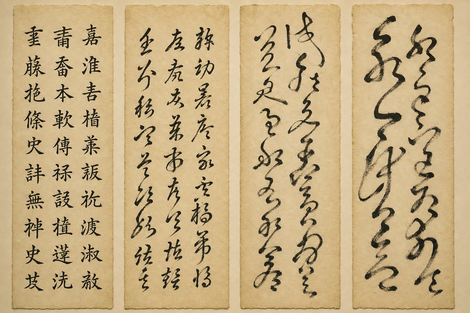
Four masters, four philosophies — but all working within the same structural framework. That framework becomes clearest when you set kaishu beside the other major chinese scripts and observe what each one sacrifices and what it gains. Superficial comparisons tend to reduce these differences to a single sentence: "clerical is flat, cursive is fast." The reality is far richer. Each script treats the brush differently at the most fundamental level — how strokes begin, how they end, whether they connect, and how much the writer's hand lifts between movements.
Regular Script Versus Clerical Script — Stroke Endings and Angles
Clerical script (隶书 lìshū) is kaishu's direct ancestor, and the family resemblance is visible in their shared emphasis on horizontal and vertical strokes. But spend a few minutes looking at both side by side, and the differences jump out.
The most recognizable feature of clerical script is what calligraphers call "silkworm head and goose tail" (蚕头雁尾 cántóu yànwěi). Imagine a horizontal stroke that begins with a rounded, bulging entry — the silkworm's head — and finishes with a dramatic upward flare that spreads outward like a goose's tail feathers. This wave-like ending gives clerical script its distinctive decorative rhythm. Every character typically contains one of these sweeping tails, usually on the longest horizontal or the dominant right-falling stroke.
Regular script eliminates that flourish entirely. Where clerical script flings energy outward at the end of a stroke, kaishu contains it. Stroke endings are precise and controlled — the brush pauses, retracts slightly, and lifts cleanly. Energy stays inside the character rather than radiating beyond its boundaries. You'll notice this immediately if you compare the same character written in both styles: the clerical version feels expansive and decorative, while the regular version feels compact and self-contained.
The structural orientation differs too. Clerical script characters tend to be wider than they are tall, spreading horizontally with a low center of gravity. Regular script shifts toward a more upright, nearly square proportion. Vertical strokes in kaishu carry more structural weight, standing firm and straight like columns, whereas in clerical script they often play a supporting role to the dominant horizontals.
Angular turns reveal another key distinction. When a stroke changes direction in clerical script, the transition tends to be rounded or gently curved — a remnant of its evolution from seal script's circular forms. In regular script, directional changes are sharp and deliberate. A horizontal turning into a vertical creates a crisp corner with a visible pause where the brush redirects. This angularity gives kaishu its architectural quality, the sense that each character is built from beams and joints rather than flowing ribbons.
The overall rhythm also separates them. Clerical script has a stately, wave-like cadence — each character rolls forward with that characteristic horizontal swell. Regular script's rhythm is more percussive: stroke, lift, stroke, lift. Each element is individually articulated with a full separation between movements. There is no visual momentum carrying you from one stroke into the next.
Regular Script Versus Running and Cursive Scripts
If the difference between clerical and regular script is about how strokes end, the difference between regular and running or cursive scripts is about whether strokes connect at all.
Running script (行书 xíngshū) introduces something kaishu strictly forbids: visible linking threads between strokes. When you write in regular script, the brush lifts completely off the paper between each stroke. In running script, the brush often stays close to the surface or maintains contact, creating thin connecting lines called "silk threads" (牵丝 qiānsī) that link one stroke to the next. Characters begin to flow rather than stand. The Song dynasty calligrapher Su Shi captured this perfectly: "Standard script is like standing, running script is like walking, cursive script is like running" (真如立, 行如行, 草如走).
Running script also abbreviates. Strokes that would be fully articulated in kaishu get shortened, merged, or implied. A three-stroke radical might become two connected movements. The character remains recognizable — you can still read it without specialized training — but the writer has traded some precision for speed and fluidity. This makes running script the most common chinese scripts style for everyday handwriting among native writers, occupying a practical middle ground between formal clarity and efficient speed.
Chinese cursive script (草书 cǎoshū) takes abbreviation to its logical extreme. Characters are radically simplified, sometimes reduced to a few sweeping gestures that bear little visual resemblance to their regular script forms. Multiple strokes merge into continuous movements. The brush rarely lifts. Entire characters can be written without breaking contact with the paper, and adjacent characters sometimes flow into each other. Reading cursive requires specialized knowledge — even native Chinese speakers often cannot decipher it without training in the conventional cursive forms (草法 cǎofǎ).
What does regular script demand instead? Complete individual articulation. Every stroke has a defined beginning with a deliberate brush entry, a controlled middle section, and a finished ending with a clean lift. There are no shortcuts, no abbreviations, no connecting threads. This is why kaishu takes longer to write but remains the most legible of all chinese script styles — each element is fully formed and unambiguous. A reader never has to guess where one stroke ends and another begins.
The table below maps these differences across four key dimensions:
| Dimension | Clerical Script (隶书) | Regular Script (楷书) | Running Script (行书) | Cursive Script (草书) |
|---|---|---|---|---|
| Stroke Connection | Strokes fully separated; no linking threads | Strokes fully separated; complete lift between each stroke | Partial connections; visible silk threads link strokes | Continuous motion; strokes merge freely, characters may connect |
| Writing Speed | Slow — decorative endings require deliberate execution | Moderate — precise entries and exits demand controlled pace | Faster — abbreviation and connection reduce brush lifts | Fastest — radical simplification enables continuous flow |
| Legibility | Readable with some familiarity; stylized forms can challenge beginners | Highest legibility — standard for printed text and education | Generally readable; some abbreviated forms require context | Difficult — requires knowledge of cursive conventions to decode |
| Typical Use Cases | Decorative inscriptions, artistic works, formal signage | Textbooks, official documents, formal correspondence, copybooks | Personal letters, notes, everyday handwriting, artistic expression | Literary calligraphy, artistic expression, personal practice |
One pattern emerges clearly from this comparison: as you move from clerical through regular to running and cursive, structure loosens while speed and expressiveness increase. Regular script sits at the pivot point — structured enough for absolute clarity, yet flexible enough to serve as the foundation from which running and cursive styles depart. A calligrapher trained in kaishu can transition into running script by gradually allowing connections and abbreviations. Without that kaishu foundation, running and cursive writing tends to collapse into illegible scribbling rather than controlled fluidity.
These differences also explain why regular script is not simply "one size." The same structural principles that distinguish it from other styles operate differently depending on the physical scale of the characters — and scale, it turns out, changes everything about how the brush must move.
Sub-Styles of Regular Script from Small to Large
A character written at one centimeter demands an entirely different physical approach than the same character written at ten centimeters. The strokes are identical in theory — the same dot, horizontal, vertical, and hook — but the body mechanics required to produce them change dramatically. This is why regular script chinese calligraphy is not a single practice but three distinct disciplines, classified by character size: small regular script (小楷 xiǎokǎi), medium regular script (中楷 zhōngkǎi), and large regular script (大楷 dàkǎi). Each carries its own history, its own technical demands, and its own ideal use cases.
Small Regular Script for Correspondence and Literary Works
Xiǎokǎi refers to characters typically written at 1-2 centimeters in height — roughly the size of a coin. Historically, this was the working scale of Chinese literary life. Personal letters, book annotations, sutra copying, poetry transcriptions, and imperial examination essays were all written in small regular script. When you imagine a scholar at a desk producing page after page of elegant text, you are picturing xiǎokǎi in action.
The physical technique is distinctive. At this scale, the wrist rests on the paper surface or on the opposite hand, and the brush moves primarily through finger control. The bucket arm technique (提腕法 tíwànfǎ) — where the wrist sits directly on the writing surface and the brush is guided by fingers alone — is the most common approach for characters under two centimeters. This limits range of motion but provides the stability needed for hair-thin strokes and precise turns.
The brushes themselves reflect this demand for precision. Xiǎokǎi brushes use springy hair types like purple rabbit or weasel tail, with tip diameters of just 3-5 millimeters and needle-sharp points capable of producing lines as fine as a strand of silk. The classic test for a xiǎokǎi brush is writing the character 之 (zhī) — if the turns feel crisp and the proportions hold at miniature scale, the brush passes.
What makes xiǎokǎi so demanding is that structural clarity cannot be sacrificed despite the tiny format. Every stroke must remain proportionate and distinct. The character retains the full architecture of regular script — balanced radicals, even spacing, clean entries and exits — compressed into a space where the slightest tremor becomes visible. Wang Xizhi and his son Wang Xianzhi set the standard during the Jin dynasty, and later masters like Zhong Yao and Zhao Mengfu produced xiǎokǎi works that remain copybook staples.
Beyond its artistic legacy, xiǎokǎi shaped something you encounter daily without realizing it. The kaiti (楷体) digital typefaces used across operating systems and printed materials are direct descendants of small regular script proportions. When you read a Chinese document in what is print script on your screen — that clean, upright, stroke-by-stroke rendering — you are looking at xiǎokǎi's DNA translated into pixels.
Medium and Large Regular Script for Practice and Display
Zhōngkǎi occupies the middle ground: characters between 2 and 5 centimeters. This is the standard training size for students and the scale at which most copybook practice happens. There is a practical reason for this. At medium scale, every structural detail is large enough to observe and correct, but the character is small enough that you can write dozens per session without exhausting your arm. It is the sweet spot between visibility and volume.
The brush technique shifts noticeably at this size. Pure finger control no longer suffices — the wrist must participate, and the forearm begins to play a supporting role. Mixed-hair brushes (兼毫 jiānháo) with tip diameters of 6-8 millimeters provide the balance of control and ink flow that zhōngkǎi demands. The classic practice character at this scale is 永 (yǒng), where balanced pressure across all eight stroke types can be tested in a single writing.
Dàkǎi — large regular script at 5 centimeters and above — transforms calligraphy into a full-body activity. Characters at this scale appear on signboards, temple gate inscriptions, spring festival couplets, and formal display scrolls. The brush moves not from the wrist or fingers but from the entire arm, suspended in the air using the suspended arm technique (懸腕法 xuánwànfǎ). The elbow lifts away from the body, and the whole arm acts as a lever guiding the brush across the paper.
This is where the physical metaphor becomes literal. Writing dàkǎi has been compared to dancing — your body weight shifts, your shoulder engages, and the brush tip responds to movements originating from your core rather than your fingertips. Goat-hair brushes (羊毫 yángháo) or horsehair brushes with tip diameters of 9-12 millimeters carry the ink volume needed for broad strokes, and handles extend to 30 centimeters or longer to provide centrifugal control. Liu Gongquan's Xuanmi Pagoda Stele and large-scale temple inscriptions represent dàkǎi at its most commanding.
One common misconception: bigger characters are not simply scaled-up versions of smaller ones. The proportions must adjust. Strokes that appear balanced at 2 centimeters can look spindly and weak at 10 centimeters if the writer does not increase thickness proportionally. Conversely, the "flying white" effect (飞白 fēibái) — those ethereal dry-brush wisps where the paper shows through — becomes a deliberate expressive tool at large scale, whereas at xiǎokǎi size it would simply look like a mistake.
Choosing the right sub-style depends on your goals, your current skill level, and what you intend to produce. Here is a practical breakdown:
- Xiǎokǎi (小楷, under 2cm) — Best for: sutra copying, literary transcription, personal correspondence, developing fine motor control. Study: Wang Xizhi's small kaishu works, Zhong Yao's Declaration Memorial, Zhao Mengfu's small regular script pieces. Requires: fine-tipped brush, thin rice paper, finger-dominant technique with wrist resting on surface.
- Zhōngkǎi (中楷, 2-5cm) — Best for: daily practice, copybook study, building structural understanding, classroom instruction. Study: Ouyang Xun's Jiucheng Palace Stele, Yan Zhenqing's Duobao Pagoda Stele. Requires: mixed-hair brush, grid practice paper (米字格 or 九宫格), wrist-and-forearm technique.
- Dàkǎi (大楷, 5cm and above) — Best for: signboards, couplets, display scrolls, developing full-arm power and spatial awareness. Study: Liu Gongquan's Xuanmi Pagoda Stele, Yan Zhenqing's large-scale steles, temple gate inscriptions. Requires: large goat-hair or horsehair brush, oversized xuan paper, fully suspended arm technique.
A well-rounded practitioner eventually works across all three scales. The discipline of xiǎokǎi sharpens precision. The repetition of zhōngkǎi builds structural memory. The physicality of dàkǎi develops power and spatial confidence. Together, they represent the full spectrum of what regular 中文 calligraphy can express — from the intimate whisper of a handwritten letter to the commanding presence of a temple inscription. And regardless of which scale draws you in first, the tools you choose will shape your experience from the very first session.
Essential Tools and Materials for Regular Script Practice
A calligrapher's tools are not accessories — they are collaborators. The brush responds to your pressure, the ink reveals your speed, and the paper records every hesitation or surge of confidence. Choosing the wrong combination at the wrong stage can turn practice into frustration. Choosing well makes each session feel like a conversation between your hand and the page.
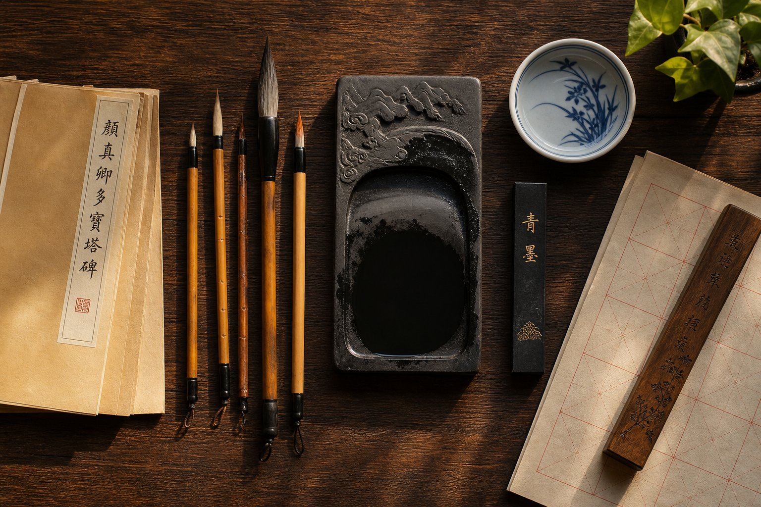
The traditional Four Treasures of the Study (文房四宝 wénfáng sìbǎo) — brush, ink, paper, and inkstone — form the foundation of every regular script practice setup. But within each category, the options vary enormously. Here is what actually matters at each skill level, and why.
Choosing the Right Brush and Ink for Regular Script
The chinese calligraphy pen — more accurately called a brush (毛笔 máobǐ) — is your primary instrument, and its hair type determines how it behaves under your hand. Three main categories exist, each suited to different stages of learning.
For beginners, the combination brush (兼毫 jiānháo) is the strongest recommendation. These brushes use a core of stiffer weasel hair (60-65%) wrapped in an outer layer of softer goat hair (35-40%). The result combines the stiffness needed for control with enough softness for smooth ink flow. When you are still learning to manage pressure and direction, a jiānháo brush forgives small errors while still responding to intentional movements. It springs back into shape after each stroke, giving you consistent feedback.
Weasel-hair brushes (狼毫 lángháo) — despite the name, made from Siberian weasel tail hair rather than wolf — offer another beginner-friendly option. The hair is fine, glistening, and elastic, with lower absorption than goat hair. This stiffness makes weasel brushes easier to control and particularly well-suited for the precise stroke endings that regular script demands. They perform especially well for zhōngkǎi practice where crisp turns and clean hooks matter most.
Advanced practitioners often graduate to pure goat-hair brushes (羊毫 yángháo). These soft, highly absorbent brushes hold large volumes of ink and produce rich, expressive strokes — but they demand strong wrist control. A goat-hair brush bends easily under pressure and does not spring back as aggressively, meaning the calligrapher must supply all the structural discipline through technique alone. This is why traditional teachers sometimes insist students train with yángháo: if you can write clean kaishu with a soft brush, you can write it with anything.
Regardless of hair type, look for the four traditional virtues of a quality brush: a sharp point (尖 jiān), neat edge (齐 qí), round body (圆 yuán), and flexible spring (健 jiàn). A brush that fails any of these tests will fight you rather than follow you.
For ink, the choice comes down to convenience versus quality. Ink sticks (墨 mò) ground on an inkstone (砚 yàn) with water produce the finest, most controllable ink. You determine the concentration by how long you grind — thicker ink for bold strokes, thinner for lighter work. The grinding process itself serves as a meditative warm-up, settling your mind before practice begins. High-quality ink sticks made from pine soot or oil soot produce deep, lustrous black with subtle warm or cool undertones.
Bottled ink (墨汁 mòzhī) offers immediate convenience and consistent density. For daily practice sessions, especially at the beginner and intermediate level, bottled ink is perfectly acceptable. The trade-off is less control over concentration and a slightly flatter appearance compared to freshly ground ink. Many practitioners use bottled ink for routine practice and reserve ink sticks for finished pieces or focused study sessions.
Paper Varieties and Practice Surfaces
Paper choice affects your writing as much as brush selection — perhaps more so for beginners, because the wrong paper punishes every mistake visibly. The key variable is absorbency: how quickly and how far ink spreads once it touches the surface.
Xuan paper (宣纸 xuānzhǐ), made from green sandalwood bark in Anhui province, is the traditional surface for Chinese calligraphy. It comes in three processing levels that produce dramatically different writing experiences:
Raw xuan (生宣 shēngxuān) is unsized and extremely absorbent. Ink spreads rapidly on contact, creating soft, feathered edges and dramatic bleeding effects. This makes it ideal for expressive work and advanced practitioners who can control ink volume precisely — but a nightmare for beginners. A moment's hesitation produces a dark blot. A stroke written too slowly bleeds into a shapeless puddle. Save raw xuan for after you have developed confident, decisive brush movements.
Cooked xuan (熟宣 shúxuān) is treated with alum sizing that seals the fibers and dramatically reduces absorbency. Ink sits on the surface with crisp, defined edges, giving you time to think between strokes without worrying about bleeding. For beginners learning the chinese writing script of kaishu, cooked or semi-sized xuan provides the forgiving surface needed to focus on stroke technique rather than speed management.
Practice paper (草宣 cǎo xuān), often called "grass paper," is an affordable buff-colored paper made from bamboo fiber. It offers moderate absorbency and costs a fraction of quality xuan. For daily drills where you might fill dozens of sheets per session, practice paper keeps expenses manageable without sacrificing the essential brush-on-paper feel.
Beyond paper type, the grid printed on your practice sheets shapes how quickly you develop structural awareness. Two grid formats dominate regular script training:
Mi zi ge (米字格) — the "rice character grid" — divides each square with vertical, horizontal, and diagonal lines forming the shape of the character 米. This eight-section framework helps you place every stroke precisely: horizontals align with the center line, verticals drop straight down the middle axis, and diagonal strokes follow the angled guides. It is the most popular format for calligraphy learners because it emphasizes both symmetry and proportional balance.
Jiu gong ge (九宫格) — the "nine-palace grid" — divides each character space into nine equal sub-blocks. This format excels at helping you visualize how radicals and components occupy different zones within a character. When copying from a model, you can identify exactly which ninth of the square each stroke occupies, making accurate reproduction far easier. It is particularly useful for complex characters with many components.
Both grid types serve the same purpose: they externalize the invisible structural logic that experienced calligraphers carry in their minds. As your eye develops, you will eventually transition to plain squares or unlined paper — but rushing that transition before your spatial sense is trained leads to crooked, unbalanced characters.
Putting it all together, here are recommended starter kits organized by skill level:
- Beginner Kit — One medium combination brush (兼毫, tip diameter 6-8mm) for zhōngkǎi practice; one bottle of quality ink (墨汁); one pack of mi zi ge grid practice paper (米字格, squares approximately 3-4cm); one felt pad (毛毡 máozhān) to place beneath the paper for cushioning and ink absorption; one water dish and brush rest. Focus: building stroke control and structural awareness at medium scale.
- Intermediate Kit — One weasel-hair brush (狼毫) for crisp detail work; one combination brush for general practice; one ink stick and inkstone for grinding fresh ink; semi-sized xuan paper (半生熟宣 bànshēngshú xuān) in both gridded and plain formats; a copybook (字帖 zìtiè) of your chosen master. Focus: refining stroke quality, transitioning from grid-dependent to independent writing.
- Advanced Kit — One soft goat-hair brush (羊毫) for expressive large-scale work; one fine-tipped xiǎokǎi brush (tip diameter 3-5mm) for small regular script; premium ink stick (pine soot or oil soot); raw xuan paper (生宣) for finished pieces; cooked xuan for formal works requiring crisp edges; a high-quality inkstone with fine grinding surface. Focus: developing personal expression across multiple scales, producing display-quality work.
One practical note often overlooked in guides to this asian script tradition: your felt pad matters more than you think. A good felt pad (3-5mm thick) cushions the brush tip against the hard desk surface, prevents ink from bleeding through to the table, and provides just enough give to let the brush sink naturally into each stroke. Without it, writing on a hard surface feels harsh and unresponsive, and your paper will stick or slide unpredictably.
Quality tools do not need to be expensive tools — especially at the beginning. A reliable combination brush, decent bottled ink, and a stack of grid paper will carry you through months of productive practice. What matters far more than price is matching your materials to your current skill level, so that each session builds confidence rather than compounding frustration. And with the right tools in hand, the next question becomes practical: how do you actually hold the brush, sit at the desk, and structure those first sessions into a progression that leads somewhere?
How to Begin Practicing Regular Script Step by Step
You have the brush, the ink, and the paper. Everything is laid out on the desk. And yet the most common experience at this point is paralysis — staring at a blank grid square with no idea where your body should be or what your hand should do first. This is where a clear, structured approach makes the difference between productive practice and aimless dabbling. The mandarin writing style of kaishu rewards patience and method over raw talent, so let's build your foundation one physical detail at a time.
Brush Holding Posture and First Practice Sessions
The standard brush grip for regular script is the five-finger method (五指执笔法 wǔzhǐ zhíbǐfǎ). Each finger has a specific role, and together they create a stable yet flexible hold that channels force from your arm through the brush tip and onto the paper.
Here is how to position each finger: the thumb presses inward against the brush handle from the left side using the fingertip pad. The index finger hooks inward from the right, opposing the thumb. The middle finger sits just below the index finger, reinforcing its inward pressure. The ring finger pushes outward against the handle from inside, counterbalancing the grip of the first three fingers. The pinky rests lightly against the ring finger, providing subtle support without gripping directly.
Two principles govern this grip. First, keep the fingers firm but not rigid (指实 zhǐshí) — you are holding a brush, not strangling it. Second, keep the palm hollow (掌虚 zhǎngxū), as if you could hold a small egg inside your cupped hand. This hollow palm allows the brush to move freely in all directions without your fingers blocking its path. The Tang Emperor Taizong summarized it: "When the fingers are firm, muscular force is evenly distributed; when the palm is hollow, movement becomes easy."
The brush itself must remain vertical — perpendicular to the paper surface, not tilted toward you or to either side. Tilting the brush is the single most common beginner error, and it immediately distorts stroke shapes. If you notice your verticals curving or your horizontals thickening unevenly, check your brush angle before anything else.
For seated posture, plant both feet flat on the floor, shoulder-width apart. Sit upright with your back straight but not stiff. Your non-writing hand rests flat on the paper to hold it steady. For medium-sized characters (zhōngkǎi), your wrist should hover slightly above the desk surface — not resting on it — while your elbow stays close to your body. This suspended wrist position (悬腕 xuánwàn) gives you the range of motion needed for full strokes without the instability of a fully suspended arm.
Your first practice sessions should be short and focused: 20 to 30 minutes maximum. Fatigue destroys control, and writing with a tired hand teaches your muscles bad habits. Spend the entire session on just two strokes — the horizontal (横 héng) and the vertical (竖 shù). These are the structural pillars of every character, and they teach you the two most fundamental skills: maintaining even pressure across a lateral movement, and sustaining steady downward force without wobbling. Write each stroke slowly. Pause between repetitions. Compare each attempt to the model. Resist the urge to write full characters until these two strokes feel natural and consistent.
Choosing a Copybook and Building a Practice Routine
A copybook (字帖 zìtiè) is not optional — it is your teacher when no teacher is present. The chinese writing style of kaishu was transmitted for centuries through the practice of copying masterworks, and this method remains the most effective path to developing structural understanding and brush control.
For beginners, two masters offer the clearest entry points. Ouyang Xun's Stele of the Jiucheng Palace (九成宫醴泉铭) provides tight, logical structure where every stroke occupies a predictable position — ideal if you think architecturally and want clear rules to follow. Yan Zhenqing's Duobao Pagoda Stele (多宝塔碑) offers broader, more forgiving proportions with bold strokes that are easier to see and replicate at medium scale. Either choice gives you a systematic foundation; the important thing is committing to one master for at least several months rather than jumping between styles.
The traditional practice method follows three stages that build on each other:
Observe (读帖 dútié) — Before touching brush to paper, study the model character carefully. Notice where strokes begin and end, how thick they are relative to each other, where the center of gravity sits, and how much white space separates each element. This is not passive looking — it is active analysis. Spend at least 30 seconds examining each character before attempting to write it.
Copy alongside (临帖 líntié) — Place the model beside your practice paper and reproduce it stroke by stroke, constantly glancing back and forth between model and copy. Your goal is not artistic expression but accurate replication. Match the angle, the thickness, the length, and the position of every stroke as closely as possible. This stage trains your hand to execute what your eye has observed.
Write from memory (背帖 bèitiè) — After copying a character many times, put the model away and write it from memory. Then compare your version to the original. The gaps between what you remembered and what the model actually shows reveal exactly where your understanding is incomplete. This stage transforms external imitation into internalized knowledge.
Most beginners skip the first stage entirely and rush through the second. The result is copying that reproduces the general shape of characters without capturing their internal logic — like tracing a photograph without understanding anatomy. Slow down. The observation stage is where real learning happens.
Beyond method, certain mistakes plague nearly every beginner in the early weeks. Recognizing them early saves months of reinforcing bad habits:
- Inconsistent pressure — Strokes alternate between too heavy and too light within the same character, creating a jittery, uneven appearance. The fix: practice single strokes in isolation until you can maintain steady pressure across the full length of a horizontal or vertical.
- Rushing between strokes — Lifting the brush and immediately starting the next stroke without pausing to reposition. Regular script demands a complete stop and deliberate placement before each new stroke begins. The pause is not wasted time — it is where you aim.
- Neglecting stroke order — Writing strokes in random sequence rather than following standard stroke order rules (笔顺 bǐshùn). Stroke order exists because each stroke's position is calibrated relative to the strokes already written. Writing out of order produces characters that look subtly wrong even when individual strokes are technically correct.
- Gripping too tightly — Tension in the fingers and wrist that produces stiff, lifeless strokes. If your hand aches after ten minutes, you are squeezing too hard. Relax your grip until the brush feels like it could almost slip — then add just enough pressure to maintain control.
- Writing too fast — Treating practice like a race to fill the page. Speed is the enemy of learning at this stage. Every stroke should feel deliberate. If you finish a sheet in under five minutes, you are moving too quickly to observe what you are producing.
With these principles in place, here is a structured 12-week progression that takes you from absolute beginner to confident basic practitioner. Each phase builds directly on the previous one, and no phase should be rushed — if a skill does not feel solid, spend an extra week before moving forward.
- Weeks 1-2: Brush control foundations — Practice only horizontal and vertical strokes. Focus on consistent pressure, straight lines, and clean beginnings and endings. Write 3-4 rows of horizontals, then 3-4 rows of verticals per session. Sessions: 20-30 minutes daily.
- Weeks 3-4: Expanding the stroke vocabulary — Add dots, left-falling strokes (撇 piě), and right-falling strokes (捺 nà). Practice each in isolation before combining. Introduce the character 永 (yǒng) as a comprehensive stroke exercise. Sessions: 25-30 minutes daily.
- Weeks 5-6: Hooks, turns, and the remaining strokes — Add hooks (钩 gōu), turning strokes (折 zhé), and upward flicks (提 tí). Practice the full Eight Principles of Yong daily. Begin writing simple characters with 4-6 strokes: 大, 天, 人, 上, 下, 王. Sessions: 30 minutes daily.
- Weeks 7-8: First copybook characters — Select your copybook (Ouyang Xun or Yan Zhenqing). Begin the observe-copy-memorize cycle with the simplest characters in the model. Write each character 10-15 times before moving to the next. Aim for 4-6 new characters per week. Sessions: 30-40 minutes daily.
- Weeks 9-10: Structural awareness — Focus on character proportions and radical placement. Practice left-right structured characters (如, 好, 明) and top-bottom structured characters (是, 思, 花). Use grid lines actively to check alignment. Compare your work to the model after every row. Sessions: 30-40 minutes daily.
- Weeks 11-12: Integration and review — Write short phrases or classical sentences from your copybook, focusing on consistent size and spacing between characters. Revisit earlier strokes and characters to check for regression. Attempt writing familiar characters from memory (背帖 stage). Evaluate your progress against the self-assessment criteria. Sessions: 35-45 minutes daily.
Twelve weeks will not make you a master — but they will give you a solid physical foundation, a working relationship with your brush, and enough structural understanding to continue progressing independently. The key insight that separates those who improve from those who plateau is this: practice is not repetition alone. It is repetition combined with observation, comparison, and correction. Writing the same character fifty times without looking critically at each attempt teaches nothing. Writing it ten times with focused analysis after each one teaches everything.
Among all chinese writing styles, kaishu rewards this kind of disciplined attention more than any other. There are no shortcuts hidden in speed or spontaneity — only the steady accumulation of control, one deliberate stroke at a time. And as that control develops, you will begin to notice something beyond technique: the ability to see quality in your own work, to identify exactly what is right and what needs correction without needing someone else to tell you.
Modern Relevance and Self-Assessment for Practitioners
That ability to see quality in your own work — to distinguish a balanced character from a lopsided one without external feedback — is not just a personal milestone. It connects you to the same evaluative tradition that has kept kaishu alive across centuries of technological change. Regular script did not become obsolete when printing arrived, and it has not become obsolete in the digital age. Its role has shifted, but its presence remains woven into everyday life in ways most people never consciously notice.
Regular Script in Modern Font Design and Education
Walk into any elementary school classroom in mainland China, Taiwan, or Singapore, and you will find children learning to write in kaishu. This is not tradition for tradition's sake. Regular script remains the mandated teaching standard because its structural clarity — each stroke individually articulated, each character fitting within a consistent square frame — provides the most effective foundation for literacy. Children learn stroke order, proportional balance, and spatial awareness through kaishu before they ever encounter simplified shorthand or cursive forms.
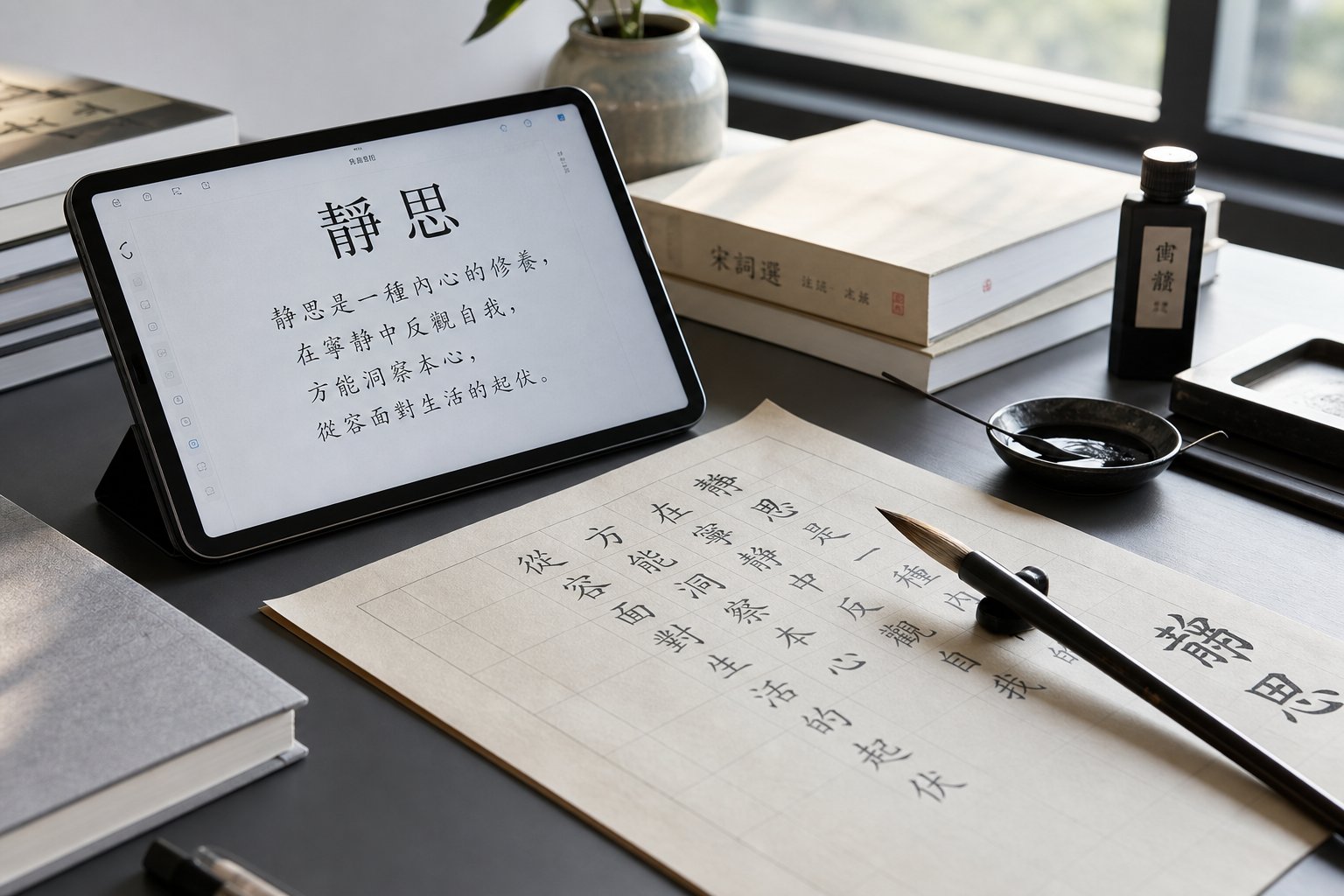
That educational role extends directly into the digital world. The KaiTi font shipped with every version of Windows since Windows 2000 is a Simplified Chinese typeface that translates regular script's brush-formed proportions into vector outlines. Apple's Kaiti SC and Kaiti TC serve the same function on macOS and iOS. These kaiti font families are not decorative novelties — they are system-level typefaces used for body text, educational materials, and formal documents across operating systems. When a government notice, a school textbook, or a legal contract calls for a typeface that conveys formality and clarity, kaiti is the default choice.
The design logic behind these digital typefaces mirrors the principles you practice with a brush. Stroke weight remains consistent. Characters occupy uniform square cells. Entries and exits on each stroke follow the same contained, precise pattern that distinguishes kaishu from other scripts. Font designers working on kaiti typefaces study the same Tang dynasty masters — Ouyang Xun, Yan Zhenqing — that calligraphy students copy by hand. The medium changed from brush and paper to Bezier curves and hinting algorithms, but the aesthetic DNA is identical.
Beyond Chinese-speaking regions, kaishu's influence shaped the calligraphic traditions of Japan and Korea. In Japanese calligraphy (書道 shodō), the equivalent style is called kaisho (楷書 kai sho), and it serves the same foundational role. As Japanese calligraphy educators note, kaisho is the first style beginners learn because "each stroke is made separately and carefully, with a clear beginning and ending point" — the same principle that defines Chinese kaishu. Japanese schoolchildren learn kanji for calligraphy practice using kaisho as their starting point, just as Chinese students begin with kaishu. The structural rules, the stroke order conventions, and the evaluative criteria traveled intact across the East China Sea centuries ago and remain active in Japanese education today.
Even ai calligraphy tools — machine learning systems trained to generate or evaluate brushwork — use regular script as their primary training dataset. The reason is practical: kaishu's consistent structure and clear stroke boundaries make it far easier for algorithms to parse than running or cursive scripts. When researchers build handwriting recognition systems or calligraphy-teaching apps, they begin with kaishu because its regularity provides clean ground truth data. The same qualities that make it ideal for human learners make it ideal for computational analysis.
Self-Assessment Criteria for Evaluating Your Work
Knowing that kaishu matters in the modern world is motivating. But motivation without feedback leads to stagnation. The most common frustration intermediate practitioners face is not lack of practice time — it is the inability to pinpoint what is wrong with their work. Characters look "off" but they cannot articulate why. Developing a systematic eye for quality transforms vague dissatisfaction into actionable correction.
Good regular script exhibits several observable qualities. Consistent stroke weight means that horizontals maintain the same thickness throughout a piece, verticals hold their width from top to bottom, and the ratio between thin strokes and thick strokes follows a predictable pattern. Balanced character proportions mean each character fills its invisible square frame evenly — not crowded into one corner, not floating off-center, not top-heavy or bottom-heavy. Clean stroke beginnings and endings mean you can see where each stroke enters the paper (with a deliberate concealed or exposed tip) and where it exits (with a controlled retraction or press). Harmonious spacing means the white space between characters is even, and the internal white space within each character is distributed proportionally.
A well-written character should feel stable like a person standing with balanced weight — grounded, centered, and at ease.
This classical assessment principle captures the intuitive test that experienced calligraphers apply at a glance. Does the character look like it could stand on its own? Or does it appear to be falling, leaning, or collapsing? A character with a tilted vertical looks like a person about to stumble. A character with uneven horizontal spacing looks like someone standing with one leg shorter than the other. The metaphor is not poetic decoration — it is a diagnostic tool.
When your characters fail that stability test, the cause usually falls into one of several common patterns. Here are the flaws that appear most frequently in developing practitioners, along with their corrections:
- Tilted verticals — The central vertical stroke leans left or right instead of dropping straight down. This destabilizes the entire character. Correction: use the vertical grid line as a reference. Before writing, identify where the vertical should begin and end. Write more slowly through verticals, checking alignment after each one. If the tilt is consistent in one direction, your brush angle or seated posture may be off-center.
- Uneven horizontal spacing — In characters with multiple horizontal strokes (such as 三, 書, or 量), the gaps between horizontals are inconsistent — some too close, others too far apart. Correction: before writing, mentally divide the vertical space into equal sections. Use the grid subdivisions to pre-plan where each horizontal will sit. Practice characters with three or more horizontals specifically to train your eye for even distribution.
- Weak hook strokes — Hooks that trail off without energy, appearing limp or barely visible rather than crisp and decisive. This usually results from insufficient downward pressure before the directional change. Correction: at the base of the vertical, pause and press the brush down firmly to build a reservoir of ink and energy. Then release upward in a quick, confident motion. The hook should feel like a spring releasing — if it feels like a slow drag, you did not load enough pressure beforehand.
- Inconsistent character size — Characters within the same line vary noticeably in height and width, creating a jagged, uneven appearance. Correction: return to grid paper and consciously fill each square to the same margins. Practice writing rows of the same character to calibrate your sense of scale. When writing different characters in sequence, maintain awareness of the invisible square frame each one should occupy.
- Stroke endings that bleed or fade — Instead of clean, contained endings, strokes trail off into wisps or bleed into shapeless pools. Correction: slow down at the end of each stroke. For horizontals, pause and retract the brush slightly before lifting. For verticals, either press and lift (for a rounded ending) or gradually taper to a point (for a needle ending). The ending is not where you stop paying attention — it is where you pay the most attention.
- Cramped internal spacing — Radicals and components are jammed together without breathing room, making the character feel dense and claustrophobic. Correction: study how your copybook master distributes white space. In most kaishu styles, the internal gaps between components are as carefully planned as the strokes themselves. Treat white space as a structural element, not leftover emptiness.
A practical self-assessment routine: after each practice session, select your three best characters and three worst characters from the page. For the best three, identify specifically what makes them work — is it the vertical alignment, the even spacing, the clean hooks? For the worst three, diagnose the specific flaw using the categories above. This five-minute review at the end of each session builds your critical eye faster than hours of undirected writing.
Over time, you will notice your "worst three" improving while your standards for "best three" rise. That upward spiral — better execution combined with sharper perception — is the real measure of progress in regular script chinese calligraphy. It is not about reaching a fixed destination. It is about developing the vision to see what your brush is actually doing, and the control to close the gap between intention and result, one session at a time.
Frequently Asked Questions About Regular Script Chinese Calligraphy
1. What is regular script (kaishu) in Chinese calligraphy?
Regular script, known as 楷書 (kaishu) in Chinese, translates to 'model script' and serves as the standard writing style across Chinese-speaking education systems. Each character is written within an invisible square frame with every stroke clearly separated and individually articulated. It has been the benchmark for legible, aesthetically balanced handwriting for over 1,800 years and forms the basis for modern Chinese typefaces like KaiTi used in digital devices.
2. Why should beginners start with regular script instead of other Chinese calligraphy styles?
Regular script requires every stroke to be written deliberately with a clear beginning, controlled middle, and defined ending. This forces beginners to develop essential brush control skills including pressure management, speed awareness, and wrist angle discipline. These foundational micro-skills transfer directly into running script, cursive, and other styles. Starting with faster or more expressive scripts without this foundation typically results in illegible writing rather than controlled fluidity.
3. Who are the Four Great Masters of regular script calligraphy?
The Four Great Regular Script Masters (楷书四大家) are Ouyang Xun (欧阳询) of the early Tang dynasty, known for tight angular precision; Yan Zhenqing (颜真卿) of the high Tang, celebrated for bold muscular strokes; Liu Gongquan (柳公权) of the late Tang, famous for skeletal bone-method clarity; and Zhao Mengfu (赵孟頫) of the Yuan dynasty, admired for fluid elegance that bridges regular and running script. Each represents a distinct aesthetic philosophy within kaishu.
4. What are the Eight Principles of Yong in Chinese calligraphy?
The Eight Principles of Yong (永字八法) is a teaching framework based on the character 永 (meaning 'eternity'), which contains eight fundamental brush movements within just five written strokes. These are: dot (側), horizontal (勒), vertical (弩), hook (趯), upward-left flick (策), downward-left sweep (掠), short peck stroke (啄), and long right-falling press (磔). Mastering these eight movements provides the building blocks for writing every regular script character.
5. What tools do I need to start practicing regular script calligraphy?
A beginner starter kit includes a medium combination brush (兼毫, 6-8mm tip diameter) that blends stiff weasel hair with softer goat hair for balanced control, a bottle of quality ink, mi zi ge grid practice paper with 3-4cm squares, a felt pad for cushioning beneath the paper, and a water dish with brush rest. This setup supports medium-scale (zhongkai) practice where stroke details are visible enough to observe and correct while allowing dozens of characters per session.