Why Traditional vs Simplified Matters for Calligraphy Practice
When you search for information on traditional vs simplified Chinese characters, you'll find hundreds of articles about which system to learn for business, travel, or passing an exam. Very few address the question that actually matters to someone holding a brush: how does character form shape the way ink meets paper?
This distinction is everything for practitioners of traditional Chinese calligraphy. The debate between these two writing systems isn't just academic or linguistic. It's physical. It changes how your wrist turns, how you distribute visual weight across a composition, and whether a finished piece carries the structural depth that centuries of masters refined stroke by stroke.
Why Calligraphers Need to Understand Both Systems
Imagine spending months perfecting a character's balance, only to realize the version you practiced strips away the very components that give it compositional tension. That's the reality many calligraphers face when navigating traditional Chinese vs simplified Chinese forms without understanding what was lost or preserved in each.
Chinese characters simplified vs traditional aren't just two ways to write the same meaning. They demand different brush techniques, different spatial awareness, and different levels of motor control. A calligrapher fluent in both systems gains access to a wider range of expressive tools and can make informed artistic choices about which form serves a given piece.
Traditional characters preserve millennia of calligraphic evolution in their structure. Each radical, each interlocking component, exists because generations of calligraphers refined it for visual harmony and brush flow. Simplification prioritized writing speed and literacy, often at the cost of the very elements that make a character rewarding to practice and beautiful to display.
What Makes the Calligraphy Angle Different From Language Learning
Language learners ask: which system is easier to read? Business professionals ask: which system does my audience use? Calligraphers ask something else entirely. They want to know which characters build skill, which forms create visual impact on a hanging scroll, and which strokes develop the fine motor control that separates competent writing from genuine artistry.
In this article, we rank specific character pairs that best reveal the calligraphic differences between traditional and simplified Chinese. Each pair is evaluated not for communication efficiency but for what it teaches the hand, challenges the eye, and offers the viewer. The characters ahead were chosen because they expose, in concrete and measurable ways, how simplification altered brush technique, visual balance, and artistic expression.
How We Selected and Ranked These Character Pairs
Not every simplified vs traditional Chinese characters pair tells an interesting calligraphic story. Some simplifications are minor, shaving a stroke or two without meaningfully altering brush movement or composition. Others gut a character so thoroughly that the traditional and simplified forms feel like entirely different artistic objects. We needed a framework to separate the dramatic from the trivial.
The five character pairs ranked in this article were chosen through a structured evaluation. Each pair was scored across five criteria that reflect what actually matters when brush meets paper, not what matters for reading speed or digital input efficiency.
Our Five Ranking Criteria for Calligraphic Comparison
These criteria emerged from the practical concerns of traditional Chinese writing as an art form. You'll notice they focus entirely on what a calligrapher experiences during practice and what a viewer perceives in the finished piece:
- Stroke count difference - The raw numerical gap between traditional and simplified forms. A larger gap generally means more compositional elements were removed, reducing the character's complexity as a brush exercise.
- Impact on visual balance and symmetry - Whether simplification disrupted the spatial harmony of the original form. Traditional Chinese characters often achieve balance through mirrored components or carefully weighted sections that simplification collapses.
- Change in brush technique requirements - How many distinct stroke types, turning movements, and pressure variations the traditional form demands compared to its simplified counterpart. Fewer stroke types means fewer skills developed during practice.
- Loss or preservation of pictographic meaning - Whether the simplified form retains the visual logic connecting the character to its meaning. Many traditional characters carry embedded pictographic elements that enrich artistic interpretation.
- Overall aesthetic quality for display calligraphy - How each form performs when rendered at large scale for hanging scrolls, framed pieces, or exhibition work, where every structural detail becomes visible and compositional density matters.
A character pair that scores high across all five criteria represents a case where simplification created the widest gap between artistic potential in the traditional form and limitation in the simplified one. The pairs ranked ahead aren't chosen to argue that simplified Chinese characters are worthless. They're chosen because they reveal, with maximum clarity, how the two systems diverge for someone practicing calligraphy as a visual art.
How Script Styles Interact With Character Systems
Understanding the mandarin simplified vs traditional debate in calligraphy also requires understanding script styles. Chinese calligraphy operates across five major script styles that developed over more than three thousand years: seal script (篆書), clerical script (隸書), regular script (楷書), running script (行書), and cursive script (草書). Each has distinct visual characteristics, from the thin, symmetrical lines of seal script to the flowing, abbreviated strokes of cursive.
Here's where the interaction gets critical for practitioners. Not all script styles accommodate simplified characters equally. Regular script, running script, and cursive script can technically render simplified forms because these styles evolved during or after the periods when many simplification patterns already existed in handwritten shorthand. Cursive script, in particular, already abbreviates characters so aggressively that some simplified forms were actually derived from cursive conventions.
The older styles tell a different story entirely.
Seal script and clerical script are essentially incompatible with simplified character forms. These scripts predate simplification by centuries or millennia, and their structural logic depends on the full traditional form. Writing a simplified character in seal script is an anachronism, like typesetting a medieval manuscript in a font that didn't exist until the 20th century.
This incompatibility matters practically. If you study calligraphy seriously enough to explore seal or clerical script, you'll need traditional characters regardless of which system you use for daily communication. The mandarin simplified vs traditional question, for a calligrapher working across multiple scripts, isn't really a choice at all. It's a matter of which styles you want access to and how deeply you want to engage with the art form's full historical range.
With these criteria and script-style considerations established, the character pairs that follow are ordered from most to least impactful. The first pair demonstrates the single most dramatic calligraphic transformation in common use.
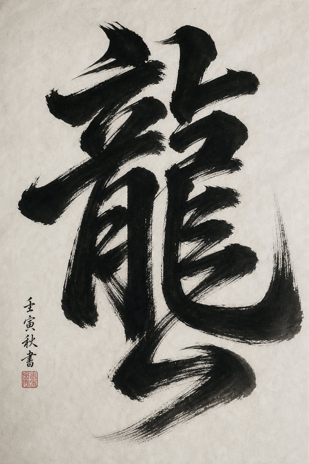
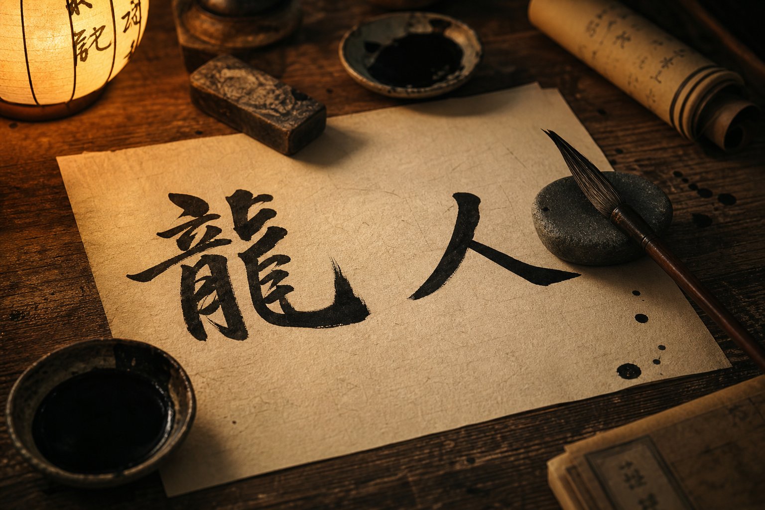
Dragon 龍 vs 龙 - The Most Dramatic Calligraphic Transformation
A drop from 16 strokes to 5. No other commonly written character loses this much structural material during simplification. The dragon character represents the single most dramatic example of traditional chinese characters vs simplified forms diverging in calligraphic potential, and it earns the top spot in our ranking for good reason.
The traditional form 龍 is a miniature composition unto itself. It contains interlocking components that create dynamic tension and visual movement across the page, mimicking the coiling energy of the mythical creature it represents. The character evolved from Seal Script, where it depicted a stylized dragon with a serpent's body on the right side, legs beneath it, and a head featuring a mouth with whiskers, fangs, eyes, and a crown on the left. Over centuries of refinement, those pictographic elements became abstracted into the dense, layered structure calligraphers practice today.
The simplified 龙, by contrast, retains only a skeletal suggestion of this history. Five strokes. No interlocking radicals, no layered composition, no internal tension between compressed elements. For a language learner, that's efficient. For a calligrapher, it's a character that offers almost nothing to practice.
Stroke Analysis and Brush Movement
When you write 龍 in regular script, you're building visual energy through a specific sequence of movements that demand constant adjustment. Here's how the traditional form develops compositionally, stroke by stroke:
The upper-left section begins with the component influenced by 立 (to stand), establishing a vertical anchor. Your brush sets firm horizontal and vertical strokes that create a stable crown for the character. Moving to the lower-left, the component derived from 月 (moon) introduces curved vertical strokes and hooks, requiring you to shift from rigid control to fluid turning movements. The right side of the character is where the real complexity lives. A serpent-like body built from compressed horizontal strokes stacks tightly, demanding precise spacing and consistent stroke weight. Below that, leg-like components with hooks and turning strokes pull the eye downward, creating the sense of a creature in motion.
Each section requires a different brush technique. The upper portion demands crisp, controlled horizontals. The lower-left asks for smooth curves. The right side tests your ability to maintain even spacing under compression. The hooks and turns at the bottom challenge wrist flexibility. A single character becomes a complete workout across multiple skill categories.
The simplified 龙 offers a single horizontal stroke, a short vertical, a curving stroke, and two minor finishing strokes. The brush barely changes angle or pressure throughout. You can write it in seconds without developing any new technical capacity.
Why This Pair Ranks First for Calligraphic Impact
Across all five of our ranking criteria, this pair scores at the maximum. The stroke count difference is the largest among common characters. The visual balance shifts from a dense, architecturally complex composition to a sparse, asymmetrical sketch. The brush technique requirements collapse from a multi-skill exercise to a near-trivial sequence. The pictographic connection to a coiling dragon, visible in the traditional form's layered body and crowned head, vanishes entirely in the simplified version. And for display calligraphy, the traditional 龍 fills a frame with commanding presence, while 龙 struggles to hold visual weight at large scale.
Pros of 龍 (Traditional) for Calligraphy
- Develops mastery of turning strokes, hooks, and compressed radicals in a single character
- Creates powerful visual density ideal for hanging scrolls and display pieces
- Preserves pictographic connection to the dragon's body, making artistic interpretation richer
- Compatible with all five script styles, including seal and clerical scripts where the dragon motif is most visible
- Teaches proportion management across multiple interlocking sections
Cons of 龙 (Simplified) for Calligraphy
- Five strokes offer minimal opportunity to develop brush control or technique variety
- Lacks internal compositional tension, making the character feel visually flat at display scale
- No pictographic resonance with the dragon concept remains in the simplified structure
- Incompatible with seal script and clerical script, limiting its use across historical styles
- Provides almost no challenge for spacing, proportion, or stroke weight consistency
The dragon character also carries cultural weight that amplifies its calligraphic significance. It appears constantly in festival decorations, ceremonial scrolls, and artistic commissions. When a client or occasion calls for the character dragon, the traditional form 龍 delivers presence and authority that simplified characters simply cannot replicate. The density of its structure commands attention on a wall in a way that five sparse strokes never will.
This gap between the two forms illustrates a pattern you'll see repeated in the pairs ahead, though never quite this dramatically. The next character on our list takes the comparison in a more philosophical direction, examining what happens when simplification erases not just strokes but the very concept of writing from the character that means "to write."
Writing 書 vs 书 - When Simplification Erases Calligraphic Heritage
What happens when you simplify the character that literally means "writing"? You get a philosophical contradiction embedded in ink. The character 書 (shu) stands for book, writing, and written documents. More importantly, it forms the first half of 書法 (shufa), the Chinese word for calligraphy itself. Stripping this character of its structural depth is like redesigning a paintbrush to be faster to manufacture but worse at painting.
The traditional form carries 10 strokes arranged in a balanced vertical structure. The simplified 书 reduces that to 4. But the real loss isn't numerical. It's conceptual. The traditional form contains the radical 聿 (yu), a pictogram depicting a hand holding a brush. Below it sits 曰 (yue), meaning "to speak" or "to utter." Together, these two components convey the idea of writing down what is spoken, as in the creation of a book. The simplified 书 erases this etymology entirely, leaving no visual trace of the brush that gave the character its meaning.
The Irony of Simplifying the Character for Writing
Consider what is traditional Chinese calligraphy at its core. It's a practice where the physical act of writing and the meaning of what you write exist in constant dialogue. The character 書 embodies that dialogue perfectly. When a calligrapher writes 書 in its traditional form, they are literally drawing a hand holding a brush while simultaneously using a hand holding a brush. The act and the symbol merge.
The simplified 书 breaks this loop. Its four strokes bear no pictographic relationship to writing instruments, speech, or the creation of texts. For everyday communication, that's fine. For a calligrapher exploring what is traditional Chinese as an artistic system, it represents a severed connection between form and meaning that no amount of skillful brushwork can restore.
This irony extends further. The term 書法 appears constantly in calligraphy education, exhibition titles, and studio signage. A calligrapher who writes 书法 in simplified form is using a character that has forgotten its own origins to name an art form built entirely on remembering them. Chinese traditional calligraphy has always treated the relationship between a character's structure and its meaning as sacred ground. This pair violates that principle more pointedly than any other.
Structural Balance and Vertical Composition
Beyond philosophy, the traditional 書 teaches concrete skills that matter for written Chinese as an art form. Its 10-stroke structure divides into a clear upper and lower architecture. The upper section, built around 聿, features a sequence of horizontal strokes crossed by a strong central vertical, creating a grid-like framework. The lower section, 曰, provides a stable rectangular base. This vertical stacking teaches calligraphers how to manage proportion between distinct sections of a character while maintaining a unified center of gravity.
You'll notice that the central vertical stroke runs through nearly the entire character, acting as a spine. Practicing this stroke trains you to anchor complex compositions around a single axis, a fundamental principle in Chinese language written as art. Every horizontal stroke in the upper section must relate symmetrically to this spine, building the kind of spatial awareness that transfers to hundreds of other characters with similar vertical architecture.
The simplified 书 collapses this teaching opportunity. Its structure offers a single vertical hook with a few short horizontals. There's no upper-lower relationship to manage, no spine running through layered components, no opportunity to practice proportional stacking. The brush moves quickly and simply, which is exactly the problem for someone trying to develop skill.
Pros of 書 (Traditional) for Calligraphy
- Contains the brush radical 聿, creating a direct philosophical link between the character's form and the art of calligraphy
- Teaches vertical composition through clear upper-lower structural division
- Central vertical spine develops the ability to anchor complex characters around a single axis
- Multiple horizontal strokes at varying widths build consistency and spacing control
- Works beautifully across all five script styles, with particularly elegant forms in seal and clerical scripts
Cons of 书 (Simplified) for Calligraphy
- Loses the brush radical entirely, severing the pictographic connection to writing
- Four strokes provide minimal opportunity for practicing proportion or spatial relationships
- No upper-lower structural division means no lesson in vertical composition management
- Visually lightweight at display scale, lacking the density needed for hanging scrolls or framed pieces
- Incompatible with seal script, where the original pictographic elements of hand and brush are most visible
The character 書 also appears in dozens of compound words central to Chinese literary culture: 書院 (academy), 書畫 (calligraphy and painting), 教科書 (textbook). Each time the traditional form appears in these compounds, it reinforces the visual presence of the brush radical, reminding the reader that all written knowledge traces back to the physical act of putting brush to paper. Simplified chinese writing symbols like 书 function perfectly for communication but carry none of this embedded cultural memory.
Where the dragon character demonstrated what happens when sheer structural complexity is removed, 書 vs 书 reveals something subtler. This pair shows how simplification can erase meaning from form, disconnecting a character from the very concept it represents. The next pair on our list shifts the focus from meaning to movement, examining how bilateral symmetry in the traditional form of "fly" creates a sense of motion that simplification reduces to a bare sketch.
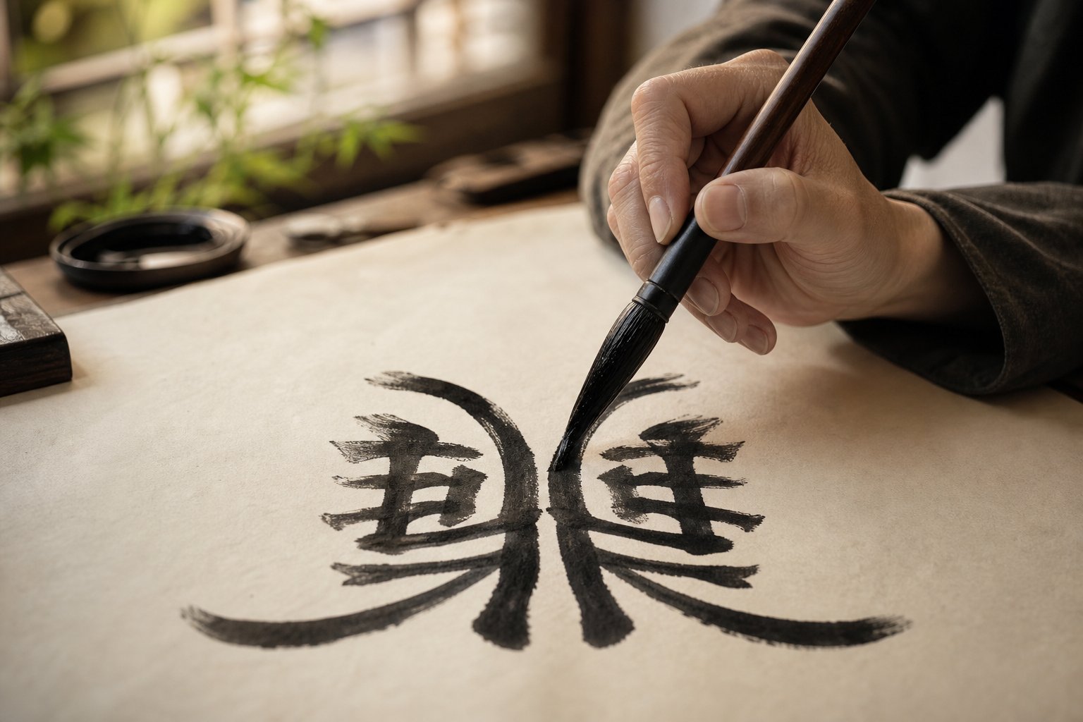
Fly 飛 vs 飞 - Symmetry and Movement in Brush Strokes
Imagine a bird spreading both wings in perfect balance, frozen at the moment of takeoff. That's what the traditional character 飛 looks like on paper. Its two mirrored wing-like components create bilateral symmetry that visually enacts the concept of flight. At 9 strokes, it's not the most complex character on our list, but it demonstrates something the previous pairs didn't: how repetition and mirroring generate a sense of motion within a static form.
The simplified 飞 reduces this to 3 strokes. What remains is a single skeletal gesture, a faint echo of one wing rather than the full span of two. For anyone comparing chinese simplified vs traditional forms from a calligraphic perspective, this pair reveals how symmetry functions as both an aesthetic principle and a technical training tool.
Symmetry as a Calligraphic Principle
Symmetry in Chinese calligraphy isn't merely decorative. It serves a structural purpose, creating visual harmony that the eye reads as stability, completeness, and intentional design. The traditional 飛 achieves this through two nearly identical halves. The left and right wing components mirror each other, each containing rising strokes that sweep outward and upward. Between them, a central vertical element acts as the bird's body, anchoring the composition.
When you practice this character, you're training a specific and difficult skill: consistency across mirrored elements. The left wing must match the right wing in stroke weight, angle, and length. Any imbalance becomes immediately visible because the human eye detects asymmetry in mirrored forms far more readily than in non-repeating structures. This makes 飛 an honest character. It exposes inconsistency in your brush control with zero room to hide.
The character's pictographic origin depicted a bird with spread wings, and that imagery survived through oracle bone inscriptions, seal script, and clerical script before arriving at the regular script form calligraphers practice today. Each historical stage preserved the bilateral structure because it was essential to the character's meaning. Flight requires two wings. The traditional form remembers this. The simplified form forgets it.
The simplified 飞 retains a horizontal stroke, a left-falling stroke, and a right-falling stroke with an upward lift. These three strokes suggest upward motion, but they carry no internal symmetry. There's nothing to mirror, nothing to match, and therefore nothing that tests your ability to produce consistent paired elements. The skill that 飛 develops simply has no equivalent exercise in 飞.
Compositional Spacing and Visual Weight
Beyond symmetry, the traditional 飛 presents a compositional challenge that simplified vs traditional chinese forms rarely share: horizontal width. Most Chinese characters fit comfortably within a square frame. 飛, with its two outspread wings, pushes against the boundaries of that square, demanding wider spacing or careful compression to sit harmoniously alongside other characters in a column.
This width issue forces calligraphers to plan ahead. In a hanging scroll or couplet, you'll need to account for 飛's lateral spread when determining character spacing for the entire piece. As calligraphy practitioners know, careful character spacing and sizing is one of the best ways to create clear rhythm in a composition. A wide character like 飛 disrupts uniform rhythm unless you consciously accommodate it, and that accommodation itself becomes a lesson in compositional awareness.
The visual weight distribution also differs dramatically between the two forms. In 飛, weight spreads evenly across the horizontal axis, with both wings carrying equal mass. The eye rests comfortably at the center. In 飞, weight concentrates in the upper-left corner where the horizontal and falling strokes originate, leaving the lower-right area empty. At display scale, this imbalance makes 飞 feel incomplete, as though the character is tipping rather than soaring.
For practitioners working in simplified chinese vs traditional systems, this pair clarifies something important about how stroke reduction affects perceived motion. The traditional form creates movement through balanced tension between two symmetrical halves pulling outward. The simplified form attempts movement through a single upward flick. One feels like sustained flight. The other feels like a quick gesture toward the sky.
Pros of 飛 (Traditional) for Calligraphy
- Bilateral symmetry trains consistent stroke weight and angle across mirrored components
- Wide horizontal structure teaches compositional planning and spacing awareness within a column
- Preserves the pictographic image of a bird in flight, enriching artistic interpretation
- Evenly distributed visual weight creates stability and presence at display scale
- Compatible with all five script styles, with particularly striking forms in seal script where the bird imagery remains most literal
Cons of 飞 (Simplified) for Calligraphy
- Three strokes offer no opportunity to practice symmetry or mirrored consistency
- Unbalanced visual weight makes the character feel incomplete at large scale
- No bilateral structure means no lesson in matching paired elements
- Pictographic connection to flight is reduced to a vague upward gesture rather than a recognizable bird form
- Minimal compositional challenge, as the narrow form fits easily into standard spacing without requiring adjustment
The simplified versus traditional chinese comparison here isn't about which form communicates the meaning "fly" more efficiently. Both do that job. The question is which form rewards the calligrapher's time and develops transferable skills. Bilateral symmetry appears in dozens of traditional characters, from 林 (forest) to 竹 (bamboo) to the gate character we'll examine next. Mastering the mirrored wings of 飛 builds muscle memory and spatial judgment that carry directly into every other symmetrical form you'll encounter.
Where 飛 spreads its symmetry horizontally across two wing-like halves, the next character on our list achieves perfect vertical mirroring through an architectural structure that looks exactly like what it represents: a gate with two identical pillars.
Gate 門 vs 门 - Architectural Balance and Pictographic Roots
Two identical pillars flanking an open space. That's what 門 looks like, and that's exactly what a gate is. Few characters in the Chinese writing system achieve this level of direct visual representation while simultaneously offering a masterclass in structural balance. The traditional form carries 8 strokes arranged as two perfectly mirrored halves, each half a vertical pillar with a hook at its base and horizontal crossbars within. The simplified 门, at just 3 strokes, retains only the left panel of this gateway, collapsing the architectural symmetry into a single-sided frame.
For anyone deciding between simplified chinese or traditional chinese forms for calligraphy practice, this character makes the argument visually. The traditional 門 is a building. The simplified 门 is half a building.
Architectural Balance in Character Design
The concept of structural integrity in calligraphy means that a character's visual construction supports itself the way a physical structure would. 門 achieves this perfectly. Its two halves bear equal weight, creating a stable frame that the eye reads as solid, grounded, and complete. Remove one half, and the structure feels like it should topple.
When you practice the traditional form, you're training one of the most fundamental calligraphic skills: producing two matching vertical strokes with identical weight, length, and hook angle. The left and right panels of 門 must mirror each other precisely. If your left vertical is thicker than your right, or if one hook curves more sharply than the other, the gate looks broken. This immediate visual feedback makes 門 an exceptional training character for beginners working on stroke consistency.
The internal structure adds another layer of challenge. Each panel contains horizontal strokes that must align across the central gap, creating the impression of crossbars or door frames. These horizontals test your ability to maintain consistent height and spacing between the two halves without a connecting element to guide you. You're building two separate structures that must read as one unified form.
The simplified 门 eliminates this challenge entirely. With only a single vertical stroke, a horizontal fold, and a hook, there's nothing to mirror and nothing to match. A beginner can write it in seconds, but they won't develop the bilateral consistency that transfers to dozens of other symmetrical characters. Whether you're working in simplified or traditional chinese, the gate character reveals how much training value disappears when mirrored architecture becomes a single wall.
Pictographic Meaning and Artistic Interpretation
The traditional character 門 represents a door with two side panels, and this pictographic clarity survived thousands of years of script evolution for good reason. From oracle bone inscriptions through seal script and into regular script, the two-panel gate structure persisted because it was both meaningful and beautiful. The character looks like what it means, and that visual honesty gives calligraphers interpretive freedom.
In seal script, 門 appears as two rounded, ornate pillars with decorative tops, evoking the ceremonial gates of ancient palaces. In clerical script, the horizontal emphasis widens the gate, giving it a stately, grounded presence. In regular script, the crisp verticals and sharp hooks create architectural precision. In running and cursive scripts, the two halves can flow together with varying degrees of connection, allowing the calligrapher to suggest a gate swinging open or standing firm. All five script styles accommodate the traditional form naturally because the character's structure predates every one of them.
This versatility matters practically. The 門 radical appears in dozens of common characters: 間 (between), 問 (ask), 聞 (hear), 閒 (leisure). Each of these compounds inherits the gate's architectural frame, and a calligrapher who has mastered 門's bilateral balance can render all of them with confidence. The traditional or simplified chinese choice here cascades through an entire family of related characters.
The simplified 门, while functional as a radical in compounds like 间 and 问, loses the pictographic resonance. It no longer looks like a gate. It looks like a bracket. For communication, that's sufficient. For artistic interpretation, where a calligrapher might render 門 with heavy, fortress-like strokes to evoke strength or with light, airy strokes to suggest openness, the simplified form offers far less room to play.
Pros of 門 (Traditional) for Calligraphy
- Perfect bilateral symmetry trains matching stroke weight, length, and hook angle across mirrored halves
- Strong pictographic connection to a physical gate enables rich artistic interpretation across moods and contexts
- Compatible with all five script styles, from ornate seal script to flowing cursive
- Serves as the foundation radical for an entire family of compound characters, making mastery highly transferable
- Ideal beginner training character due to immediate visual feedback when symmetry is off
Cons of 门 (Simplified) for Calligraphy
- Three strokes offer no bilateral mirroring practice and minimal technical challenge
- Pictographic connection to a gate is lost, reducing interpretive possibilities for display work
- Incompatible with seal script and clerical script, where the full two-panel structure is historically essential
- No internal alignment challenge between matched components, limiting spatial awareness development
- Visually lightweight at display scale, lacking the commanding presence of the full architectural form
The gate character demonstrates something distinct from the previous pairs. Dragon showed what happens when sheer complexity is removed. Writing showed what happens when meaning is severed from form. Fly showed what happens when horizontal symmetry disappears. Gate combines several of these losses, symmetry, pictographic clarity, and cross-style versatility, into a single, clean example that any beginner can immediately understand. You don't need years of training to see that 門 looks like a gate and 门 doesn't.
That accessibility makes it a powerful teaching tool for practitioners still deciding whether to study chinese traditional or simplified forms. The next character on our list moves from architectural clarity to something denser and more demanding: the character for "learn," where a complex upper section packed with small strokes challenges even experienced calligraphers to manage proportion under pressure.
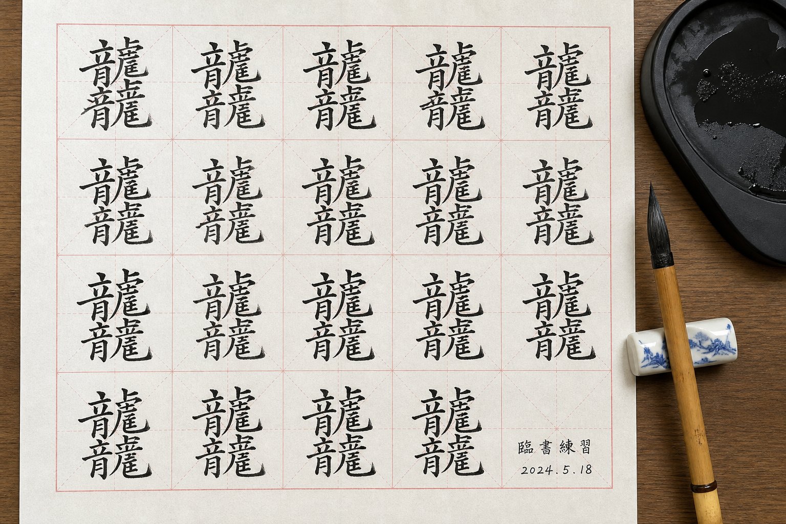
Learn 學 vs 学 - Complexity That Builds Calligraphic Skill
Every character we've examined so far lost symmetry, meaning, or structural presence through simplification. The character 學 (xue), meaning "to learn," loses something different: density. Its traditional form packs 16 strokes into a layered vertical composition where the upper section is so tightly constructed that it demands precise fine motor control just to keep the strokes from colliding. The simplified 学, at 8 strokes, removes the upper complexity entirely, replacing a crowded, skill-building challenge with open space that asks very little of the brush.
For practitioners comparing simplified chinese vs traditional chinese forms as training tools, this pair illustrates a principle that applies far beyond a single character: dense compositions develop hand control faster than sparse ones. The more strokes you must fit into a confined area while maintaining legibility and balance, the more your fine motor skills are forced to adapt.
Dense Composition and Proportion Management
The traditional 學 tells a story through its structure. According to its etymology, the upper portion features a pair of hands (left and right components) holding 爻, a symbol associated with divination sticks or the Book of Changes. Below the hands sits 冖, representing a cover or table. At the very bottom, 子 depicts a child. The full composition conveys the image of a child being guided through learning, hands above directing knowledge downward.
From a calligraphic standpoint, this layered etymology creates a dense upper section where multiple small strokes compete for space. The two "hand" components on either side of 爻 require you to write short, angled strokes with extreme precision. Each one must be distinct enough to read clearly yet compact enough to leave room for its neighbors. The 爻 component alone contains four crossing strokes that must maintain consistent angle and spacing within a tiny area.
Imagine fitting six or seven distinct stroke elements into the top third of your character grid while keeping them legible and balanced. That's what 學 demands. Your brush tip must move with controlled brevity, lifting cleanly between strokes that sit millimeters apart. There's no room for the kind of sweeping, relaxed movements that wider characters allow. Every stroke is short, deliberate, and precisely placed.
The simplified 学 replaces this entire upper construction with three simple strokes resembling a flattened cover. The hands disappear. The 爻 disappears. What remains is an open, airy top section that requires no particular precision to execute. The character becomes easier to write, certainly, but it also becomes easier in a way that teaches nothing about managing density or controlling stroke placement under spatial pressure.
Visual Weight Distribution Across the Character
Beyond fine motor demands, 學 demonstrates one of the most important principles in character balance: visual weight distribution between top and bottom sections. The traditional form is deliberately top-heavy. Its dense upper section carries most of the character's visual mass, while the lower section, built around the simple 子 radical, provides a stable, grounded base.
This top-heavy design works because 子 acts as a pedestal. Its broad horizontal stroke and downward-sweeping hook create a wide, stable foundation that supports the complexity above. The relationship between the heavy top and stable bottom mirrors the character's meaning: knowledge (above) being received by the learner (below). The calligrapher's job is to make this weight relationship feel intentional rather than precarious.
Getting this balance right requires careful proportion management. If you make the upper section too large, the character feels like it's about to collapse. Too small, and the dense strokes become illegible. The 冖 component in the middle acts as a visual shelf, separating the crowded upper zone from the open lower zone and giving the eye a resting point. Learning to use this kind of internal divider is a skill that transfers to many other top-bottom structured characters in both simplified and traditional chinese systems.
The simplified 学 retains the top-bottom structure and the 子 base, but the weight relationship flattens. Without the dense upper section, there's no real contrast between heavy and light zones. The character reads as uniformly light throughout, which is perfectly functional for communication but offers no lesson in managing visual mass. For calligraphers studying traditional and simplified chinese forms side by side, this difference becomes obvious the moment you write both versions at display scale. The traditional form commands attention through its internal contrast. The simplified form sits quietly, neither heavy nor light, neither dense nor open.
Pros of 學 (Traditional) for Calligraphy
- Dense upper section develops fine motor control through tightly spaced, precisely placed short strokes
- Top-heavy weight distribution teaches proportion management between visually dense and visually open zones
- Multiple distinct components (hands, 爻, 冖, 子) create a layered composition that builds spatial planning skills
- Pictographic meaning of guided learning remains visible in the character's structure, enriching artistic interpretation
- Compatible with all five script styles, with particularly beautiful forms in seal script where the hand components are most recognizable
Cons of 学 (Simplified) for Calligraphy
- Removes the dense upper construction, eliminating the primary fine motor challenge
- No meaningful weight contrast between top and bottom sections, reducing the lesson in proportion management
- Pictographic elements of hands guiding a child are lost, flattening the character's interpretive depth
- Eight strokes spread across open space offer moderate but unremarkable technical challenge
- Less effective as a display character due to reduced visual density and internal complexity
The character 學 also appears in compounds central to calligraphic culture: 學問 (scholarship), 學者 (scholar), and 學習 (study). In each case, the traditional form's dense upper section signals intellectual weight and accumulated knowledge through pure visual structure. A calligrapher rendering 學 on a studio plaque or educational scroll can use the character's built-in complexity to convey seriousness and depth without relying on size alone.
Research in Chinese calligraphy therapy supports the idea that structured progression from basic to complex characters creates optimal challenge levels that promote skill development. Characters like 學, with their demanding upper sections, represent exactly the kind of calibrated difficulty that pushes practitioners into growth. The simplified chinese and traditional chinese versions of this character offer fundamentally different levels of that productive challenge.
Across all five pairs we've examined, a consistent pattern emerges. Simplification reduces symmetry, removes radicals that connect form to meaning, and eliminates the stroke variety that develops brush skill. The next section brings these individual comparisons together into a unified ranking, revealing just how consistently these losses accumulate across the system.
Complete Comparison of All Five Character Pairs Ranked
Five characters. Five cases where simplification stripped away something calligraphically essential. Individually, each pair tells its own story about lost symmetry, erased meaning, or collapsed complexity. But when you line them up side by side, a larger pattern becomes unmistakable. The difference between chinese simplified and traditional forms isn't random or inconsistent. It follows a predictable logic: the elements most valuable to calligraphers are precisely the elements most likely to be removed.
The table below consolidates everything we've examined into a single reference. Each character pair is scored across our five ranking criteria, with ratings from 1 (minimal impact) to 5 (maximum impact). A higher score means simplification caused a greater calligraphic loss in that category.
Side-by-Side Ranking Table
| Character Pair | Stroke Count (Trad / Simp) | Symmetry Impact (1-5) | Brush Technique Loss (1-5) | Pictographic Preservation (1-5) | Display Aesthetic Loss (1-5) | Overall Calligraphic Rating |
|---|---|---|---|---|---|---|
| Dragon 龍 vs 龙 | 16 / 5 (-11) | 4 | 5 | 5 | 5 | 19/20 - Extreme |
| Writing 書 vs 书 | 10 / 4 (-6) | 3 | 4 | 5 | 4 | 16/20 - Very High |
| Fly 飛 vs 飞 | 9 / 3 (-6) | 5 | 4 | 4 | 4 | 17/20 - Very High |
| Gate 門 vs 门 | 8 / 3 (-5) | 5 | 3 | 5 | 4 | 17/20 - Very High |
| Learn 學 vs 学 | 16 / 8 (-8) | 2 | 5 | 4 | 4 | 15/20 - High |
A few things jump out immediately. Every pair scores at least 15 out of 20, confirming that these aren't marginal cases. They represent the clearest examples of calligraphic loss in the chinese language traditional vs simplified divide. The dragon character dominates because it loses the most across every dimension simultaneously. But the fly and gate characters score nearly as high because their perfect bilateral symmetry, once destroyed, cannot be partially recovered. Symmetry is binary: a character either has mirrored halves or it doesn't.
The stroke count column reveals another pattern. The average reduction across these five pairs is 7.2 strokes, representing a loss of roughly 55% of the original character's structural material. That's not trimming. That's demolition. And the strokes removed aren't random. They tend to be the ones that create internal relationships: mirrored components, interlocking radicals, and layered sections that demand proportion management.
Notice that pictographic preservation scores 4 or 5 across every pair. This is the most consistently damaged criterion. The difference between chinese traditional and simplified forms shows up most reliably in how well the character's visual structure connects to its meaning. Dragon loses its coiling body. Writing loses its brush radical. Fly loses its wings. Gate loses its second pillar. Learn loses its guiding hands. In each case, the simplified form communicates the same dictionary definition but severs the visual logic that made the character's form meaningful to look at, not just to read.
For calligraphers who work across both systems, converting simplified chinese to traditional chinese isn't just a matter of adding strokes back. It requires understanding the compositional logic those strokes served. A calligrapher who learned 龙 first and later encounters 龍 isn't simply writing more strokes. They're learning an entirely different approach to internal structure, spatial tension, and visual rhythm. The conversion from traditional to simplified chinese, by contrast, is mostly subtraction. You can always write less. Writing more, with purpose and balance, is the harder direction.
This asymmetry matters for practitioners who study both systems. Moving from traditional chinese to simplified chinese calligraphy is a process of letting go, of accepting that certain compositional tools are no longer available in the simplified form. Moving the other direction means acquiring new skills: managing density, maintaining symmetry across mirrored halves, and balancing visual weight between layered sections. The difference between simplified and traditional chinese, from a skill-development perspective, is the difference between subtraction and addition.
When Simplified Characters Appear in Calligraphy
Does all of this mean simplified characters have no place in calligraphy? Not exactly. The answer depends on context, script style, and artistic intent.
In running script (行書) and cursive script (草書), many simplified forms are historically legitimate. As noted in research on character simplification history, some simplified characters were derived directly from cursive shorthand that calligraphers had used for centuries. The simplified form of 為/为, for example, has appeared in handwritten calligraphy since at least the Song dynasty. In these cases, writing the simplified form in a cursive or semi-cursive piece isn't anachronistic. It's historically grounded.
Modern calligraphy exhibitions in mainland China regularly feature works in simplified characters, particularly in running and cursive scripts where the abbreviated forms feel natural. Contemporary calligraphers sometimes mix systems deliberately, using traditional forms for key display characters while allowing simplified forms in surrounding text. This hybrid approach acknowledges practical reality without abandoning artistic standards.
Simplified characters are acceptable in modern calligraphic contexts when the script style historically accommodates abbreviation (running and cursive scripts), when the artistic intent is contemporary rather than classical, or when the piece is meant for an audience that reads simplified characters daily. They remain inappropriate for seal script, clerical script, and formal regular script works intended to reference classical tradition.
The chinese simplified vs chinese traditional question in calligraphy, then, isn't a binary choice between right and wrong. It's a spectrum of appropriateness that depends on what you're writing, how you're writing it, and who will see it. A cursive piece for a modern gallery in Beijing can use simplified forms without apology. A seal script commission for a temple gate cannot. A regular script practice piece benefits enormously from traditional forms regardless of where you live or what system you use for daily writing.
What the table above makes clear is that for skill development, display work, and engagement with calligraphy's full historical range, traditional characters offer measurably more. More strokes to master, more symmetry to maintain, more meaning to interpret, and more visual weight to command. Simplified characters serve communication efficiently. Traditional characters serve the art.
The practical question that remains is personal: given these differences, which system should someone just starting their calligraphy journey choose to study first? The answer involves not just artistic considerations but a realistic assessment of time, goals, and the learning path that builds skill most effectively.
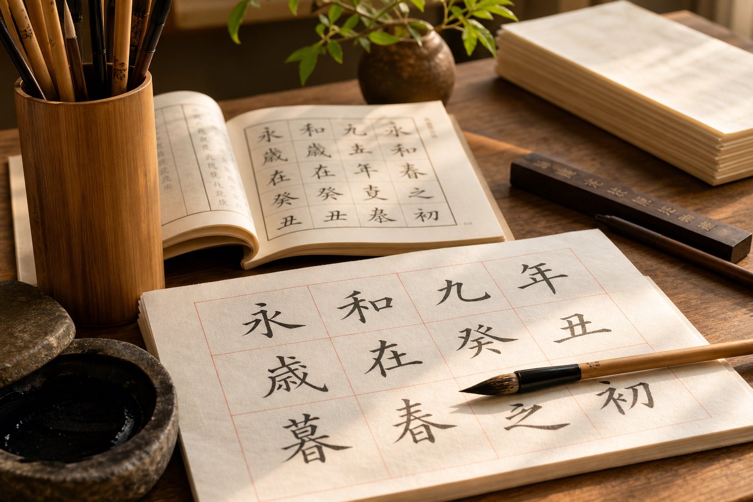
Which System Should Calligraphy Beginners Learn First
The data from our five character pairs points in one direction. If your goal is artistic development rather than quick communication, traditional characters build essential brush skills faster and more thoroughly than simplified forms. The structural complexity that makes them harder to write is precisely what makes them better teachers. Every mirrored component, every dense radical cluster, every layered section forces your hand to develop control it wouldn't need otherwise.
A common question from newcomers is whether the choice between traditional chinese or simplified depends on which spoken dialect they're learning. People often ask: is mandarin simplified or traditional? The answer is that Mandarin speakers use both systems depending on geography. Mainland China uses simplified. Taiwan and Hong Kong use traditional. But calligraphy isn't bound by regional communication standards. It's a visual art with its own logic, and that logic favors the system with more structural depth regardless of where you live or which variant you speak daily.
For serious calligraphy study, start with traditional characters in regular script. The complexity builds foundational skills, including stroke consistency, proportion management, and spatial awareness, that transfer directly to every other script style and character you'll encounter later.
Recommended Learning Path for New Calligraphers
Rather than jumping between systems or styles, a structured progression gives you the strongest foundation. Here's a path that balances skill development with realistic time investment:
- Begin with regular script (楷書) using traditional characters. Regular script demands precision in every stroke, and traditional forms provide the structural complexity that develops your control. Start with architecturally clear characters like 門 and 書 before progressing to denser forms like 學 and 龍.
- Master the eight basic strokes and their variations. As Columbia University's calligraphy curriculum emphasizes, every Chinese character is composed of just eight fundamental stroke types. Practice these individually until your pressure control and brush angle become consistent.
- Expand into running script (行書) once your regular script is stable. Running script introduces connected strokes and fluid movement while still maintaining recognizable character structure. At this stage, you can begin exploring how simplified forms emerged naturally from cursive shorthand.
- Study seal script (篆書) or clerical script (隸書) to deepen historical understanding. These archaic styles require traditional characters exclusively and reveal how character forms evolved over millennia. Even brief exposure to seal script transforms how you see the pictographic roots of every character you write.
- Explore cursive script (草書) as an advanced practice. Cursive demands mastery of the underlying traditional structure because you must know what you're abbreviating. A calligrapher who skips traditional forms and jumps to cursive is improvising without a foundation.
Building Your Practice With the Right Character System
A concern many beginners raise is time. Traditional characters take longer to learn, and the question of whether that investment pays off is fair. The answer depends on what you're after. If calligraphy is a casual hobby you'll practice occasionally, simplified forms in regular script will give you a pleasant experience without overwhelming difficulty. If you want to develop genuine skill, exhibit your work, or engage with calligraphy's full historical range, the extra time spent on traditional forms compounds into capability that simplified practice simply cannot match.
Another frequent point of confusion: is simplified chinese mandarin? Not exactly. Simplified characters are a writing system, while Mandarin is a spoken language. The question of whether mandarin is chinese simplified or traditional conflates speech with script. You can speak Mandarin and write in either system. Calligraphy separates this further because it treats writing as visual art independent of spoken language entirely.
Similarly, people sometimes wonder is chinese the same as mandarin when approaching calligraphy for the first time. Chinese encompasses multiple spoken dialects and two major writing systems. Calligraphy transcends all of these divisions. A calligrapher in Taipei writing traditional characters and a calligrapher in Beijing writing simplified forms are both practicing the same art, just with different raw materials. Understanding what is simplified chinese and how it relates to the traditional system makes you literate across both, which is where real versatility lives.
The most capable calligraphers today work comfortably in both systems. They choose traditional forms for formal display pieces, seal script explorations, and classical references. They use simplified forms for contemporary running script works, modern exhibition pieces, and contexts where their audience reads simplified daily. This flexibility isn't compromise. It's mastery. And it starts with learning the harder system first, because a calligrapher trained on traditional characters can always simplify. One trained only on simplified forms must essentially start over to access the art's full depth.
The five character pairs in this article represent just a fraction of the cases where traditional forms offer richer calligraphic material. But they illustrate the principle clearly enough to guide your first decision. Pick up your brush, choose a traditional character with enough structure to challenge you, and let the complexity teach your hand what simplicity never could.
Frequently Asked Questions About Traditional vs Simplified Chinese Calligraphy
1. Can simplified Chinese characters be used in formal calligraphy?
Simplified characters are acceptable in running script and cursive script, where abbreviated forms have historical precedent dating back centuries. However, they are inappropriate for seal script, clerical script, and formal regular script works referencing classical tradition. Modern exhibitions in mainland China do feature simplified characters, particularly in semi-cursive and cursive styles where the abbreviated forms feel natural and historically grounded.
2. Why do calligraphy teachers recommend learning traditional characters first?
Traditional characters build foundational brush skills faster because their structural complexity forces your hand to develop fine motor control, spatial awareness, and stroke consistency. Characters with mirrored components, dense radical clusters, and layered sections challenge calligraphers in ways that simplified forms cannot. A practitioner trained on traditional characters can always simplify later, but someone trained only on simplified forms must essentially restart to access the full depth of the art.
3. Which Chinese calligraphy script style is best for beginners?
Regular script (kaishu) is the recommended starting point for new calligraphers. It demands precision in every stroke while maintaining clear, readable structure. Begin with architecturally clear traditional characters like gate (men) and writing (shu) before progressing to denser forms like learn (xue) and dragon (long). Once your regular script is stable, you can expand into running script for more fluid, connected brushwork.
4. What is the biggest difference between traditional and simplified characters for calligraphy practice?
The most significant difference is structural complexity and what it teaches the hand. Traditional characters contain mirrored components, interlocking radicals, and layered sections that develop brush technique across multiple skill categories simultaneously. Simplified forms remove precisely these elements, reducing stroke variety, eliminating symmetry, and severing pictographic connections between form and meaning. On average, the most impactful pairs lose about 55% of their structural material through simplification.
5. Are seal script and clerical script compatible with simplified Chinese characters?
No. Seal script and clerical script predate character simplification by centuries or millennia. Their structural logic depends entirely on the full traditional form. Writing a simplified character in seal script is historically anachronistic because these scripts were developed around the original complex structures. Any calligrapher who wants to explore these ancient styles must work with traditional characters regardless of which system they use for everyday communication.