Understanding Seal Script Calligraphy and Its Enduring Legacy
Imagine picking up a brush and writing characters that look almost identical to those carved into bronze vessels over three thousand years ago. That is the experience of practicing seal script calligraphy. Among all Chinese writing styles, this is the one that reaches furthest back in time while remaining a living, breathing art form.
What Is Seal Script Calligraphy
Seal script calligraphy, known in Chinese as zhuanshu (篆書), is the oldest formal script style still actively practiced. It belongs to the five major Chinese calligraphy scripts alongside clerical, regular, running, and cursive. What sets it apart is its visual character: thin, even lines, symmetrical structures, and rounded turns that give each seal character a sense of balanced elegance.
Seal script (篆書, zhuanshu) is an ancient Chinese calligraphy style characterized by uniform line width, symmetrical structure, and rounded strokes. It exists in two forms — large seal script (大篆) derived from bronze vessel inscriptions of the Shang and Zhou dynasties, and small seal script (小篆) standardized during the Qin dynasty as China's first unified writing system.
The Smithsonian's National Museum of Asian Art describes small seal script as "specifically devised as a standardized system of writing under the first emperor of the Qin dynasty," noting its symmetrical structure formed with thin, even lines executed with balanced movements. Every script that followed — clerical, regular, running, and cursive — evolved from this foundational form. In the broader history of Chinese calligraphy, seal script stands as the root from which all other branches grew.
Why Seal Script Still Matters for Calligraphers
You might wonder why anyone would study a script most modern Chinese readers cannot easily decipher. The reasons are both practical and deeply personal.
First, Chinese seal script remains the standard for personal name seals and signature stamps. Artists, calligraphers, and professionals still commission carved seals in this style to authenticate their work. Its compact, balanced forms fit the small square format of a carved stamp perfectly.
Second, the practice itself is meditative. Seal script demands slow, deliberate brushwork with consistent pressure and smooth, rounded turns. There is no rushing it. Each stroke requires full attention, making it a form of moving meditation that appeals to practitioners seeking calm focus in a fast-paced world.
Third, studying seal script builds a deep understanding of how Chinese characters are constructed. Because these characters retain closer ties to their pictographic origins, you'll notice structural logic that modern simplified forms obscure. Learning to read and write seal characters reveals the architectural blueprint beneath everyday Chinese writing.
This guide bridges the history of Chinese calligraphy with hands-on practice. You will trace the script's origins across dynasties, compare its two major forms, learn the brush techniques that produce its signature lines, and discover how to apply this ancient art in modern life — from your first stroke to your own name seal.
Historical Origins from Bronze Inscriptions to Qin Standardization
Every Chinese character you write today carries DNA from ancient ritual objects buried thousands of years ago. The story of seal script calligraphy is really the story of how scattered, pictographic marks on bone and metal slowly crystallized into a unified writing system — and how that system continues to shape artistic practice.
From Bronze Vessels to Imperial Standardization
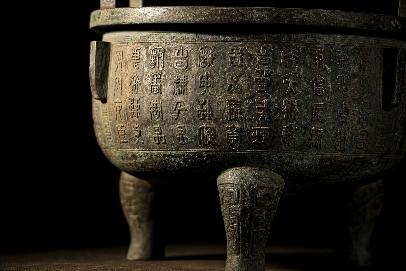
The earliest ancestors of seal script appear in Shang dynasty bonescript — those cryptic marks scratched into turtle shells and animal bones for divination during the 13th century BCE. These oracle bone inscriptions were pictographic, irregular, and highly variable. But a parallel tradition was developing on a grander scale: chinese bronze script, known as jinwen (金文).
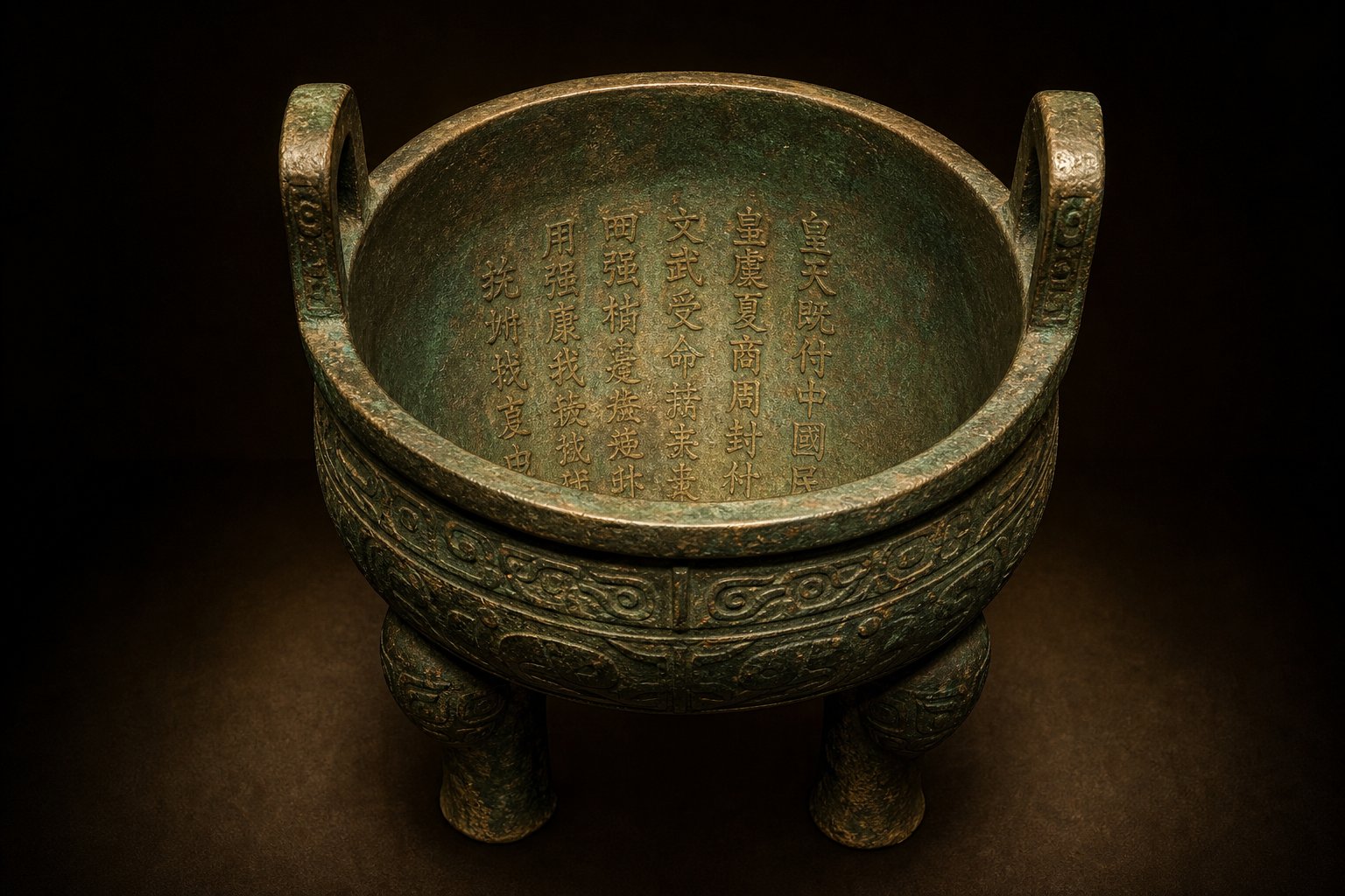
During the Shang and Western Zhou periods (roughly 17th to 8th century BCE), artisans cast inscriptions into ritual bronze vessels used for ancestral sacrifices and royal ceremonies. Early chinese inscriptions were short — sometimes just a family name or a dedication to an ancestor. Over time, they grew longer and more narrative. The famous Mao Gong Ding tripod from the late Western Zhou carries 479 characters, the longest bronze inscription of its era, recording a royal investiture speech of remarkable literary quality.
What matters for calligraphy students is this: bronze script characters were bolder, more organic, and less standardized than what came later. Different regional states developed their own writing variations — the thick-bodied "tadpole script" of Jin, the decorative "bird script" of the southern states. By the Warring States period (5th–3rd century BCE), this ancient chinese script had fractured into mutually confusing regional forms. Political unification demanded a single writing system.
Li Si and the Creation of Small Seal Script
When Qin Shi Huang unified China in 221 BCE, his chancellor Li Si tackled the chaos of regional scripts head-on. Li Si simplified and regularized the Qin state's existing writing — itself descended from Western Zhou bronze script — into what we now call Small Seal Script (小篆). This qin writing system abolished the variant characters of the six conquered states and established a single standard for official documents, stone monuments, and imperial weights and measures.
Li Si's standardization produced the model texts that seal script students still study today. The Yishan Stele (峄山碑) and the Mount Tai Stone Inscriptions (泰山刻石) represent this qin dynasty writing at its most refined — characters with perfectly even line width, symmetrical structures, and elegant elongated proportions. Though most original Qin stones have been damaged or lost over the centuries, Song dynasty replicas of the Yishan Stele survive and remain primary study materials for anyone learning small seal script. These stelae demonstrate the aesthetic ideal: orderly, rounded, and dignified.
For learners, this matters practically. The regularity of Li Si's standardized forms makes them far more approachable as practice models than the irregular bronze script that preceded them.
The Qing Dynasty Revival and Its Modern Impact
After the Qin and Han dynasties, seal script gradually yielded its everyday role to clerical and regular scripts. It survived mainly on seals, stele headings, and occasional ceremonial inscriptions. The Tang dynasty calligrapher Li Yangbing sparked a brief revival, but the script's full creative renaissance waited over a thousand years.
During the Qing dynasty (1644–1911), a surge of interest in epigraphy — the study of ancient stone and bronze inscriptions — transformed seal script calligraphy into a vibrant artistic movement. Calligraphers like Deng Shiru (邓石如) broke new ground by infusing seal script with the robust energy of stele aesthetics, moving beyond the thin, restrained lines of Qin models toward bolder, more expressive brushwork. Wu Changshuo (吴昌硕) pushed further still, drawing on the ancient vigor of the Stone Drum Inscriptions to create seal script with heroic, muscular character.
These Qing masters proved something essential: seal script was not a museum piece but a living medium capable of personal expression. Their innovations opened creative possibilities that contemporary practitioners continue to explore — blending archaeological scholarship with artistic freedom, and treating the ancient forms not as rigid templates but as springboards for individual voice.
This tension between structure and expression sits at the heart of seal script practice. And it raises a practical question for anyone picking up a brush: which form of seal script should you actually learn first?
Greater Seal Script Versus Lesser Seal Script Compared
The answer depends on what you want from your practice. Seal script chinese calligraphy actually encompasses two distinct forms — Greater Seal Script (大篆, dazhuan) and Lesser Seal Script (小篆, xiaozhuan) — and they differ in age, appearance, and learning curve. Think of them as a wild ancestor and its refined descendant.
Visual and Structural Differences Between the Two Forms
Greater Seal Script preserves the organic irregularity of its bronze-vessel origins. Characters vary in size — complex ones spread wider, simple ones stay compact. Strokes carry a natural, slightly unpredictable energy, and pictographic roots remain visible. You'll notice asymmetry, uneven spacing, and a raw vitality that reflects centuries of regional scribal traditions before any central authority imposed order.
Small seal script, by contrast, is geometry made visible. Every character occupies the same tall rectangular cell (roughly a 3:5 width-to-height ratio). Line width stays perfectly uniform throughout. Turns are smooth and rounded, never angular. Symmetry governs the internal structure, and the overall effect is one of controlled elegance — wire-like strokes arranged with architectural precision.
Here is a side-by-side comparison to clarify the differences:
| Feature | Greater Seal Script (大篆) | Lesser Seal Script (小篆) |
|---|---|---|
| Historical Period | Shang and Zhou dynasties (c. 1600–221 BCE) | Qin dynasty standardization (221–206 BCE) |
| Visual Characteristics | Organic, pictographic, variable character sizes | Geometric, symmetrical, uniform tall-rectangle format |
| Stroke Regularity | Irregular width, natural variation | Perfectly even line width throughout |
| Character Standardization | Regional variants, no unified system | Fully standardized by Li Si's reforms |
| Difficulty Level | Higher — requires familiarity with archaic forms and variant characters | More approachable — regular structure supports systematic practice |
| Primary Learning Resources | Stone Drum Inscriptions (石鼓文), bronze vessel rubbings, Qing dynasty interpretations | Yishan Stele, Taishan Stele, Shuowen Jiezi dictionary |
This chinese ancient script tradition eventually gave way to li scripts — the clerical style that simplified seal forms into flatter, more angular characters for faster bureaucratic writing. Understanding both seal forms helps you see exactly how and why that transformation happened.
Which Style Should Beginners Learn First
For most learners, small seal script is the stronger starting point. Its regularity gives you clear targets: even lines, consistent sizing, symmetrical balance. When every character follows the same structural rules, you can focus on mastering brush control without also decoding unfamiliar variant forms. The abundance of Qin-era model texts — particularly the Yishan Stele — provides well-documented practice material with centuries of pedagogical tradition behind it.
Small seal script also functions as a bridge. Once you internalize its logic, Greater Seal Script's irregularities become readable rather than bewildering. You start recognizing how the standardized forms simplified their wilder predecessors.
That said, some practitioners have good reason to begin with Greater Seal Script. If your primary interest is seal carving, the bolder, more expressive strokes of dazhuan translate naturally to the knife-on-stone medium. Students drawn to archaeological study or those who want to read ancient bronze inscriptions directly will also benefit from immersing themselves in the older forms first. The Qing master Wu Changshuo built his entire artistic identity on Greater Seal Script's muscular energy — proof that this path leads to powerful creative results.
Whichever form you choose, the underlying discipline remains the same: slow execution, centered brush tip, and absolute attention to line quality. Those qualities define masterful work in both styles — and distinguishing good seal script from mediocre work requires understanding exactly what "quality" means in this context.
Aesthetic Principles That Define Masterful Seal Script
What separates a page of stiff, lifeless strokes from a piece that feels alive and authoritative? In seal script calligraphy, the answer is not complexity or decorated writing flourishes — it is discipline made invisible. The best work looks effortless precisely because the practitioner has internalized a set of aesthetic standards so deeply that they no longer think about them consciously. Understanding these standards gives you a clear target to aim for and a vocabulary for evaluating your own progress.
The Five Qualities of Excellent Seal Script
Traditional Chinese calligraphy criticism identifies specific qualities that define excellence in this style. When teachers evaluate student work or when judges assess competition entries, they look for these five core principles:
- Even line width (匀, yun) — Every stroke maintains consistent thickness from beginning to end. No unintentional swelling, no thinning at curves. The brush moves at steady speed with steady pressure, producing lines that feel wire-drawn yet organic.
- Balanced symmetry (匀称, yuncheng) — Characters sit centered within their imaginary frames. Left and right components mirror each other in weight and proportion. This does not mean rigid mechanical symmetry — it means visual equilibrium, where the eye perceives harmony rather than lopsidedness.
- Rounded turns without angularity (圆转, yuanzhuan) — Where strokes change direction, the transition is smooth and continuous, like bending a flexible wire. No sharp corners, no abrupt directional shifts. This roundness is the signature visual quality that distinguishes seal script from every later style in chinese calligraphy with meaning and structure.
- Proper spacing between strokes (疏密, shumi) — Dense areas and open areas coexist within each character according to its internal logic. Strokes are neither crammed together nor awkwardly spread apart. The practitioner understands where to leave breathing room and where to cluster elements tightly.
- Overall compositional harmony (章法, zhangfa) — Beyond individual characters, the entire piece works as a unified visual field. Character sizes remain consistent, column spacing is even, and the overall layout creates a rhythm that guides the viewer's eye naturally from top to bottom, right to left.
These five qualities work together. Achieving one while neglecting others produces work that feels incomplete — perfectly even lines arranged in a cramped, poorly spaced composition still fail. The goal is integration: all five principles operating simultaneously within every character and across the full piece.
How Masters Are Distinguished from Students
Imagine two practitioners writing the same character from the Yishan Stele. Both produce lines of even width. Both achieve reasonable symmetry. So what makes one piece student work and the other a master's? The difference lives in what the Chinese tradition calls bone structure (骨法, gufa) — the internal energy and structural conviction that animates each stroke.
A beginner's lines are mechanically correct but lifeless. You'll notice hesitation at the start of strokes, slight wobbles where confidence falters, and a stiffness that comes from overthinking each movement. The characters look drawn rather than written — assembled piece by piece rather than flowing from an integrated understanding of the whole form.
An advanced practitioner's work carries what critics describe as internal rhythm. The brush moves with unhesitating certainty. Each stroke begins decisively, travels smoothly, and ends cleanly. Subtle variations in ink density — slightly darker where the brush pauses fractionally at a turn, slightly drier toward the end of a long horizontal — bring warmth and life to what might otherwise feel sterile. These variations are not mistakes; they are the natural breath of a confident hand.
This style in chinese calligraphy rewards patience in a particular way. Because seal script demands slow, deliberate execution, it cultivates a meditative state that experienced practitioners channel directly into their brushwork. The master does not rush, but neither do they hesitate. There is a quality of settled presence — each stroke placed with the quiet authority of someone who has written it a thousand times before and will write it a thousand times again.
Bone structure also manifests in how the brush engages the paper. Student work often sits on the surface — ink deposited lightly, without penetration. Masterful work shows what traditional criticism calls "力透纸背" (strength penetrating through the paper's back). The brush presses into the paper with controlled force, and the resulting line has density and weight even at uniform width. This is not about pressing harder; it is about directing energy downward through the brush tip with focused intent.
Recognizing these qualities in model texts and in your own practice is the first step toward achieving them. The second step is developing the physical brush control to translate understanding into action — which requires specific techniques unique to this script form.
Essential Brush Techniques for Writing Seal Script
Seal script lives or dies on line quality. Unlike running or cursive styles where expressive variation is the goal, every stroke here demands the same even width, the same rounded finish, the same quiet authority. That consistency comes from one foundational technique — and getting it right changes everything about your practice.
Holding the Brush and Maintaining Centered Tip
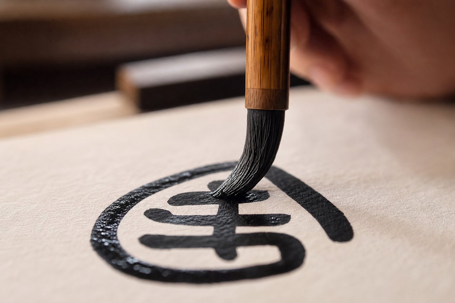
The single most important concept in seal script brushwork is zhongfeng (中锋) — center-tip technique. This means keeping the brush tip traveling along the center of each stroke rather than dragging along one edge. When the tip stays centered, ink spreads evenly to both sides of the line, producing that characteristic uniform width. When it drifts to one side, you get lopsided strokes with one sharp edge and one fuzzy one.
To achieve center-tip consistently, hold the brush perfectly perpendicular to the paper — not tilted forward as you might for regular script. Grip the handle in the upper third, fingers firm but palm hollow, as if holding a small egg inside your hand. This elevated grip gives you the freedom of movement that seal script's long, sweeping curves demand.
Here is where seal script differs from other styles: you write primarily with your whole arm rather than your wrist. Wrist-only movement works for small calligraphy chinese letters in regular script, but seal script's smooth, extended curves require the shoulder and elbow to guide the brush in broad, steady arcs. Think of your arm as a compass drawing circles — the pivot point stays stable while the brush sweeps through space. Developing stable center-tip brushwork typically takes two to three months of dedicated practice, though this varies from person to person.
Executing Seal Script Strokes Step by Step
Every stroke in seal script follows the same fundamental sequence. Whether you are writing a short horizontal, a long vertical, or a sweeping curve, the mechanics remain consistent. In calligraphy in ancient china, masters described this process as "concealing the entry, traveling the middle, collecting the exit." Here is how it works in practice:
- Concealed entry (藏锋, cangfeng) — Do not simply touch the brush to paper and pull. Instead, move the brush slightly in the opposite direction of your intended stroke, then reverse into the stroke path. This tucks the brush tip inside the beginning of the line, creating a rounded start rather than a pointed one. The motion is subtle — barely visible in the finished stroke — but it prevents the sharp, exposed tip that marks amateur work.
- Steady travel with consistent pressure — Once the stroke begins, maintain even downward pressure as you move the brush along its path. Do not press harder or lighter. Do not speed up or slow down. The brush tip remains centered, the ink flows at a constant rate, and the resulting line holds its width from start to finish. Ancient critics compared this to "drawing an awl through sand" — the resistance is constant, the depth uniform.
- Rounded turns without lifting — When a stroke changes direction, do not lift the brush and restart. Instead, slow your movement at the turning point, allow the brush tip to reposition itself to the center of the new direction, then continue. The turn should feel like bending a flexible wire — smooth, continuous, with no angular break. This is the most difficult part of seal script technique and the one that requires the most repetition to master.
- Collected exit (收锋, shoufeng) — End each stroke by reversing direction slightly, just as you did at the entry. The brush tip tucks back into the body of the stroke, producing a rounded, self-contained finish. No trailing wisps, no pointed tails. The stroke begins rounded and ends rounded — a complete, enclosed unit of energy.
This four-step sequence applies to every stroke you will ever write in this script. Horizontal lines, vertical lines, curves, and hooks all follow the same logic. Once the pattern becomes muscle memory, you can focus on character structure rather than individual stroke mechanics.
Common Technique Mistakes and Corrections
Knowing the correct method is one thing. Avoiding habitual errors is another. These are the problems that appear most frequently in beginner work, along with strategies for fixing each one:
- Uneven pressure creating thick-thin variation — Your lines swell at the start and thin out toward the end, or bulge at curves. The fix: practice long, straight horizontal lines on grid paper, focusing solely on maintaining identical width across the full length. Use a metronome or count silently to keep your speed constant. Inconsistent speed almost always causes inconsistent pressure.
- Angular corners instead of smooth curves — Your turns look like bent wire coat hangers rather than flowing arcs. This usually means you are moving too fast through the turn or lifting the brush slightly without realizing it. The fix: isolate the turning motion. Practice writing continuous S-curves and figure-eights without lifting the brush, keeping line width even throughout. Slow down dramatically at every direction change until smoothness becomes automatic.
- Rushed execution breaking the meditative rhythm — You speed up mid-character, producing strokes that feel hurried and lack the settled quality of good seal script. The fix: treat each practice session as a deliberate slowing-down exercise. Write fewer characters with greater attention rather than filling pages quickly. One well-executed character teaches more than twenty careless ones.
- Inconsistent character sizing — Some characters sprawl large while others shrink small, destroying compositional harmony. The fix: always practice on grid paper in the early stages. The grid forces uniform sizing and reveals proportion errors immediately. As you write chinese calligraphy alphabet letters in seal form, the grid becomes your structural guide until internal spacing becomes intuitive.
Each of these corrections shares a common thread: slow down, pay attention, and repeat. Seal script rewards patience above all other virtues. The brush techniques themselves are not complex — center tip, even pressure, rounded turns — but executing them consistently across hundreds of characters demands the kind of disciplined repetition that builds genuine skill.
Of course, technique alone does not produce good work if your tools fight against you. The brush, ink, and paper you choose either support these movements or undermine them — and seal script has specific material requirements that differ from other calligraphy styles.
Tools and Materials Every Seal Script Practitioner Needs
A perfectly executed center-tip stroke means nothing if your brush splays unpredictably or your ink bleeds into fuzzy edges. Seal script calligraphy demands more precision from its materials than most other script styles, and choosing the wrong tools creates frustration that no amount of technique can overcome. The good news? You do not need dozens of expensive items. A few well-chosen pieces make all the difference.
Choosing the Right Brush for Seal Script
When you pick up a brush for running or cursive script, you want softness and expressiveness — a goat-hair brush that responds to every subtle pressure change. Seal script asks for the opposite. You need control, spring-back, and the ability to maintain a consistent line without the tip collapsing under steady pressure.
This is why seal script traditionally calls for stiffer brushes. Mixed-hair brushes (兼毫, jianhao) combine goat hair with firmer fibers like weasel or hare, giving you both resilience and a reasonable ink-holding capacity. For practitioners with some experience, pure weasel-hair (狼毫, langhao) or hare-hair brushes produce crisper, cleaner strokes — their natural springiness helps maintain that even line width through long curves and rounded turns. Guanghwa Bookshop's brush guide specifically notes that goat hair is not recommended for writing seal script, as its extreme softness makes the precise control this style demands nearly impossible.
What about brush size? Match it to your intended character size. For standard practice characters around 5-7 cm tall, a medium brush with a tip length of roughly 30-40 mm works well. The tip should come to a fine point when wet but have enough belly to hold ink through several strokes without reloading. Too small a brush forces you to refill constantly, breaking your rhythm. Too large a brush makes the fine, even lines of small seal script difficult to control.
If you are a complete beginner unsure where to start, a mixed-hair brush is your safest first purchase. It forgives minor technique errors while still providing enough stiffness for seal script's demands. As your center-tip control improves, you can graduate to weasel or hare hair for sharper results.
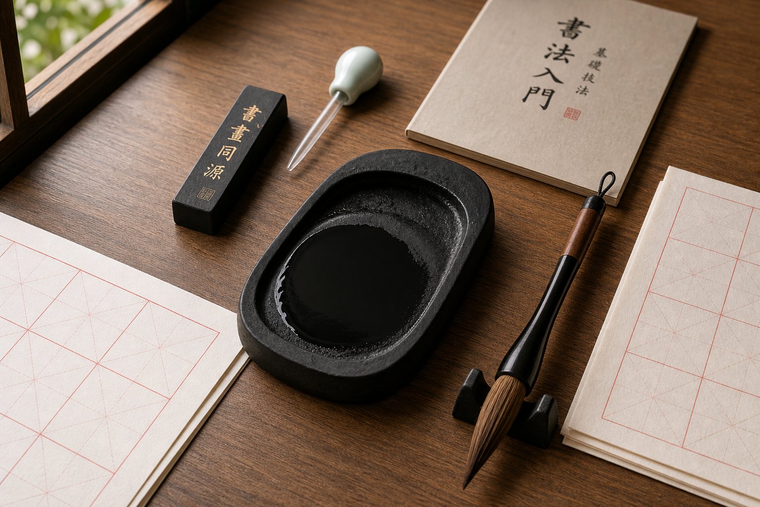
Ink, Paper, and Inkstone Selection
The brush gets the most attention, but ink consistency and paper choice quietly determine whether your strokes look professional or amateurish. Seal script's uniform lines expose every flaw — bleeding edges, inconsistent ink tone, or paper that absorbs too quickly all become glaringly obvious.
Here is what you need and why each element matters:
- Ink stick and inkstone over bottled ink — Grinding your own ink on a stone gives you precise control over consistency. For seal script, you want ink slightly thicker than what you would use for running script. Thicker ink resists bleeding and holds crisp edges on each stroke. Bottled ink can work for casual practice, but its pre-set viscosity rarely matches seal script's ideal density, and it tends to produce flatter, less luminous blacks. If you do use bottled ink, let it sit uncapped briefly to thicken slightly before writing.
- Inkstone (砚台) — A smooth-surfaced stone with a fine grain produces the best results. The grinding surface should feel slightly textured — enough to break down the ink stick efficiently without creating gritty particles that clog your brush tip. A four-inch stone is sufficient for individual practice sessions.
- Grid paper for early practice — Start with pre-printed grid paper (米字格 or 九宫格). The grid enforces consistent character sizing and reveals symmetry errors immediately. You will notice proportion problems that would be invisible on blank paper. This is especially important for seal script, where uniform character dimensions are a core aesthetic requirement.
- Raw xuan paper (生宣) for progression — Once your stroke control is solid, move to unsized xuan paper. Its absorbency tests your ink control and brush speed in ways that coated practice paper cannot. The slight feathering at stroke edges on raw xuan gives finished work a softer, more traditional appearance — the same quality prized in a chinese seal stamp impression where ink meets paper with organic warmth.
- Felt pad beneath your paper — A wool or synthetic felt mat absorbs excess ink that soaks through thin xuan paper, preventing smearing and giving your brush a slightly cushioned surface that improves stroke quality.
One practical note: when grinding ink, add water gradually and grind in slow, steady circles. The process itself becomes part of the meditative preparation for practice — settling your mind before brush touches paper. Many practitioners who carve their own chop seal designs find that this grinding ritual helps them transition from daily distractions into focused creative work.
Setting Up Your Practice Space
Your workspace arrangement directly affects your posture, sight lines, and ultimately your brushwork quality. A few simple adjustments prevent bad habits from forming.
Position your model text — whether a printed reproduction of the Yishan Stele or a teacher's exemplar — directly above or to the right of your writing surface, at eye level or slightly below. You need to glance between model and paper frequently without twisting your neck or shifting your body. Every time you contort to see your reference, your brush angle changes and your center-tip alignment suffers.
Lighting matters more than you might expect. Seal script characters contain fine internal details — subtle spacing differences, slight curve variations — that disappear under dim or uneven light. Use a bright, diffused light source positioned to your left (if right-handed) so your writing hand does not cast shadows across the characters you are studying. Natural daylight from a window works beautifully; harsh overhead fluorescents create glare on wet ink that makes evaluation difficult.
Keep your table surface clear except for the immediate tools: brush, inkstone, water dropper, paper, felt pad, and model text. A chinese stamp seal or paperweight can hold your sheet flat. Clutter invites distraction, and seal script practice rewards sustained, uninterrupted focus. Even fifteen minutes of concentrated work with proper setup produces better results than an hour of scattered effort in a chaotic environment.
With the right materials assembled and your space arranged for focused work, the next challenge shifts from physical tools to mental ones — learning to read and recognize the ancient character forms you are about to practice.
How to Read and Identify Seal Script Characters
You can hold the brush perfectly, grind your ink to ideal consistency, and execute flawless center-tip strokes — but none of that helps if you cannot read what you are writing. Seal characters look dramatically different from their modern equivalents. Radicals shift shape, components rearrange, and pictographic logic replaces the abstract geometry of standard Chinese. Learning to decode these ancient forms is a skill in itself, and it unlocks a deeper understanding of every character you practice.
Structural Principles of Seal Script Characters
Seal script sits much closer to the pictographic origins of Chinese writing than any modern form. Where regular script abstracts a tree into a few angular strokes (木), seal script preserves something that still resembles a trunk with spreading branches. This visual logic applies broadly — characters for body parts, animals, natural elements, and tools all retain recognizable pictorial traces that modern simplification has erased.
Two structural principles govern how these characters are built:
- Symmetrical balance — Most seal script characters are constructed around a vertical center axis. Left and right components mirror each other in weight and proportion. Even asymmetrical characters are composed to feel visually centered within their rectangular frame.
- Uniform spatial distribution — Strokes fill the available space evenly. Dense clusters and open gaps are carefully calibrated so no area feels overcrowded or abandoned. This principle makes seal characters appear self-contained and architecturally stable.
The challenge for modern readers is that radicals — those recurring components that signal meaning categories — appear in their archaic forms. The water radical (氵) in modern script becomes a flowing, multi-curved element in seal script. The fire radical (火) retains a flame-like shape that bears little resemblance to its four-dot modern descendant. If you only know modern radicals, seal script looks like an entirely foreign writing system. It is not — but you need a new visual vocabulary to navigate it.
Common Radicals in Their Seal Script Forms
Recognizing frequently used radicals in their older forms is the fastest path to chinese seal identification. Once you can spot these recurring building blocks, unfamiliar characters become puzzles you can solve rather than mysteries you cannot penetrate. The table below describes how several common radicals transform between their seal script and modern appearances:
| Radical Meaning | Modern Form | Seal Script Appearance | Key Visual Difference |
|---|---|---|---|
| Water | 氵 | Flowing curved lines resembling a stream with ripples | Three dots become continuous wavy strokes |
| Fire | 火 / 灬 | Upward-reaching flame shape with curling tongues | Retains pictographic flame; four dots not yet separated |
| Wood / Tree | 木 | Trunk with spreading root and branch curves | Rounded branches replace angular strokes |
| Metal / Gold | 钅/ 金 | Triangular nugget shape above a base | Pictographic ore or axe form; unrecognizable as modern 钅 |
| Earth | 土 | Horizontal ground line with a mound rising from it | Rounder, more organic than the angular modern cross |
| Person | 亻/ 人 | Standing figure with visible head and limbs | Full human silhouette rather than two abstract strokes |
| Heart / Mind | 忄/ 心 | Rounded organ shape with internal curves | Pictographic heart form; three-stroke shorthand not yet developed |
Studying these transformations reveals a pattern: seal script radicals are fuller, rounder, and more pictorially complete than their modern shorthand versions. When you encounter unfamiliar sealook characters on an antique stamp or in a model text, try identifying the radical first. Even partial recognition narrows your search dramatically.
Using Seal Script Dictionaries and Digital Tools
A dedicated seal dictionary (篆書字典) organizes characters by their seal-form radicals rather than modern ones — an essential distinction. The most widely used reference, the Shuowen Jiezi (说文解字), was compiled during the Han dynasty specifically to explain character origins through their small seal script forms. Modern reprints with indexes sorted by stroke count or pinyin make lookup accessible even for beginners.
When using a seal dictionary, the process works differently from a standard Chinese dictionary. You identify the seal-form radical in the character you want to find, locate that radical's section, then scan for your target character among its entries. This takes practice — especially since radical identification itself requires familiarity with archaic forms — but it becomes faster with repetition.
Digital tools have simplified verification considerably. A chinese seal script generator allows you to type modern characters and instantly see their seal script equivalents, which is invaluable for confirming whether you are writing the correct historical form. The Seal Script Dataset hosted by Japan's ROIS-DS Center for Open Data in the Humanities offers a searchable database where users input characters and receive historical seal script examples from classical sources. One important note: as researchers at the Digital Orientalist have documented, these databases often require old-form (traditional) character input rather than simplified forms — searching 國 rather than 国, for example.
Other useful digital resources include the Ownership Stamp Database, which lets users search by radical, script style, or even upload images of sealook characters for AI-assisted identification. These tools represent a growing ecosystem for anyone working with seal script generator technology to cross-reference historical forms.
A word of caution, though: digital tools verify forms, but they do not build skill. Typing a character into a chinese seal script generator and copying the output teaches you nothing about stroke order, brush rhythm, or spatial proportion. Use these resources as reference companions — confirming that you have the right character before committing it to practice — while keeping your primary learning rooted in hand-copying from model texts. The muscle memory that transforms knowledge into ability only develops through repetition with brush on paper.
With the ability to both write and read seal script characters, the question becomes how to organize all of this into a coherent learning journey — one that builds systematically from isolated strokes to complete compositions.
A Structured Learning Pathway from Beginner to Practitioner
Most people who pick up a brush for seal script calligraphy hit the same wall: they know the strokes, they own the tools, they can identify the characters — but they have no roadmap. What should you practice first? How long before you move on? When are you ready to write a complete piece rather than isolated characters? Without a clear progression, practice becomes aimless repetition rather than deliberate growth.
The pathway below draws on the traditional stages that Chinese calligraphy education has refined over centuries. It is not a rigid schedule — everyone progresses differently — but it gives you concrete milestones so you always know where you stand and what comes next.
Stage One — Foundation Building
Before you write a single character, you write strokes. Lots of them. This phase is about training your hand to produce the even, controlled lines that seal script demands — and nothing else.
Start with straight horizontal lines on grid paper. Your only goal: identical width from start to finish, with rounded entries and exits. Fill entire sheets with nothing but horizontals until evenness becomes automatic rather than effortful. Then move to verticals, applying the same standard. These two strokes alone teach center-tip control, consistent pressure, and concealed brush entry — the mechanical foundation everything else builds on.
Once straight lines feel stable, progress to curves and rounded turns. Practice continuous S-shapes and circular forms without lifting the brush. You are training your arm to guide smooth arcs while maintaining that same even width through directional changes. This is harder than it sounds, and most learners spend several weeks here before curves feel natural.
Only after isolated strokes feel reliable should you attempt simple characters. Begin with numerals (一, 二, 三) and basic radicals (木, 水, 火) in their seal forms. These characters use few strokes and let you practice combining elements into balanced compositions without overwhelming complexity. Resist the temptation to jump ahead to your chinese calligraphy name or elaborate multi-component characters — that ambition will serve you better once your stroke foundation is solid.
Stage Two — Character Practice and Model Text Study
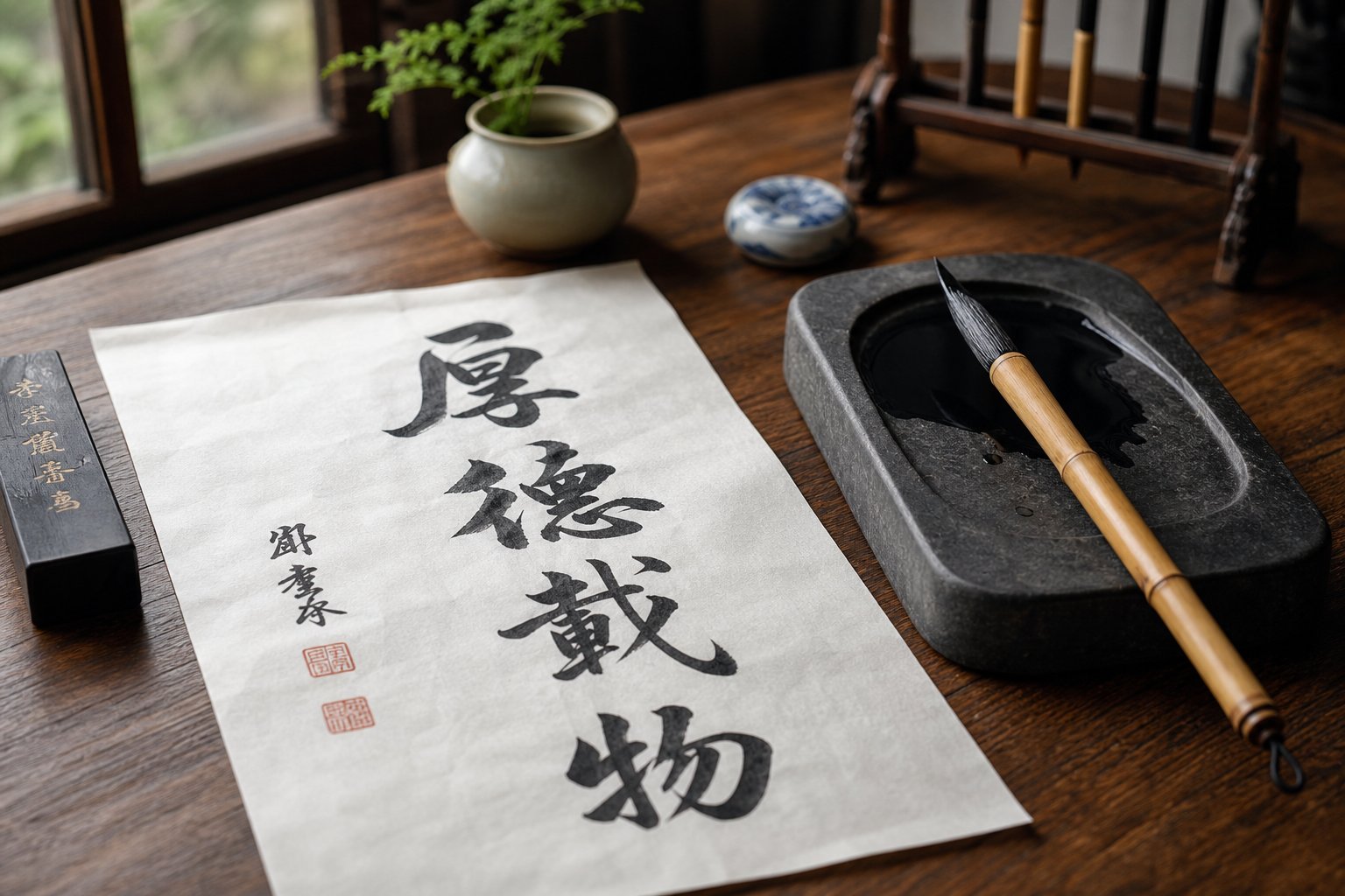
This is where the traditional method of Lin Mo (临摹) becomes your primary practice mode. Lin Mo is not mere copying — it is emulation, a process of studying a master's work so deeply that you internalize its spirit alongside its form. The Chinese calligraphy tradition identifies this as indispensable: all great calligraphers throughout history were lifetime students of this method, often spending decades in dedicated emulation before their own mature style emerged.
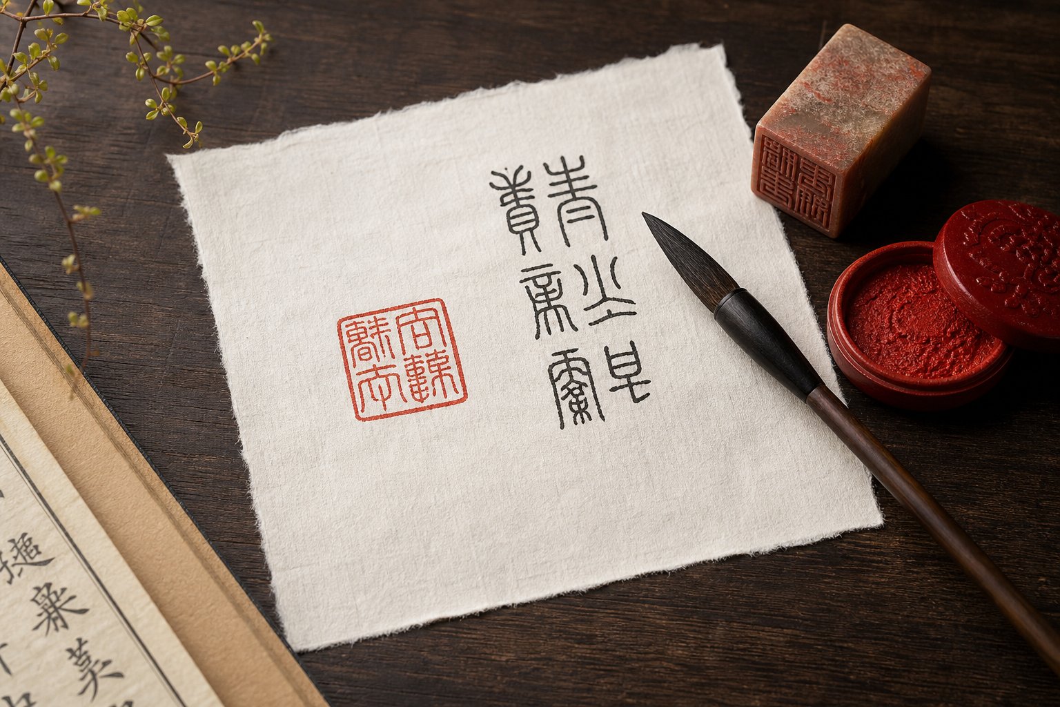
Begin with the Yishan Stele (峄山碑). Its characters are regular, clearly structured, and represent small seal script at its most approachable. Position a printed reproduction beside your paper and work through characters one at a time. The process has two layers:
- Lin (临) — observational copying: Study the model character carefully before writing. Notice the proportions, the spacing between strokes, the angle of each curve. Then write it beside the model, comparing your version stroke by stroke. This engages hand, eye, and mind simultaneously.
- Mo (摹) — tracing: Place thin paper over the model and trace directly, feeling the original master's structural decisions through your brush. This builds positional accuracy and helps you "feel" correct proportions physically.
How many repetitions does it take? There is no magic number, but traditional pedagogy suggests writing each character dozens of times across multiple sessions before moving to the next. You are building muscle memory — the kind where your hand knows the character's architecture without conscious calculation. A single character practiced thirty times with full attention teaches more than ten characters rushed through three times each.
During this stage, you will also begin using a seal dictionary to verify character forms and may explore a calligraphy chinese translation reference to confirm you are writing the correct historical variant. Accuracy matters: seal script contains many characters that look similar but carry different meanings, and practicing the wrong form builds the wrong muscle memory.
Many practitioners find value in joining a society for calligraphy or a local study group during this phase. Feedback from experienced eyes catches errors you cannot see in your own work — proportion imbalances, subtle asymmetries, or habitual pressure inconsistencies that become invisible through familiarity.
Stage Three — Composition and Creative Development
Individual characters are building blocks. A finished piece of seal script calligraphy is architecture — and architecture requires understanding how blocks relate to each other in space.
At this stage, you shift from practicing isolated characters to writing complete compositions: couplets, short poems, or classical phrases arranged in vertical columns. The new challenges are spacing, rhythm, and layout. Characters must sit at consistent intervals. Columns must align cleanly. The overall piece needs visual unity — a quality that emerges only when you plan the full composition before your brush touches paper.
Creative development begins here too. After months of faithful emulation, your hand carries the structural DNA of the models you have studied. Gradually, personal tendencies emerge — slightly bolder curves, a preference for tighter internal spacing, or a particular rhythm in how you pace your strokes. The tradition encourages this evolution, but only after the foundation is secure. As the classical principle states: learn the rules completely, then transcend them naturally.
Here is the complete progression mapped with approximate timeframes:
- Stroke isolation and basic radicals (months 1-3) — Master horizontal, vertical, and curved strokes on grid paper. Write simple characters using few strokes. Focus exclusively on line quality and center-tip control.
- Character emulation from model texts (months 4-12) — Practice Lin Mo with the Yishan Stele and other Qin-era models. Build a vocabulary of 100-200 correctly formed seal characters. Develop consistent sizing and symmetry.
- Multi-character compositions (months 12-24) — Write couplets, short texts, and four-character phrases. Learn column spacing, layout planning, and compositional harmony across a full sheet.
- Style exploration and personal development (year 2 onward) — Study Qing dynasty masters like Deng Shiru and Wu Changshuo. Experiment with brush variation within seal script's structural constraints. Begin developing a recognizable personal voice.
- Applied practice — seals, artworks, and exhibition pieces (ongoing) — Design compositions for specific purposes: name seals, hanging scrolls, fan surfaces. Integrate seal script into a broader calligraphic practice that may include other script styles.
These timeframes assume regular practice — ideally thirty minutes to an hour daily, or several focused sessions per week. Sporadic practice extends each phase considerably. Consistency matters more than marathon sessions; the meditative rhythm of daily brushwork compounds over months in ways that occasional bursts cannot replicate.
One final perspective worth holding: the learning pathway never truly ends. Even accomplished practitioners return to model texts throughout their lives, discovering new subtleties in works they first copied as beginners. The ancient masters understood this — Wang Xizhi practiced into old age, and the Qing revival calligraphers studied bronze inscriptions for decades before producing their most celebrated works. Seal script rewards the long view, and every stage of the journey carries its own satisfaction.
This structured progression builds skill systematically — but skill serves a purpose. The real question for many practitioners is what they will do with these abilities once developed, and how this ancient art form connects to the living world around them.
Modern Applications from Name Seals to Contemporary Art
Seal script calligraphy is not a relic preserved behind museum glass. It lives in studios, on legal documents, across gallery walls, and inside the quiet daily rituals of practitioners around the world. The skills you develop through structured practice connect directly to a tradition that remains culturally active — and in some contexts, legally required.
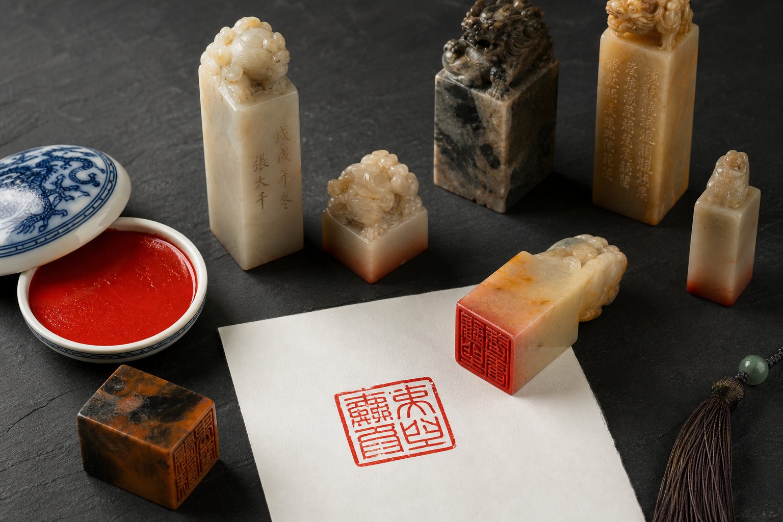
Personal Name Seals and Signature Stamps
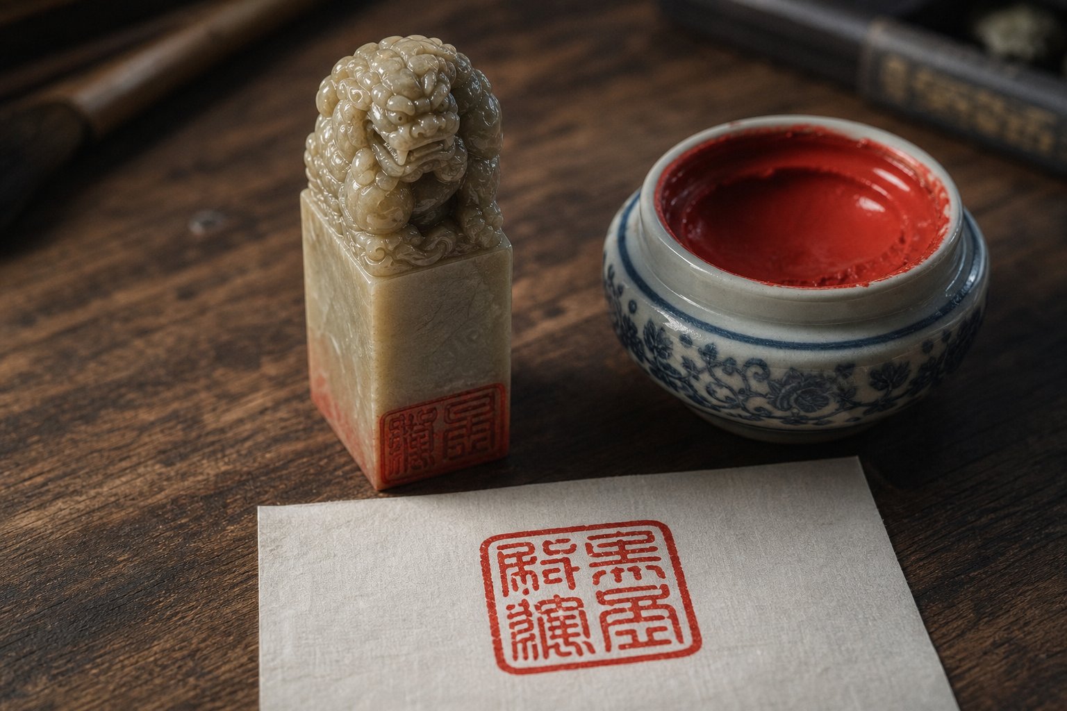
The most immediate application for any practitioner is the personal name seal (印章, yinzhang). Artists, calligraphers, and professionals still commission carved seals as identity marks — pressed in vermillion ink onto paintings, documents, and correspondence. A chinese name seal functions the way a signature does in Western culture, but with deeper symbolic weight. As the MingShu Library's research on seal culture explains, stamping a document with your seal invests it with your authority, reputation, and honor — something a handwritten signature cannot replicate with the same permanence.
Why does seal script dominate this tradition? Its compact, symmetrical forms fit the small square format of a carved stamp perfectly. A typical chinese name stamp measures just one to three centimeters per side — barely enough space for two to four characters. Seal script's balanced geometry and uniform stroke width make characters legible and aesthetically harmonious even at this miniature scale. Running or cursive script would dissolve into illegibility at such dimensions.
Commissioning a chinese signature stamp is often a practitioner's first real-world application of their studies. You choose between intaglio carving (阴文, white characters on a red field) and relief carving (阳文, red characters on a white field). You select the stone — Shoushan, Qingtian, or another carving-grade material. And you either carve it yourself or work with a seal artist who renders your name in historically accurate seal forms. Either way, your calligraphic knowledge directly informs the process: you can evaluate whether the character forms are correct, whether the spacing follows proper compositional principles, and whether the overall design achieves the balanced harmony your practice has trained you to recognize.
Contemporary Art, Design, and Cultural Preservation
Beyond personal seals, this ancient script thrives in contexts its creators could never have imagined. Walk through any major museum collection of Chinese paintings — the Metropolitan Museum's holdings, for instance — and you will notice chinese seals scattered across the surfaces of scrolls spanning centuries. Each red impression marks a moment of cultural engagement: the artist's claim of authorship, a collector's pride of ownership, a scholar's stamp of appreciation. Old chinese seals on a Song dynasty landscape might span eight hundred years of provenance, each one a verified link in a chain of cultural custody.
In contemporary practice, seal script's influence extends well beyond traditional ink art:
- Personal seals and art authentication — Living artists and calligraphers use carved seals to sign and authenticate their work, continuing a tradition unbroken for millennia.
- Logo and brand design — The geometric balance and visual distinctiveness of seal script characters inspire corporate identity work, particularly for brands seeking to signal cultural heritage and craftsmanship.
- Typography and graphic design — Contemporary type designers draw on seal script's structural principles to create display fonts that evoke antiquity while functioning in modern layouts.
- Meditative and mindfulness practice — The slow, deliberate brushwork appeals to practitioners seeking focused calm. Each session becomes a form of moving meditation where attention narrows to brush, ink, and paper.
- Cultural education — Schools and community programs use seal script as a gateway to understanding Chinese character origins, making abstract linguistic history tangible through hands-on practice.
- Decorative and fine art — Seal script compositions appear as hanging scrolls, framed works, and integrated elements in mixed-media contemporary pieces.
There is also an experiential dimension worth acknowledging. In a world saturated with speed and digital immediacy, seal script's deliberate pace offers something countercultural. You cannot rush it. The brush demands your full presence — steady hand, quiet mind, unhurried rhythm. Many modern practitioners come to this art not primarily for its historical significance but for what it does to their state of mind during practice. The cultural preservation happens almost as a side effect of personal cultivation.
Whether you carve your first china seal, hang a finished composition on your wall, or simply sit with brush and ink for thirty quiet minutes each morning, you are participating in something that has sustained human meaning for over three thousand years. The characters change slowly. The tools remain largely the same. And the satisfaction of a well-formed line — even, rounded, alive with quiet energy — connects you to every practitioner who held a brush before you and every one who will hold one after.
Frequently Asked Questions About Seal Script Calligraphy
1. What is the difference between large seal script and small seal script?
Large seal script (dazhuan) originates from Shang and Zhou dynasty bronze inscriptions and features organic, irregular strokes with pictographic qualities and variable character sizes. Small seal script (xiaozhuan) was standardized by Li Si during the Qin dynasty and is defined by perfectly uniform line width, symmetrical structure, and consistent tall-rectangle character proportions. Most beginners start with small seal script because its regularity makes stroke practice more systematic, while large seal script appeals to those interested in seal carving or studying ancient bronze inscriptions.
2. What brush should I use for seal script calligraphy?
Seal script requires stiffer brushes than other calligraphy styles because you need precise control to maintain uniform line width. Mixed-hair brushes (jianhao) combining goat and weasel hair work well for beginners, offering resilience with decent ink capacity. More experienced practitioners often prefer pure weasel-hair (langhao) or hare-hair brushes for crisper strokes. Soft goat-hair brushes are not recommended because their flexibility makes the even-pressure control seal script demands nearly impossible to achieve consistently.
3. How long does it take to learn seal script calligraphy?
A structured learning pathway typically spans two or more years of regular practice. The first three months focus on mastering isolated strokes and basic radicals on grid paper. Months four through twelve involve character emulation from classical model texts like the Yishan Stele, building a vocabulary of 100 to 200 correctly formed characters. Months twelve through twenty-four introduce multi-character compositions and layout principles. Personal style development begins in the second year and continues indefinitely. Daily sessions of thirty minutes to one hour produce the most consistent progress.
4. Why is seal script still used today?
Seal script remains culturally active in several ways. Its primary living application is personal name seals carved for artists, calligraphers, and professionals to authenticate artwork and documents. Beyond seals, the script influences modern logo design, typography, and contemporary ink art. Many practitioners also value it as a meditative discipline because its slow, deliberate brushwork cultivates focused calm. Additionally, seal script serves as a tool for cultural education, helping students understand the pictographic origins and structural logic underlying all Chinese characters.
5. What is the center-tip technique in seal script?
Center-tip technique (zhongfeng) is the foundational brushwork method for seal script. It means keeping the brush tip traveling along the exact center of each stroke rather than dragging along one edge. When executed correctly, ink spreads evenly to both sides of the line, producing the uniform width that defines seal script aesthetics. Achieving this requires holding the brush perpendicular to the paper, gripping the handle in its upper third, and guiding strokes with whole-arm movement rather than wrist-only motion. Most learners need two to three months of focused practice before center-tip control becomes consistent.