Understanding Cursive Script in Chinese Calligraphy
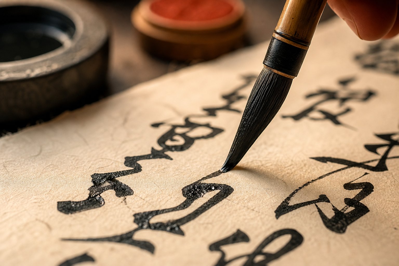
Imagine watching someone write a twenty-stroke word in a single, sweeping gesture of the brush. The result looks more like abstract art than writing, yet it follows centuries of established conventions. This is cursive script Chinese calligraphy, known in Chinese as 草書 (cǎoshū), literally "grass script." It is the most expressive, most dynamic, and least readable of all Chinese writing styles.
What Is Cursive Script in Chinese Calligraphy
Cursive script (草書/cǎoshū) is one of the five major styles of Chinese calligraphy. It drastically simplifies and abbreviates individual strokes within a character, often reducing them to a single continuous movement of the brush. Both reading and writing cǎoshū require special training beyond standard literacy.
That definition captures the core tension of this art form: it is writing, yet it resists being read. According to the Smithsonian's National Museum of Asian Art, the number and structure of strokes change so significantly in cursive script that special study is needed to decipher it. A word like chrysanthemum (菊花/júhuā), which takes twenty strokes in standard script, can become one fluid gesture under a skilled calligrapher's hand.
Cursive script sits at the far end of a spectrum. The five styles of Chinese calligraphy explained in traditional classification are: seal script (篆書/zhuànshū), clerical script (隸書/lìshū), regular script (楷書/kǎishū), running script (行書/xíngshū), and cursive script (草書/cǎoshū). Each represents a different balance between legibility and expressive freedom. Cǎoshū tips that balance entirely toward expression.
Why Cursive Script Matters in Chinese Art
You'll notice that people often confuse cursive and semi-cursive Chinese calligraphy. The distinction matters. Running script (行書/xíngshū) is a semi-cursive style that maintains recognizable character structure while allowing connected, flowing strokes. It is structured flow. Cursive script goes further: strokes merge, abbreviate, and transform until the character becomes a single expressive gesture. Where xíngshū controls movement, cǎoshū releases it.
This difference is not just technical. It reflects a philosophical divide between communication and pure artistic expression. Semi-cursive remains widely readable. Full cursive prioritizes rhythm, energy, and spontaneity over clarity, making it the calligraphic equivalent of abstract expressionism, centuries before that Western movement existed.
Whether you are a student of Chinese language, a collector of East Asian art, or simply curious about one of humanity's oldest continuous art traditions, understanding cǎoshū opens a window into how writing transcended utility and became high art. The story of how that transformation happened stretches back more than two thousand years.
Historical Evolution of Chinese Cursive Script
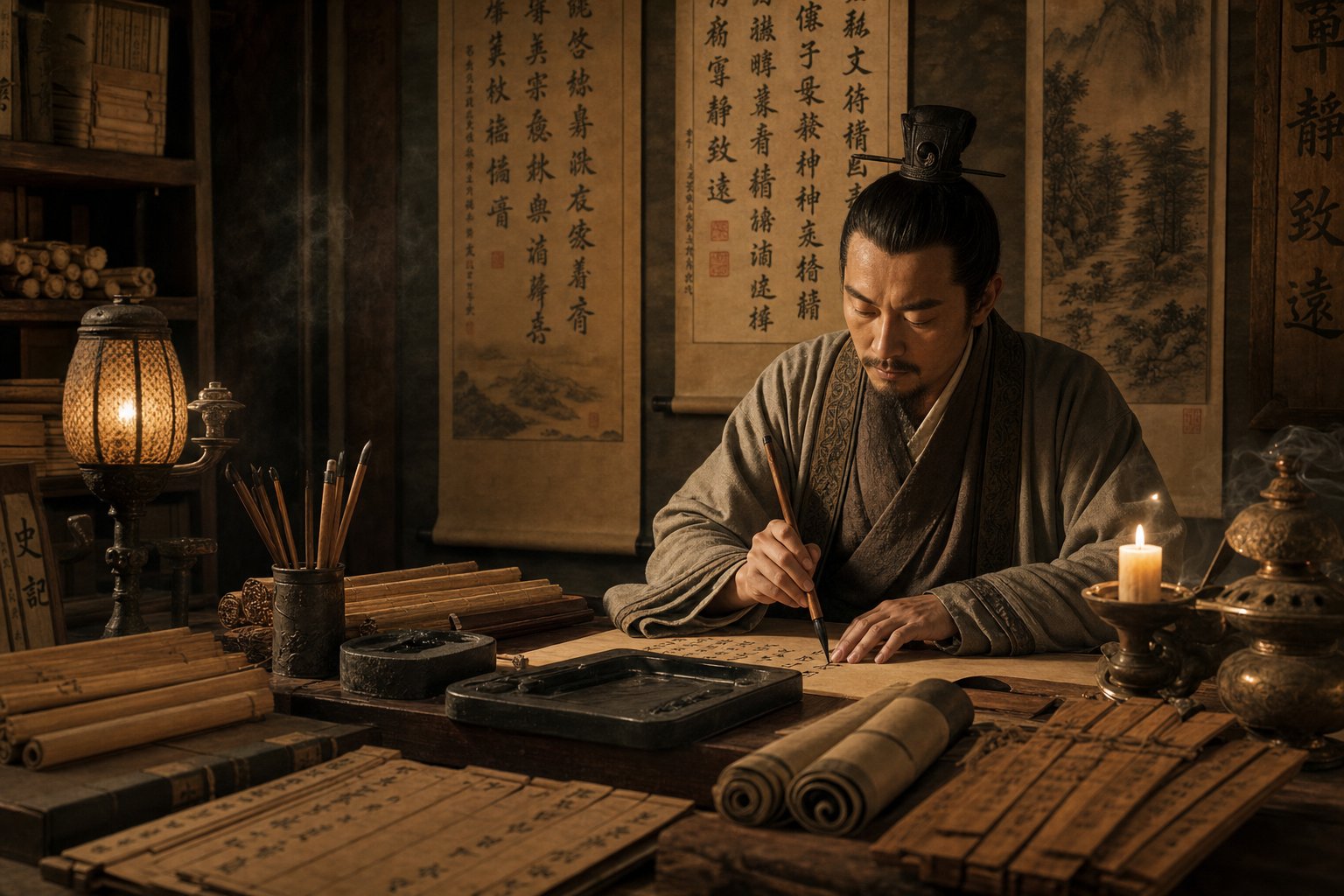
Two thousand years ago, no one thought of cursive as art. It was a shortcut. Government clerks, military officers, and scribes needed to write faster, and the rigid strokes of clerical script (隸書/lìshū) simply could not keep up with the demands of a growing empire. That practical urgency gave birth to one of the most celebrated art forms in East Asian culture. The history of cursive script in China is a story of function transforming into philosophy, and speed becoming soul.
Origins in the Han Dynasty
The Han dynasty (206 BCE-220 CE) was an era of bureaucratic expansion. The empire needed records, correspondence, and military dispatches produced at volume. Clerical script, the dominant writing style of the period, was efficient compared to seal script but still demanded deliberate, separated strokes. Scribes began abbreviating and linking strokes to save time, and these informal shortcuts gradually crystallized into recognizable patterns.
This early form became known as 章草 (zhāngcǎo), or draft cursive. It retained the flat, horizontal structure of clerical script but introduced connected strokes within individual characters. Each character still stood apart from its neighbors, and the abbreviations followed consistent rules. Think of it as controlled shorthand rather than free expression.
The Han dynasty origins of Chinese cursive are well documented in surviving bamboo slips and wooden tablets from frontier garrisons. These artifacts show that cursive was not invented by a single calligrapher. It emerged organically from thousands of hands writing under time pressure. By the late Han period, however, individual masters like Zhang Zhi (張芝) began elevating this practical shorthand into something deliberately beautiful, connecting characters across entire lines in continuous brush movement.
The Golden Age of Cursive During the Tang Dynasty
Between the Han and Tang dynasties, a critical transformation occurred during the Wei-Jin period (220-420 CE). The aristocratic culture of the Eastern Jin dynasty valued personal expression, philosophical refinement, and artistic accomplishment. Calligraphy became a marker of social status and intellectual depth. Wang Xizhi (王羲之) and his son Wang Xianzhi (王獻之) developed 今草 (jīncǎo), or modern cursive, which broke free from the clerical-influenced structure of zhāngcǎo. Characters became rounder, more fluid, and strokes flowed between them without pause.
This evolution of Chinese calligraphy styles reached its peak during the Tang dynasty (618-907 CE), widely recognized as the golden age of Chinese calligraphy. The Tang court valued both technical discipline and creative daring. Regular script (楷書/kǎishū) achieved its definitive form during this period, but so did the wildest extremes of cursive.
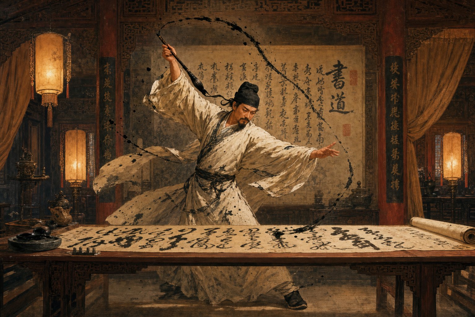
The Tang dynasty cursive calligraphy golden age produced two legendary figures: Zhang Xu (張旭) and the monk Huaisu (懷素). Both practiced 狂草 (kuángcǎo), or wild cursive, a form so radically abbreviated and energetic that characters dissolve into pure kinetic expression. Zhang Xu reportedly drew inspiration from watching a sword dance. Huaisu, a Buddhist monk, was said to write in states of intoxication, his brush racing across silk with abandon. Their work pushed cursive beyond communication entirely and into the realm of performance art.
What made this possible? The Tang dynasty combined political stability, cultural confidence, and philosophical openness. Daoist ideas about naturalness (自然/zìrán) and spontaneous action (無為/wúwéi) gave intellectual legitimacy to unrestrained brushwork. Chan Buddhism, with its emphasis on sudden insight and non-rational knowing, further encouraged calligraphers to trust instinct over calculation.
Cursive Script From Song Dynasty to the Present
The Song dynasty (960-1279 CE) shifted the emphasis from technical virtuosity to personal expression and literary sensibility. Calligraphers like Huang Tingjian (黃庭堅) developed distinctive cursive styles that prioritized individual voice over adherence to Tang-era models. The connection between calligraphy, poetry, and painting deepened, and cursive script became inseparable from the broader literati culture of scholar-officials.
During the Yuan (1271-1368) and Ming (1368-1644) dynasties, calligraphers oscillated between reverence for classical models and bursts of individual experimentation. The Qing dynasty (1644-1912) brought a scholarly turn, with calligraphers studying ancient inscriptions and rediscovering earlier script forms. Cursive never disappeared, but it existed alongside a renewed interest in the archaic structures it had originally simplified.
In the modern era, cursive script calligraphy no longer serves any practical writing function. Yet it persists as a living art form, practiced for its meditative qualities, its expressive power, and its deep connection to Chinese cultural identity. The trajectory from Han-dynasty shorthand to contemporary art studio traces one of the longest continuous artistic traditions on earth, a tradition built not on adding complexity but on the paradox of finding depth through radical simplification.
That paradox raises a natural question: what exactly are the different degrees of simplification within cursive script, and how do they relate to each other?
Three Sub-Types of Cursive Script Explained
Not all cursive is created equal. When people talk about types of Chinese cursive script calligraphy, they are actually referring to three distinct sub-types that developed across different centuries, serve different purposes, and demand different levels of expertise to read. Understanding the difference between zhangcao draft cursive vs kuangcao wild cursive is essential for anyone studying, collecting, or simply appreciating this art form.
Think of these three sub-types as points on a spectrum. At one end, characters remain individually legible with consistent abbreviation rules. At the other, writing dissolves into pure kinetic energy where artistry completely overtakes communication.
Zhangcao or Draft Cursive
The oldest form, 章草 (zhāngcǎo), emerged directly from the clerical script (隸書/lìshū) during the Han dynasty. Its name is sometimes translated as "draft cursive," "ancient cursive," or "clerical cursive." Each label captures something true about it. Zhāngcǎo retains the wide, flat proportions of clerical script and preserves a visible connection to standard character structures.
What makes zhāngcǎo distinctive? Each character remains separate from its neighbors. There is no linking between characters, no continuous brush movement across an entire line. Within each character, strokes are abbreviated and connected, but the overall shape stays recognizable to someone trained in clerical or regular script. You'll also notice a characteristic upward flick at the end of the final stroke in many characters, a holdover from clerical script's wave-like horizontal strokes (波磔/bōzhé).
Zhāngcǎo was the working shorthand of government clerks and military scribes. Its rules were consistent enough that different writers could read each other's work. Zhang Zhi (張芝) of the late Han dynasty is traditionally credited with elevating zhāngcǎo from bureaucratic utility into a deliberate art form, earning him the title "Sage of Cursive" (草聖/cǎoshèng).
Jincao or Modern Cursive
By the Wei-Jin period (220-420 CE), a new form emerged: 今草 (jīncǎo), meaning "modern cursive" or "contemporary cursive." The word "modern" here is relative. It was modern compared to zhāngcǎo when it first appeared nearly two thousand years ago.
The difference between jincao and kuangcao starts with understanding what jīncǎo actually changed. It abandoned the clerical-influenced flat structure of zhāngcǎo and adopted the rounder, more vertical proportions of regular script (楷書/kǎishū). More importantly, jīncǎo introduced continuous brush movement between characters. A calligrapher could link two, three, or more characters in a single unbroken gesture, creating a flowing rhythm impossible in zhāngcǎo.
Wang Xizhi (王羲之) and his son Wang Xianzhi (王獻之) are the defining masters of jīncǎo. Their work balanced legibility with expressive freedom. Characters are significantly simplified, strokes merge and abbreviate, but the underlying structure remains decodable by a trained reader. Jīncǎo is the form most calligraphers mean when they refer to cursive script without further qualification. It occupies the middle ground: freer than draft cursive, more controlled than wild cursive.
Kuangcao or Wild Cursive
Then there is 狂草 (kuángcǎo). The character 狂 means "mad" or "wild," and the name is earned. Wild cursive calligraphy, as kuángcǎo is often called in English, represents the extreme end of the cursive spectrum. Developed during the Tang dynasty by Zhang Xu (張旭) and Huaisu (懷素), it pushes abbreviation and connection so far that individual characters become nearly impossible to isolate.
In kuángcǎo, entire lines of text flow as a single continuous movement. Characters merge into one another. Strokes that would be separate in any other style become one sweeping gesture. The brush lifts from the paper only when the calligrapher's physical reach demands it. Legibility is no longer the point. Rhythm, energy, spatial drama, and emotional intensity take over completely.
Zhang Xu and Huaisu were known by the nickname 顛張醉素 (diān Zhāng zuì Sù), meaning "Crazy Zhang and Drunk Su." The label was not entirely metaphorical. Both reportedly created their most celebrated works in states of heightened emotion or intoxication, treating the act of writing as a kind of physical performance.
Here is a Chinese cursive script sub-types comparison that maps the key differences across all three forms:
| Dimension | 章草 Zhāngcǎo (Draft Cursive) | 今草 Jīncǎo (Modern Cursive) | 狂草 Kuángcǎo (Wild Cursive) |
|---|---|---|---|
| Historical Period | Han dynasty (206 BCE-220 CE) | Wei-Jin period (220-420 CE) | Tang dynasty (618-907 CE) |
| Structural Basis | Clerical script (隸書) | Regular script (楷書) | Regular script, heavily abstracted |
| Degree of Simplification | Moderate; consistent abbreviation rules | High; strokes merge freely | Extreme; characters dissolve into gesture |
| Character Linking | None; characters remain separate | Partial; two to three characters linked | Extensive; entire lines connected |
| Legibility | Readable with training | Difficult but decodable | Often illegible without specialized study |
| Notable Practitioners | Zhang Zhi (張芝), Du Du (杜度) | Wang Xizhi (王羲之), Wang Xianzhi (王獻之) | Zhang Xu (張旭), Huaisu (懷素) |
| Primary Purpose | Efficient writing with legibility | Artistic expression with some legibility | Pure artistic and emotional expression |
The progression from zhāngcǎo to jīncǎo to kuángcǎo is not simply a timeline. Each sub-type continued to be practiced after the next one emerged. Calligraphers in the Song, Ming, and Qing dynasties returned to zhāngcǎo as a deliberate stylistic choice, valuing its archaic flavor and disciplined structure. Jīncǎo remained the most widely practiced form across all periods. Kuángcǎo, by its nature, attracted fewer practitioners but generated outsized cultural fascination.
What unites all three is the underlying principle of stroke transformation: standard characters are systematically reduced through merging, abbreviation, and continuous movement. The rules governing those transformations differ in degree but not in kind. And all three sub-types exist within a larger ecosystem of five script styles, each occupying a specific position on the continuum between formal precision and expressive freedom.
Cursive Script Among the Five Calligraphy Styles
The five styles of Chinese calligraphy form a single interconnected system, not a random collection of fonts. Each script occupies a specific position along a continuum that stretches from maximum formality to maximum freedom. Understanding where cursive script sits within this system, and why it sits there, gives you a framework for appreciating what makes it so radically different from the other four.
The Song dynasty calligrapher Su Shi (蘇軾) captured the relationship between three of these styles in a famous analogy: "Standard Script is like standing, Running Script is like walking, and Cursive Script is like running" (真如立, 行如行, 草如走). That metaphor describes both physical posture and writing speed, but it also hints at something deeper: each style represents a different relationship between control and release.
The Five Scripts of Chinese Calligraphy
Chinese calligraphy recognizes five core scripts, collectively called 五體 (wǔtǐ). They developed across different historical periods, each responding to specific cultural and practical needs. Here is a five styles of Chinese calligraphy comparison that maps their key characteristics:
| Script Style | Speed of Execution | Legibility | Formality | Period of Dominance | Stroke Simplification |
|---|---|---|---|---|---|
| Seal Script (篆書/zhuànshū) | Very slow | Low for modern readers | Highest; ceremonial | Shang through Qin dynasty (c. 1200-206 BCE) | None; pictographic forms preserved |
| Clerical Script (隸書/lìshū) | Slow | Moderate | High; official documents | Han dynasty (206 BCE-220 CE) | Minimal; curves straightened |
| Regular Script (楷書/kǎishū) | Moderate | Highest | High; standard for print and education | Tang dynasty onward (618 CE-present) | None; strokes fully articulated |
| Running Script (行書/xíngshū) | Fast | Moderate to high | Moderate; daily correspondence | Wei-Jin through present | Moderate; strokes partially connected |
| Cursive Script (草書/cǎoshū) | Fastest | Very low | Lowest; artistic expression | Tang dynasty peak; practiced across all periods | Extreme; strokes merged and eliminated |
Notice the pattern. As you move from seal script down to cursive, writing speed increases while legibility decreases. Formality drops as expressive freedom rises. This is not coincidence. It reflects a historical progression where each new style emerged partly in response to the limitations of the one before it.
Seal script (篆書/zhuànshū) sits at the formal extreme. Its characters are symmetrical, pictographic, and slow to produce. Even native Chinese speakers often cannot read it without specialized training. Clerical script (隸書/lìshū) flattened and straightened those forms for faster government writing. Regular script (楷書/kǎishū) then refined clerical into the clear, angular characters used in modern print. These three styles prioritize clarity and structure over speed.
The final two styles, running and cursive, reverse that priority. They sacrifice varying degrees of legibility in exchange for fluidity, speed, and personal expression. This is where the seal clerical regular running cursive script differences become most meaningful for understanding cǎoshū specifically.
How Semi-Cursive Script Bridges Regular and Cursive
English-language sources frequently treat running script (行書/xíngshū) and cursive script (草書/cǎoshū) as interchangeable, or describe running script as simply "a less extreme version of cursive." This conflation misses a fundamental difference between semi-cursive and cursive Chinese script.
Running script is not a diluted form of cursive. It developed alongside cursive as a separate approach to the same problem: how to write faster without losing readability. In xíngshū, the underlying character structure remains intact. Strokes may connect, corners may soften, and some minor abbreviations occur, but a reader familiar with regular script can still identify each character without special training. The Skritter Blog describes it well: running script is "slightly more relaxed and faster than Standard Script but is still easily recognizable."
Cursive script operates on entirely different principles. Characters are not merely relaxed versions of their standard forms. They are systematically transformed through established abbreviation rules (草法/cǎofǎ) that must be memorized separately. A cursive character often bears no visual resemblance to its regular script equivalent. You cannot deduce one from the other through intuition alone.
Here is a practical way to think about it. Imagine you are reading someone's handwritten note. If the writing is slightly messy but you can still make out every word, that is the equivalent of running script. If the writing has been replaced by an entirely different set of symbols that follow their own internal logic, requiring a specialized dictionary to decode, that is cursive script.
The difference also shows up in how calligraphers learn these styles. Running script builds directly on regular script proficiency. You loosen your hand, allow strokes to flow together, and the result is xíngshū. Cursive script requires a separate course of study. You must learn the specific cursive form of each character, because the transformations are not predictable from standard forms. This is why Chinese calligraphy script types are taught in a specific sequence: regular first, then running, then cursive. Each step requires new knowledge, not just a lighter touch.
That distinction between loosening existing forms and learning entirely new ones is what separates the two styles at their core. It also explains why cursive script developed its own internal system of rules governing how standard characters transform into their abbreviated counterparts.
Aesthetic Principles That Define Great Cursive Calligraphy
Knowing the rules of stroke transformation tells you how cursive characters are formed. It does not tell you what makes one piece of cursive calligraphy a masterwork and another merely fast writing. The difference lies in a set of aesthetic principles that govern rhythm, space, ink, and the calligrapher's inner state. These principles are what separate technical competence from art, and they are deeply rooted in Chinese philosophical traditions that predate the art form itself.
Rhythm and Movement in Cursive Calligraphy
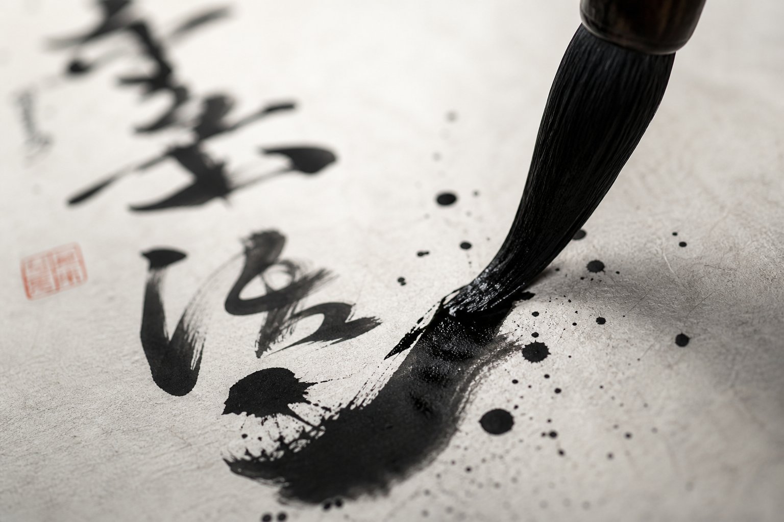
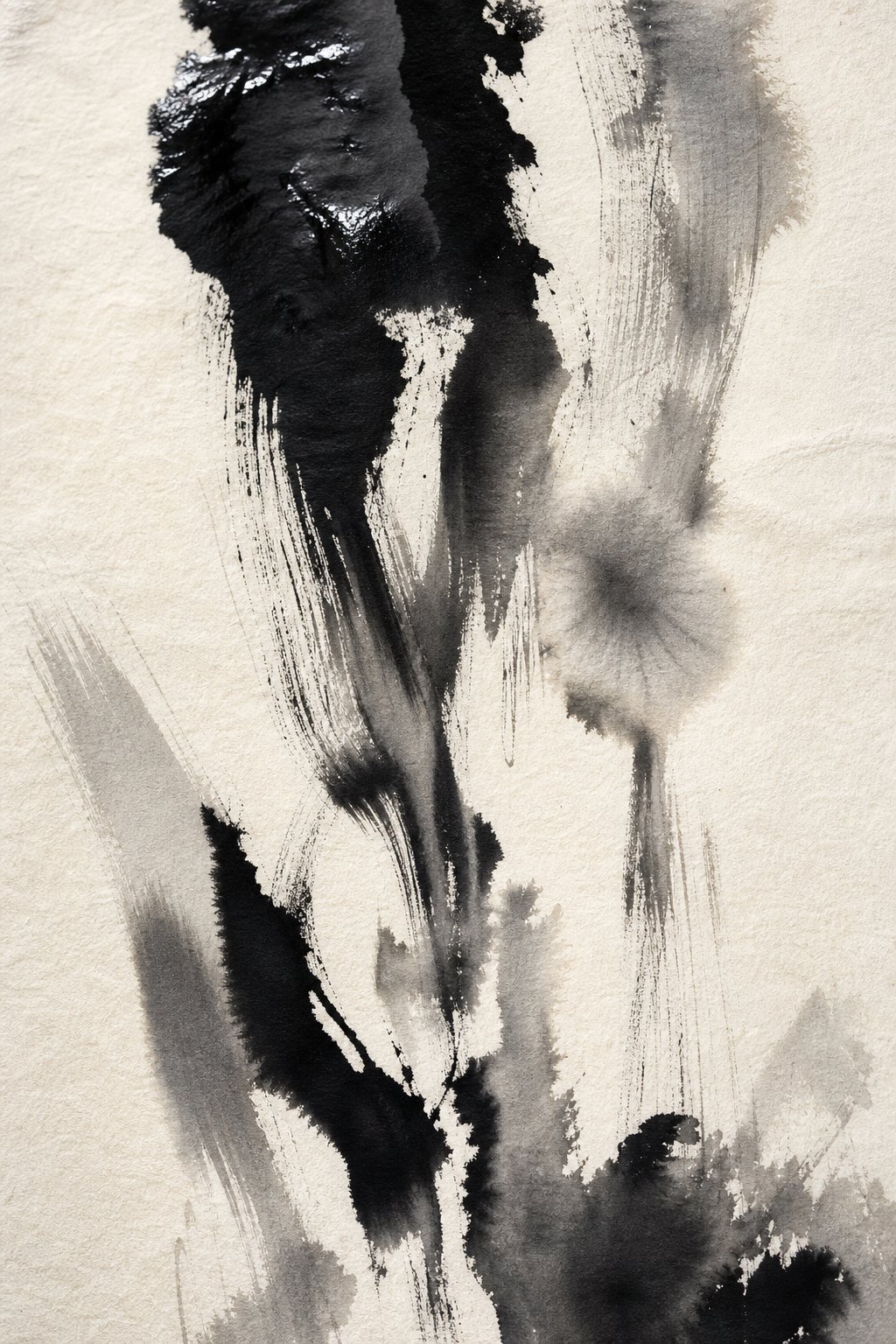
Rhythm and movement in cursive script are not metaphors. They are literal, physical realities of the brush in motion. A great cursive work varies tempo constantly: the brush accelerates through linking strokes, pauses at turning points, slows to deposit thick ink at the start of a character, then races through a trailing tail. This variation creates visual music. You can feel the speed changes by looking at the thickness and texture of the line.
Imagine a drummer who plays at one constant tempo. Technically correct, but lifeless. A master calligrapher modulates speed the way a musician modulates dynamics. Fast passages create thin, taut lines with "flying white" (飛白/fēibái), where the brush moves so quickly that dry bristle marks streak across the paper. Slow passages produce dense, saturated strokes that anchor the composition. The interplay between connected strokes and deliberate breaks, moments where the brush lifts and re-enters, creates a visual rhythm of continuity and pause that keeps the eye moving through the work.
This is not random variation. Classical calligraphy theory describes it through the concept of 氣韻 (qìyùn), meaning "breath-rhythm" or "spirit-resonance." A work with strong qìyùn feels alive. The viewer senses the calligrapher's breathing, their physical momentum, the moments of gathering energy and releasing it. Without this rhythmic variation, cursive script becomes a flat stream of connected lines, technically cursive but aesthetically dead.
Spatial Composition and Ink Variation
Beyond the individual stroke, two structural principles govern what makes great cursive calligraphy at the compositional level: 章法 (zhāngfǎ) and 墨法 (mòfǎ).
Zhāngfǎ, or spatial composition, concerns how characters relate to each other across the entire work. In regular script, characters sit in uniform invisible boxes. In cursive, those boxes dissolve. Characters expand and contract, lean into each other, leave vast empty spaces or crowd together in dense clusters. The white space (留白/liúbái) is not leftover background. It is an active compositional element, as deliberate as the ink itself. A master calligrapher composes the entire page the way a painter composes a landscape: balancing density against openness, weight against lightness, movement against stillness.
Mòfǎ, or ink modulation techniques in cursive calligraphy, adds a third dimension to this spatial play. The calligrapher controls ink density by varying how much ink the brush carries and how much pressure is applied. A freshly loaded brush produces jet-black, glossy strokes (濃墨/nóngmò). As the ink depletes, strokes become progressively drier and lighter (枯墨/kūmò), until the brush is nearly empty and leaves only faint, broken traces. Rather than reloading the brush at a constant interval, a skilled calligrapher uses this natural depletion as an expressive tool, creating passages that transition from rich darkness to ghostly dryness within a single column of text.
Together, zhāngfǎ and mòfǎ produce a work that breathes. Dense, dark passages feel heavy and grounded. Light, dry passages feel ethereal and fast. The contrast between them generates visual tension and release across the entire composition.
The Role of Spontaneity and Controlled Chaos
These technical principles only become art when animated by something deeper. Classical Chinese aesthetics locates that deeper element in the philosophical traditions of Daoism and Chan Buddhism, both of which profoundly shaped the aesthetic principles of Chinese cursive calligraphy.
"The intention precedes the execution" (意在筆前/yì zài bǐ qián) — a principle attributed to Wang Xizhi (王羲之), meaning the calligrapher must conceive the composition's spirit before the brush touches paper, so that the work emerges as an integrated whole rather than an accumulation of strokes.
This principle, documented in classical calligraphy treatises and discussed in the Stanford Encyclopedia of Philosophy's entry on Chinese aesthetics, describes a paradox at the heart of cursive practice. The calligrapher prepares through meditation and mental conception, yet the actual execution must feel effortless and unforced. The preparation enables spontaneity rather than contradicting it.
Daoist philosophy in Chinese calligraphy manifests through the concept of 自然 (zìrán), meaning naturalness or spontaneity. In Daoist thought, zìrán is not randomness. It is the spontaneous self-expression of things acting according to their true nature, unforced and unconstrained. Applied to calligraphy, this means the brush should move as naturally as water flowing downhill: following its own momentum, responding to the texture of the paper, the wetness of the ink, the energy of the calligrapher's body. The result looks effortless precisely because it is not forced.
Chan Buddhism contributed a complementary idea: sudden, non-rational insight that bypasses deliberate calculation. The Tang dynasty wild cursive masters Zhang Xu and Huaisu both practiced in states of heightened spontaneity, whether induced by wine, emotion, or meditative absorption. Their work embodies what classical theory calls the calligrapher becoming a "medium" for creative movement rather than its conscious director. As the Stanford Encyclopedia notes, the artist "lets the Dao act within them" and is "only a medium; the gesture is never pushed forward."
This is what ultimately distinguishes masterful cursive from mere speed. Fast writing is mechanical. Great cursive calligraphy channels a state where technical mastery has been so deeply internalized that the calligrapher's conscious mind steps aside, allowing rhythm, space, and ink to organize themselves through trained instinct. The looseness and absence of constraint that define cǎoshū are not the result of insufficient mastery. They are the product of mastery so complete that it becomes invisible.
These aesthetic ideals sound abstract until you see them embodied in specific works by specific hands. The masters who achieved this synthesis of technique and philosophy each did so in distinctive ways, leaving behind a lineage of styles that continues to define the art form.
Stroke Simplification Rules and Reading Cursive Script
Aesthetic mastery operates on top of a structural foundation. Before a calligrapher can channel rhythm and spontaneity, they must internalize a systematic set of rules governing how regular script becomes cursive in Chinese. These are not arbitrary distortions. They follow consistent, learnable patterns that have been codified over centuries into what is called 草法 (cǎofǎ), the "method of cursive." Understanding these cursive script stroke simplification rules is also the key to reading works that otherwise appear indecipherable.
Core Stroke Transformation Principles
When you look at a cursive character next to its regular script equivalent, the two can seem completely unrelated. Yet the transformation between them follows a limited set of Chinese cursive character transformation patterns applied repeatedly across thousands of characters. Think of these patterns as a grammar: once you learn the rules, you can decode forms you have never seen before.
Here are the core transformation principles that govern how standard characters become cursive forms:
- Stroke merging (連筆/liánbǐ): Two or more separate strokes are executed as a single continuous movement. A horizontal stroke followed by a vertical stroke, for example, becomes one fluid L-shaped gesture without the brush lifting from the paper.
- Stroke elimination (省筆/shěngbǐ): Redundant or structurally predictable strokes are simply omitted. If a component's identity remains recognizable without a particular dot or short stroke, that element disappears.
- Radical abbreviation (簡化偏旁/jiǎnhuà piānpáng): Complex radicals are reduced to a few representative strokes. The water radical (氵), for instance, often becomes a single downward sweep. The grass radical (艹) may reduce to a quick horizontal flick.
- Component substitution (替代/tìdài): Certain character components are replaced by standardized cursive symbols that bear no visual resemblance to the original but are universally recognized within the cursive system.
- Continuous-stroke linking (一筆書/yībǐshū): An entire character, or even multiple characters, is written without lifting the brush. All internal strokes flow into one another through connecting movements that may not correspond to any stroke in the standard form.
- Circular substitution (圈替/quāntì): Complex enclosed structures or repeated dots are replaced by a simple circular or looping motion, dramatically reducing stroke count while preserving the character's overall silhouette.
These principles do not operate in isolation. A single cursive character typically reflects several transformations applied simultaneously. The Smithsonian's National Museum of Asian Art illustrates this vividly: the word chrysanthemum (菊花/júhuā), which requires twenty strokes across two characters in standard script, becomes one sweeping stroke in cursive. That single gesture reflects stroke merging, elimination, radical abbreviation, and continuous linking all at once.
Common Radical Simplifications in Cursive
Radicals are the building blocks of Chinese characters, and their cursive abbreviations are among the most consistent and learnable patterns in the system. Because the same radical appears across dozens or hundreds of characters, learning its cursive form unlocks recognition of an entire family of words.
Some of the most frequently encountered radical simplifications include:
- 言 (speech radical): Reduced from seven strokes to a short vertical line with a quick rightward hook, often resembling a simple tick mark.
- 氵 (water radical): Three separate dots become a single downward curved stroke.
- 糸 (silk radical): The complex six-stroke form simplifies to a small looping figure, often resembling the numeral 3.
- 門 (gate radical): The full enclosure collapses into a single angular stroke on the left side.
- 艹 (grass radical): Two short vertical strokes connected by a horizontal become one quick horizontal sweep or a connected zigzag.
These abbreviations are not optional stylistic choices. They are standardized conventions that any trained reader of cursive script would recognize. A calligrapher who invents personal abbreviations outside this system produces work that is not cursive but simply illegible.
How to Read and Recognize Cursive Characters
So how do you actually learn to read Chinese cursive script characters? The challenge is real. As Hacking Chinese notes, even learners who read printed Chinese fluently can be completely lost when encountering handwritten or cursive forms. Stroke order knowledge becomes critical here: if you understand the sequence in which strokes are written, you can trace the logic of how they were merged or linked, even when the result looks nothing like the printed character.
Practical approaches for building cursive reading ability include:
- Study cursive script dictionaries (草書字典/cǎoshū zìdiǎn): These reference works show the cursive forms of individual characters as written by historical masters. Both printed volumes and online searchable databases exist, allowing you to look up a character's standard form and see its various cursive renderings across different periods and calligraphers.
- Learn radical abbreviations first: Since radicals repeat across many characters, recognizing their cursive forms gives you partial decoding ability for hundreds of characters at once.
- Practice with model texts (字帖/zìtiè): Working through famous cursive works with annotated standard-script transcriptions trains your eye to associate cursive gestures with their underlying characters.
- Use stroke order as a decoding tool: When a cursive character is confusing, mentally trace the standard stroke order and look for where strokes have been merged or eliminated. The sequence remains consistent even when individual strokes disappear.
- Read in context: Just as you can guess a misspelled word in English from surrounding text, cursive characters become easier to identify when you understand the phrase or poem they belong to. Literary knowledge and contextual inference are legitimate reading strategies.
For art collectors and museum visitors who want to appreciate cursive calligraphy without becoming practitioners, even a basic familiarity with these transformation principles changes the viewing experience. You stop seeing random abstract marks and start perceiving the underlying logic: where strokes were merged, which radical was abbreviated, how the brush traveled from one character to the next. The work remains visually stunning, but it also becomes intellectually legible at a structural level.
These transformation rules are the shared vocabulary that connects every cursive calligrapher across two millennia. Yet within that shared system, individual masters developed radically different voices, each pushing the boundaries of abbreviation and expression in distinctive directions.
Famous Masters of Cursive Script Calligraphy
Rules and principles live in textbooks. They come alive only through the hands of individual artists who internalize them so completely that something personal emerges on the other side. The greatest cursive script calligraphers in history did not merely follow the system of stroke transformation. They expanded it, broke it open, and left behind works so distinctive that experts can identify the calligrapher from a single character. Each master represents a different answer to the same question: how far can the brush go?
Early Masters From Zhang Zhi to the Two Wangs
The lineage begins with Zhang Zhi (張芝), a figure from the Eastern Han dynasty whose reputation towers over the earliest period of cursive development. Known as the "Sage of Cursive" (草聖/cǎoshèng), Zhang Zhi is credited with transforming draft cursive (章草/zhāngcǎo) from bureaucratic shorthand into a deliberate art form. His innovation was connecting characters across entire lines in continuous brush movement, a technique no one before him had attempted systematically.
Zhang Zhi's cursive script is celebrated for its dynamic, free-flowing, and natural appearance. His extraordinary talent allowed him to create unparalleled beauty with apparent effortlessness. Yet he never wrote his famous cursive pieces when feeling rushed. He understood that true mastery required combining technical brilliance with inner calm. None of his original works survive, but copies and descriptions confirm his foundational role. Even Wang Xizhi, widely considered the greatest calligrapher in Chinese history, acknowledged Zhang Zhi's superiority in cursive.
Wang Xizhi (王羲之, 303-361 CE) and his son Wang Xianzhi (王獻之, 344-386 CE), collectively called the "Two Wangs" (二王/èr Wáng), represent the next evolutionary leap. Wang Xizhi's cursive script contributions extended beyond technical innovation. He developed modern cursive (今草/jīncǎo) into a style that balanced expressive freedom with structural elegance. His characters are fluid and rounded, abandoning the flat clerical-influenced forms of zhāngcǎo while maintaining enough structure for trained readers to follow.
Wang Xizhi mastered all script styles, but his semi-cursive and cursive works set standards that have endured for over sixteen centuries. His son Wang Xianzhi pushed further toward continuous, unbroken movement, linking more characters per gesture and introducing greater variation in character size within a single composition. Where the father balanced control and release, the son leaned toward release. Together, they established the aesthetic vocabulary that every subsequent cursive calligrapher either built upon or reacted against.
Tang Dynasty Wild Cursive Masters
The Tang dynasty produced two figures who redefined what cursive could be. Zhang Xu (張旭) and Huaisu (懷素) are the twin pillars of wild cursive (狂草/kuángcǎo), and their reputations have only grown across twelve centuries.
The Zhang Xu wild cursive calligraphy style earned him the nickname "Crazy Zhang" (顛張/diān Zhāng). He reportedly drew inspiration from watching a princess's sword dance, from the movements of porters carrying loads, and from the natural flow of water. His brushwork is explosive: characters expand and contract dramatically, lines surge with kinetic energy, and the entire composition feels like a physical event captured on silk. Zhang Xu held official positions but was remembered primarily as a creative force who treated calligraphy as performance. His surviving works, preserved through copies, show a command of spatial drama unmatched in his era.
Huaisu (懷素, 737-799 CE), the drunken monk calligrapher, was a Buddhist monk from Hunan province whose wild cursive rivaled Zhang Xu's in intensity but differed in character. Where Zhang Xu's energy feels muscular and outward, Huaisu's feels wiry and relentless. His most famous work, the Autobiography (自敘帖/Zìxù Tiè), is a long scroll written in wild cursive that describes his own artistic journey. The brushwork is thin, fast, and continuous, with characters flowing into one another like a river that never pauses.
Huaisu reportedly practiced so obsessively that he wore through multiple stone inkstones and planted banana trees specifically to use their broad leaves as writing surfaces when paper was scarce. The legend of his drunken writing sessions gave him the paired nickname with Zhang Xu: "Crazy Zhang and Drunk Su" (顛張醉素/diān Zhāng zuì Sù). Whether the intoxication was literal or a metaphor for creative absorption, the result was calligraphy that embodied Chan Buddhist spontaneity in every stroke.
Later Innovators and Their Legacy
The Tang dynasty wild cursive masters cast a long shadow, but later centuries produced calligraphers who found new paths within the tradition. Huang Tingjian (黃庭堅, 1045-1105) of the Song dynasty stands out as the most significant post-Tang innovator in cursive script.
Huang Tingjian was one of the top four calligraphy masters of the Song dynasty, alongside Su Shi, Mi Fu, and Cai Xiang. His wild cursive was directly derived from Huaisu's work, but he transformed it into something distinctly his own. Where Huaisu's lines are thin and swift, Huang Tingjian's are bold and expansive, with dramatic extensions that stretch strokes far beyond their expected boundaries. His compositions feature a distinctive rhythm of tight clusters followed by sweeping, elongated gestures that create a sense of breathing space within dense text.
More scholarly and introverted than his contemporary Su Shi, Huang Tingjian brought a contemplative, carefully constructed quality to his cursive that contrasted with the Tang masters' emphasis on spontaneous eruption. His approach proved that wild cursive did not require wildness of personality. It could emerge from deep study and intellectual rigor. His technique of "flying white" (飛白/fēibái), where the brush moves so quickly that dry streaks appear within the stroke, became a hallmark of his style and influenced calligraphers for centuries afterward.
These famous Chinese cursive calligraphy masters form a lineage, but not a straight line. Each responded to predecessors while asserting individual vision. Zhang Zhi established the possibility. The Two Wangs refined it into balanced art. Zhang Xu and Huaisu exploded it into pure expression. Huang Tingjian proved it could be reinvented through scholarly discipline. Their collective legacy is not a single style but a living tradition of creative dialogue across centuries, one that continues to shape how cursive script is practiced, studied, and appreciated in the present day.
Modern Relevance of Cursive Script Calligraphy
A tradition born from Han dynasty clerks scribbling on bamboo slips now appears in contemporary art galleries, wellness retreats, smartphone interfaces, and luxury branding campaigns. The masters profiled above practiced in a world where brush and ink were everyday tools. That world is gone. Yet cursive script calligraphy has not only survived the digital revolution but found new purposes within it, adapting to contexts its originators could never have imagined.
Cursive Calligraphy in Contemporary Art
In galleries from Beijing to New York, contemporary artists are using cursive script as raw material for work that blurs the boundary between calligraphy, painting, and installation. The WRITE research project, funded by the European Research Council, documents how new forms of calligraphy in contemporary China are redefining Chinese cultural identity. Their findings reveal that calligraphy has "exploded into a plethora of different forms in all fields of visual and performing arts, from graffiti art to fashion design, as it has never happened before."
This explosion reflects four decades of sweeping social, political, and economic change. Artists trained in traditional brush techniques now work across media: some project cursive characters as light installations, others incorporate them into street art, and still others deconstruct cursive forms into abstract compositions that retain the kinetic energy of cǎoshū without any readable content. The WRITE project identifies trends spanning fine art, decorative and applied arts, performing arts, and graffiti, all drawing on calligraphy's visual vocabulary.
What makes cursive script particularly attractive to contemporary artists is its inherent abstraction. Because kuángcǎo already pushes characters beyond legibility, the leap from calligraphy to pure visual art is shorter than with any other script style. The gestural energy, spatial drama, and rhythmic variation that define great cursive work translate directly into the language of contemporary abstraction. Artists can honor tradition while speaking to global audiences who may never read a single Chinese character.
Meditative Practice and Wellness Benefits
Beyond the gallery, a growing global community practices Chinese cursive calligraphy as meditation. The appeal is intuitive: the slow, focused brushwork demands full attention, quiets mental chatter, and produces a tangible artifact of concentrated presence. But the therapeutic benefits of Chinese calligraphy practice are not just anecdotal. They are backed by clinical research.
A study published in Psychology Research and Behavior Management compared Chinese calligraphic handwriting (CCH) with meditation as stress reduction interventions over eight consecutive weeks. The results were striking: calligraphy practice significantly decreased heart rate and increased skin temperature in participants, effects comparable to those achieved through traditional meditation. The researchers concluded that CCH "represents an equally useful technique for reducing stress" and noted a key advantage: unlike meditation, which is purely emotion-focused, calligraphy integrates mind and body through the physical act of writing, simultaneously promoting cognitive facilitation and physiological relaxation.
Additional research from the same team has found positive effects of brush calligraphy on cognitive enhancement in children with attention deficit hyperactivity disorder, cognitive recovery in Alzheimer's patients, and emotional stability in people with depression or cancer. The act of brushing requires heightened attention and concentration, resulting in what researchers describe as an integration of mental calm and physical activity that few other practices achieve.
Cursive script, with its emphasis on continuous flow and rhythmic variation, is particularly well suited to meditative practice. The unbroken brush movement of jīncǎo or kuángcǎo creates a sustained state of focused attention that mirrors the continuous awareness cultivated in mindfulness meditation. You are not stopping to think about individual strokes. You are riding a wave of movement that demands presence without deliberation.
Digital Fonts and Modern Applications
The modern uses of cursive script calligraphy extend into the digital realm, though the relationship between traditional practice and digital tools is complex. Cursive script digital font design in Chinese presents unique challenges. Unlike regular script, where each character occupies a uniform square and strokes are discrete, cursive characters vary wildly in size, connect across boundaries, and depend on context for their specific form. A single character may have dozens of legitimate cursive variants depending on what precedes and follows it.
The broader story of Chinese digital typography, as documented by Sixth Tone, shows how practical constraints shaped which script styles dominated screens. Heiti (black-style) fonts won the digital era because their uniform stroke thickness rendered clearly at low resolutions. Semi-cursive and cursive styles, with their variable strokes and connected forms, were far harder to digitize effectively. As display technology has advanced, however, more expressive typefaces have become viable, and designers increasingly draw on calligraphic aesthetics for branding, app interfaces, and digital publications.
Semi-cursive (行書/xíngshū) fonts appear frequently in digital design where brands want to convey elegance, tradition, or cultural sophistication without sacrificing readability. Full cursive fonts are rarer in functional contexts but appear in decorative applications: logo design, packaging, book covers, and digital art. The challenge remains that true cursive resists systematization. Each character's form depends on the calligrapher's momentum, the surrounding characters, and the compositional context, qualities that static font files struggle to capture.
Here are practical ways people engage with cursive calligraphy in the modern world:
- Studio practice: Traditional brush-and-ink sessions, often in group classes or solo practice following classical model texts (字帖/zìtiè), remain the primary mode of engagement for serious practitioners.
- Wellness and mindfulness programs: Hospitals, corporate wellness initiatives, and retreat centers incorporate calligraphy sessions as stress reduction interventions, supported by clinical evidence of physiological benefits.
- Contemporary art creation: Artists use cursive forms as visual vocabulary in mixed-media work, installations, and performance pieces that reach audiences beyond the calligraphy world.
- Digital design and branding: Designers adapt cursive aesthetics for logos, packaging, and user interfaces where cultural resonance and visual distinction matter.
- Academic study and cultural preservation: Scholars, museums, and digital archives work to document, catalog, and make accessible historical cursive works for research and public education.
- Casual appreciation: Museum visitors, art collectors, and cultural enthusiasts develop viewing literacy through exhibitions, online resources, and introductory workshops without pursuing full mastery.
Digital tools like calligraphy apps and stylus-based tablets offer entry points for exploration, but practitioners widely agree that they complement rather than replace traditional brush practice. The physical resistance of paper, the unpredictability of ink flow, and the full-body engagement of standing at a table with a loaded brush create sensory feedback that no screen can replicate. Technology lowers the barrier to curiosity. The brush remains the path to depth.
This coexistence of ancient practice and modern application raises a practical question for anyone drawn to the art form: where do you actually begin?
How to Begin Learning Cursive Script Calligraphy
The honest answer is: not with cursive. This surprises people who are drawn to the expressive energy of cǎoshū and want to dive straight in. But every experienced practitioner will tell you the same thing: cursive script mastery requires deep internalization of standard forms first. You cannot meaningfully abbreviate what you do not thoroughly understand. The best order to learn Chinese calligraphy styles follows a progression that builds each layer of skill on the one before it.
Building a Foundation Before Cursive
Regular script (楷書/kǎishū) is where everyone starts. As the Eastern Stillness beginner guide emphasizes, the correct path moves from basic strokes to kǎishū to consistency before attempting flowing styles. This is not arbitrary gatekeeping. Regular script teaches you the exact structure of every stroke, the precise order in which they are written, and the spatial relationships between components within a character. When you later encounter those same components merged, abbreviated, or eliminated in cursive, you recognize what is missing because you know what was originally there.
Here is the recommended learning progression for anyone serious about how to learn Chinese cursive script calligraphy:
- Basic strokes (基本筆畫/jīběn bǐhuà): Master the eight fundamental strokes — horizontal, vertical, dot, hook, turning, rising, left-falling, and right-falling — until they feel natural and consistent.
- Regular script (楷書/kǎishū): Practice complete characters with correct structure, proportion, and stroke order. Spend months here, not weeks. A stable foundation in 300-500 common characters gives you the structural vocabulary cursive will later transform.
- Running script (行書/xíngshū): Learn to loosen your hand and connect strokes naturally. This intermediate step teaches you how characters behave when freed from rigid separation, without yet requiring memorization of new forms.
- Modern cursive (今草/jīncǎo): Begin studying the specific cursive forms (草法/cǎofǎ) of characters you already know well. Use annotated model texts that show standard and cursive forms side by side.
- Wild cursive (狂草/kuángcǎo): Only after years of practice, when your brush control and compositional sense are mature, attempt the fully expressive forms of kuángcǎo.
Realistic expectations matter. Visible improvement in regular script comes within one to three months of daily practice. Running script fluency takes another six months to a year. Reaching a point where your cursive feels genuinely expressive rather than merely sloppy typically requires several years of consistent work. This is not discouraging. It is the nature of any deep art form.
Choosing Model Texts and Practice Methods
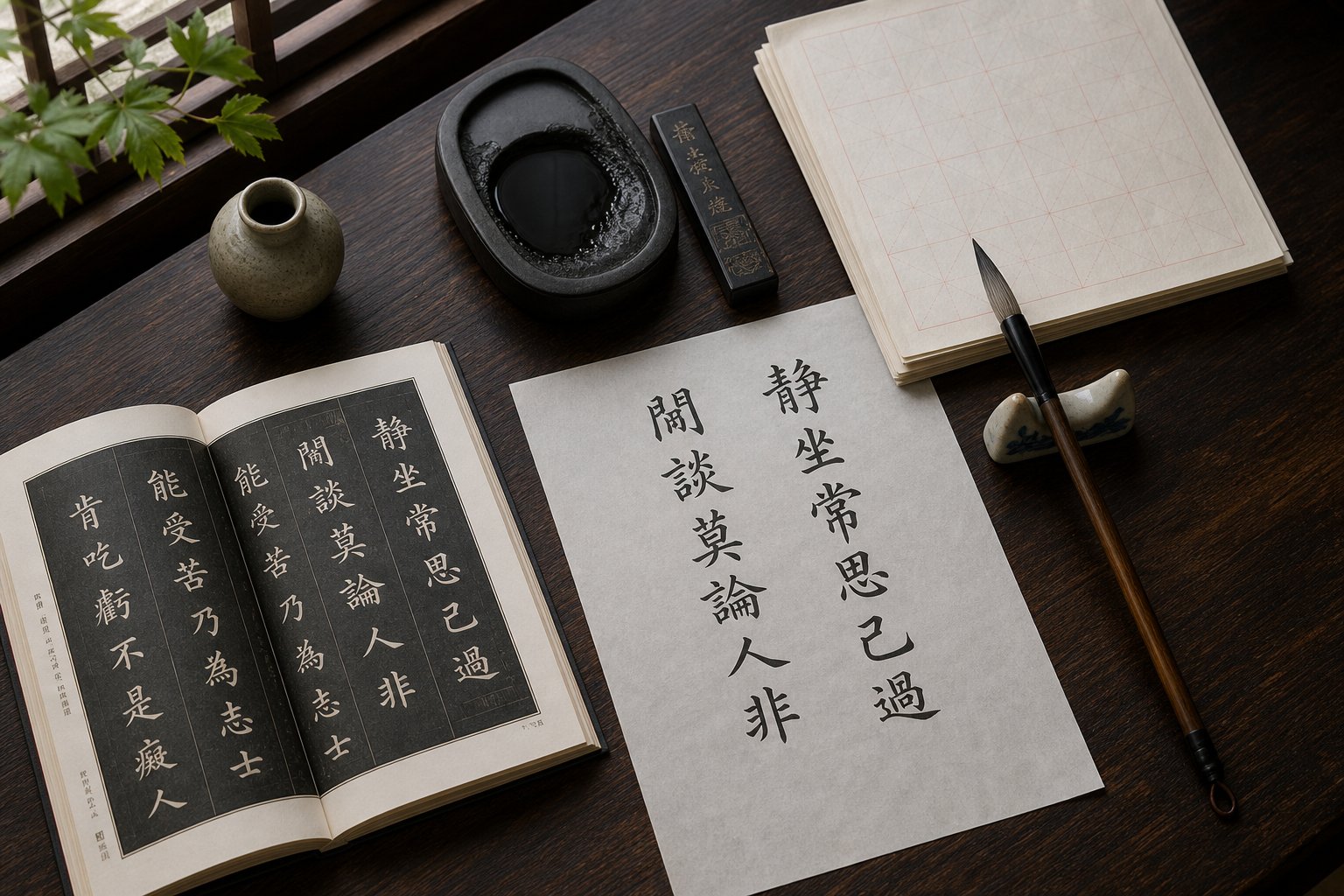
Traditional cursive calligraphy practice methods for beginners center on 臨帖 (líntie), the practice of copying masterworks. You place a classical model text (字帖/zìtiè) beside your paper and reproduce it stroke by stroke, absorbing the master's rhythm, spacing, and structural choices through your hand rather than your intellect alone.
For cursive study, widely recommended model texts include Wang Xizhi's Seventeen Model Letters (十七帖/Shíqī Tiè) for modern cursive, and Huaisu's Autobiography (自敘帖/Zìxù Tiè) for wild cursive. Beginners in cursive should start with jīncǎo models before attempting kuángcǎo. Annotated editions that include standard-script transcriptions alongside the cursive original are especially valuable for building recognition.
Essential materials remain simple: a medium-soft brush (兼毫/jiānháo works well for beginners), liquid ink or an ink stick with grinding stone, practice paper (毛邊紙/máobiānzhǐ for daily work, rice paper for finished pieces), and a felt pad beneath. The tools have not changed in centuries because they do not need to.
Resources for Continued Learning
Not everyone who appreciates cursive calligraphy needs to practice it. If you are a museum visitor, collector, or cultural enthusiast, knowing how to appreciate Chinese cursive calligraphy art without picking up a brush is entirely valid. A few principles transform your viewing experience:
- Look for rhythm variation — where the brush accelerates and slows, where lines thicken and thin.
- Notice the balance between ink-dense passages and dry, streaked sections (飛白/fēibái).
- Observe how the calligrapher uses empty space as a compositional element, not just background.
- Follow the energy of the line from top to bottom, sensing where the brush lifted and re-entered.
- Read the colophons and seals surrounding the main text for historical context about the work's provenance.
The Asian Art Museum's educational resources offer accessible entry points for developing this kind of visual literacy, including video introductions and downloadable guides designed for viewers without prior calligraphy training.
Whether you approach cursive script as a practitioner or an observer, you are engaging with one of humanity's longest continuous artistic traditions. Over two millennia, cǎoshū has absorbed the philosophical depth of Daoism and Chan Buddhism, the creative daring of Tang dynasty rebels, and the quiet discipline of Song dynasty scholars. It has survived the end of brush-based writing, the digital revolution, and the globalization of visual culture. It persists because it offers something no other art form quite replicates: the direct, unmediated trace of a human mind in motion, preserved in ink on paper, alive across centuries.
Frequently Asked Questions About Cursive Script Chinese Calligraphy
1. What is cursive script (草書) in Chinese calligraphy?
Cursive script, known as 草書 (cǎoshū) or 'grass script,' is one of the five major styles of Chinese calligraphy. It drastically simplifies standard characters by merging, eliminating, and linking strokes into continuous brush movements. Unlike regular or running script, cursive forms must be memorized separately because the transformations are too radical to deduce from standard characters. Special training is required both to write and read cǎoshū, making it the least legible but most expressively powerful of all Chinese script styles.
2. What are the three types of Chinese cursive script?
Chinese cursive script includes three sub-types arranged on a spectrum of increasing abstraction. Zhāngcǎo (章草, draft cursive) is the oldest form from the Han dynasty, where characters remain separate and follow consistent abbreviation rules. Jīncǎo (今草, modern cursive) developed during the Wei-Jin period and allows characters to link across lines with greater fluidity. Kuángcǎo (狂草, wild cursive) emerged in the Tang dynasty as the most extreme form, where entire lines merge into continuous kinetic gestures that prioritize artistic expression over legibility.
3. How is cursive script different from semi-cursive (running script) in Chinese calligraphy?
Running script (行書/xíngshū) relaxes regular script by softening corners and partially connecting strokes, but the underlying character structure stays recognizable to anyone who reads standard Chinese. Cursive script (草書/cǎoshū) operates on fundamentally different principles: characters are systematically transformed through codified abbreviation rules called 草法 (cǎofǎ), often bearing no visual resemblance to their standard equivalents. Learning running script builds directly on regular script proficiency, while cursive requires memorizing an entirely separate set of character forms.
4. Who are the most famous cursive script calligraphers in Chinese history?
The lineage of celebrated cursive masters spans nearly two millennia. Zhang Zhi (張芝) of the Han dynasty earned the title 'Sage of Cursive' for first elevating the style into art. Wang Xizhi (王羲之) and his son Wang Xianzhi (王獻之) refined modern cursive during the Jin dynasty. The Tang dynasty produced Zhang Xu (張旭) and the monk Huaisu (懷素), both wild cursive pioneers known collectively as 'Crazy Zhang and Drunk Su.' Song dynasty master Huang Tingjian (黃庭堅) later proved that wild cursive could emerge from scholarly discipline rather than spontaneous eruption.
5. How should a beginner start learning Chinese cursive script calligraphy?
Begin with regular script (楷書/kǎishū), not cursive. Spend months mastering basic strokes and character structure until you internalize the standard forms that cursive later transforms. Progress to running script (行書/xíngshū) to learn natural stroke connection, then study modern cursive (今草/jīncǎo) using annotated model texts that show standard and cursive forms side by side. Classical works like Wang Xizhi's Seventeen Model Letters are widely recommended starting points. Wild cursive (狂草/kuángcǎo) should only be attempted after years of consistent practice across the earlier styles.