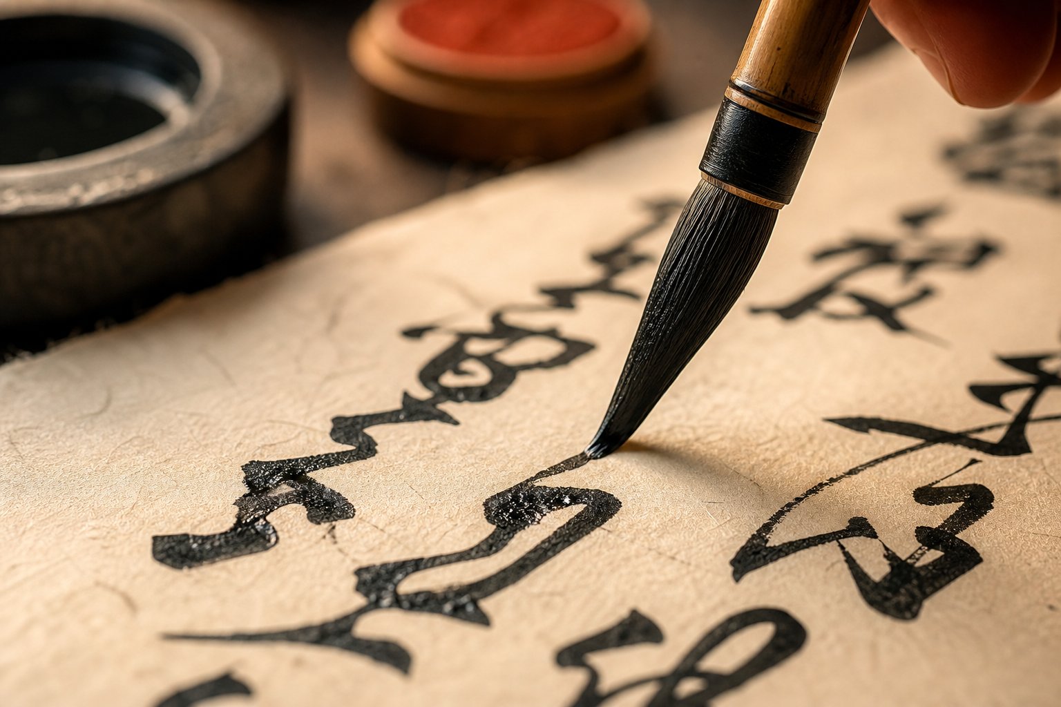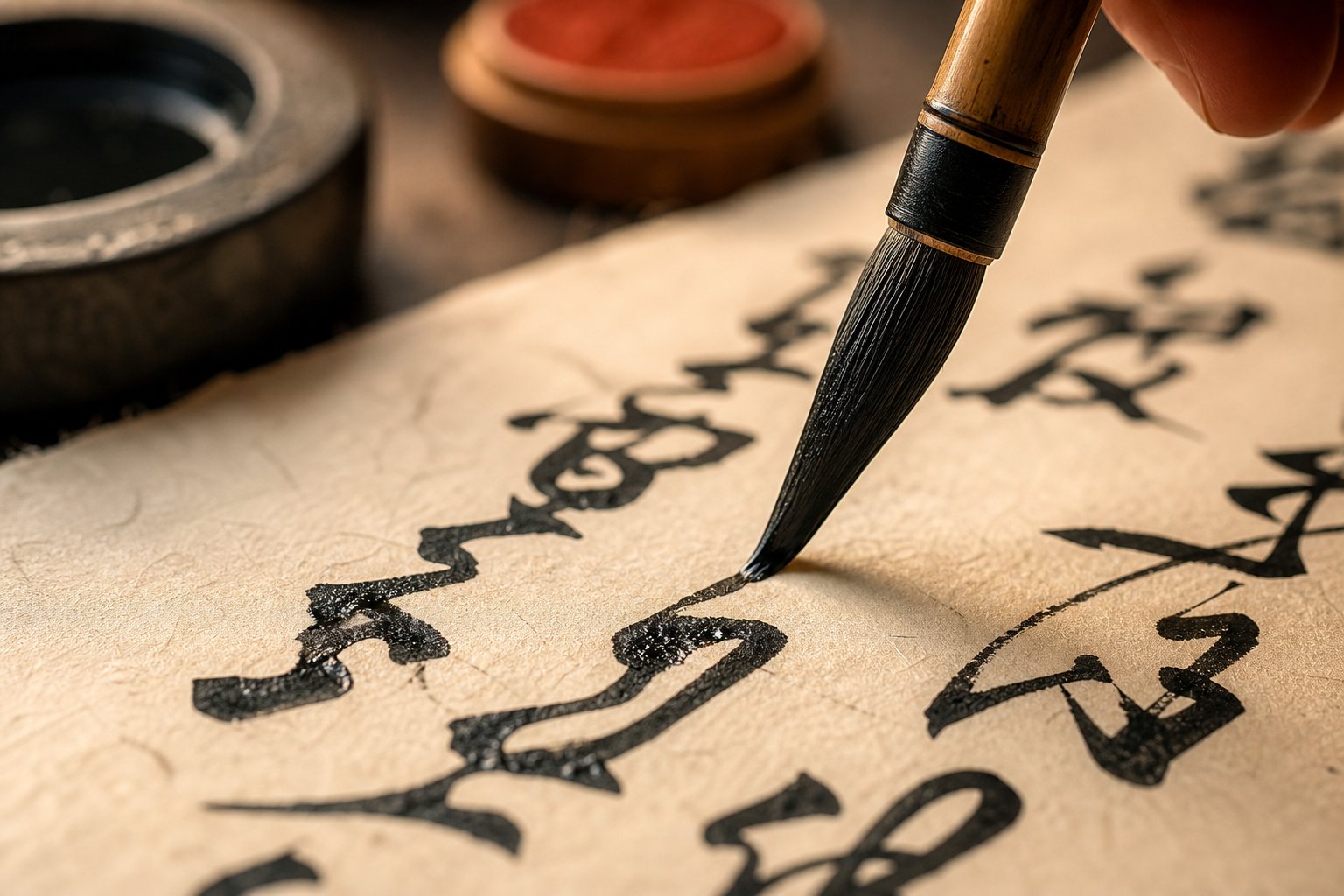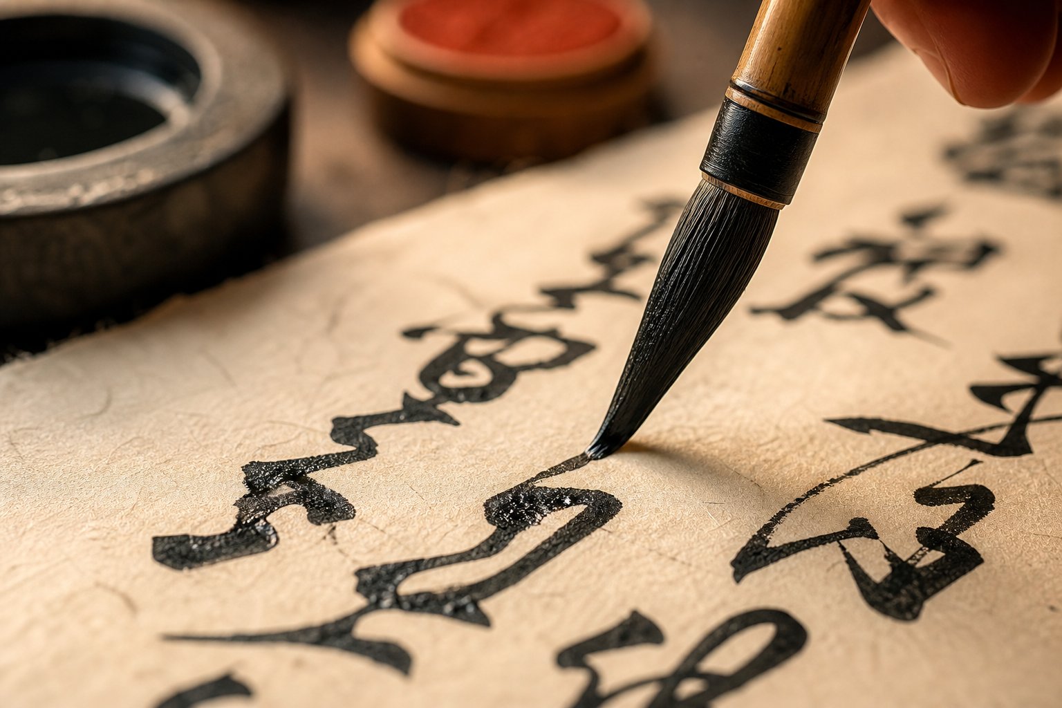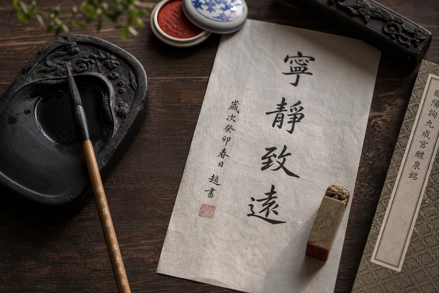
The Art of Writing Your Chinese Name in Calligraphy
Imagine your name transformed into flowing ink strokes, each line carrying centuries of artistic tradition. Chinese calligraphy, or 书法 (shūfǎ), is one of the world's oldest continuous art forms, dating back as early as 200 BCE. Writing your name in this tradition connects something deeply personal, your identity, with a practice that has shaped East Asian culture for millennia.
This guide takes a hands-on workshop approach to chinese name calligraphy. Whether you are a heritage learner wanting to write your birth name with beauty and precision, or a non-Chinese speaker looking to create a transliterated or chosen Chinese calligraphy name, you will walk through each style step by step. No prior experience required. By the end, you will have the skills to create chinese calligraphy that feels both authentic and personal.
Why Writing Your Name in Chinese Calligraphy Matters
In Chinese tradition, a person's name carries weight far beyond identification. It appears on personal seals, formal documents, artwork, and gifts. The practice of carving a name into a seal stone, known as 印章 (yìnzhāng), has been used for authentication and artistic expression since the Qin Dynasty. According to traditional conventions, a person typically owns multiple name seals for different occasions, each one carved in a specific calligraphy style to match its purpose.
Name calligraphy also plays a role in everyday cultural life. Parents carefully select characters for a child's name based on meaning, visual balance, and how the characters look when written with a brush. Wedding invitations, certificates, and gifts often feature hand-brushed names in formal scripts. Even company seals on contracts use calligraphic name characters stamped across pages for authentication. Your name, rendered in calligraphy, becomes more than text. It becomes a piece of art that represents you.
What You Will Learn in This Guide
This guide covers five major calligraphy styles, each offering a distinct visual identity for the same characters. You will progress through them in a logical sequence:
- Kaishu (楷书) - Regular Script, the clear and structured foundation style
- Xingshu (行书) - Running Script, a fluid everyday style with connected strokes
- Caoshu (草书) - Cursive Script, the most expressive and abstract form
- Lishu (隶书) - Clerical Script, known for its wide, elegant horizontal strokes
- Zhuanshu (篆书) - Seal Script, the ancient rounded style used for personal seals and art
The same two or three characters that form your name can look structured and precise in Regular Script, flow like water in Running Script, or take on the balanced symmetry of an ancient seal in Zhuanshu. Learning multiple styles reveals how dramatically a single name transforms across the full spectrum of Chinese calligraphy.
Each chapter ahead walks you through a specific stage, from choosing your characters and gathering tools to mastering stroke order and composing a finished piece. Think of it as a chinese calligraphy creator workshop in written form. You will also find guidance on using a chinese calligraphy maker or calligraphy chinese generator tool to preview how your name looks in each style before committing brush to paper.
The journey starts with the most fundamental decision: which characters will represent your name.
Step 1 Choose or Transliterate Your Chinese Name
Before any brush touches paper, you need characters to write. If you already have a Chinese name, whether given at birth or chosen later, you can skip ahead. But if you are starting from scratch, this step shapes everything that follows. The characters you select determine stroke complexity, visual balance, and how your name looks across calligraphy styles.
Two main approaches exist for creating a Chinese name: phonetic transliteration, where you match the sounds of your existing name to Chinese characters, and meaning-based selection, where you choose characters for their significance and visual appeal. Both are valid, and many people blend the two for a name that sounds familiar yet carries deeper meaning.
Phonetic Transliteration Tables and How They Work
Ever wondered what happens behind the scenes when a chinese character translator converts "Michael" into 迈克尔 (Màikè'ěr)? The process follows a standardized phonetic mapping system. Each syllable in your name gets matched to a Chinese character that approximates its sound, regardless of that character's meaning.
Here is how syllable matching works in practice. Chinese is a monosyllabic language at the character level, so each character represents one syllable. A name like "Anderson" breaks into three syllables: An-der-son, which maps to characters like 安德森 (Āndésēn). The online pinyin romanization system helps bridge the gap between English sounds and available Chinese syllables.
A few practical considerations shape this process:
- Chinese has no equivalent for certain consonant clusters (like "str" or "bl"), so these get split or approximated
- Final consonants like "m," "n," or "ng" may shift to the nearest available Chinese syllable ending
- Tone is typically ignored in transliteration since the goal is sound matching, not tonal accuracy
- Shorter transliterations generally look better in calligraphy, so two or three characters are ideal
Standard transliteration tables, like those used by Chinese embassies and media outlets, provide consistent mappings. For example, "Smith" becomes 史密斯 (Shǐmìsī) and "Wilson" maps to 威尔逊 (Wēi'ěrxùn). A chinese letters generator or chinese writing generator tool can automate this lookup, but understanding the logic helps you make better choices, especially when multiple character options exist for the same sound.
The limitation of pure phonetic transliteration? The resulting characters often carry no cohesive meaning. 迈克尔 literally translates to something like "stride-overcome-that," which reads as nonsense in Chinese. This is why many people prefer the meaning-based approach, particularly when the name will be displayed as calligraphy art.
Meaning-Based Name Selection for Calligraphy
Choosing characters by meaning gives you a name that functions like traditional chinese names do: each character carries intention. Chinese parents spend considerable time selecting characters with auspicious meanings, personality wishes, or nature references for their children. You can apply the same philosophy.
Chinese name structure follows a specific formula. The surname (one character) comes first, followed by a given name of one or two characters. This means your complete name will be either two or three characters total. For calligraphy purposes, three-character names offer more visual variety and compositional balance on the page, while two-character names create a striking, minimal impact.
When selecting characters specifically for calligraphy display, consider both meaning and visual structure. Characters with varied stroke counts create dynamic compositions. A simple surname paired with a complex given-name character produces appealing contrast. Here are common surname characters that work beautifully across all five calligraphy styles:
- 王 (Wáng) - King; simple four-stroke structure with strong horizontal lines
- 李 (Lǐ) - Plum; balanced top-bottom composition with the wood radical
- 林 (Lín) - Forest; symmetrical double-wood structure, visually striking in seal script
- 张 (Zhāng) - Stretch/bow; dynamic left-right structure with the bow radical
- 陈 (Chén) - Ancient; left-right composition with the hill radical
For given-name characters, pretty chinese names often draw from nature, virtues, or abstract beauty. Popular choices that display well in calligraphy include:
- 海 (hǎi) - Ocean; contains the water radical (氵), which flows elegantly in cursive styles
- 文 (wén) - Literature/scholar; balanced and graceful across all scripts
- 静 (jìng) - Tranquility; complex enough to showcase brush skill
- 龙 (lóng) - Dragon; dramatic stroke structure, especially powerful in running script
- 云 (yún) - Cloud; simple yet poetic, transforms beautifully in seal script
- 杰 (jié) - Outstanding; strong bottom structure anchors the character visually
A useful approach is to use a chinese character generator tool to explore options, then write each candidate character by hand to feel how the strokes flow. Some characters that look appealing in print become awkward under a brush, while others reveal unexpected beauty when written with ink. The alphabet in chinese characters does not map one-to-one, so think in terms of syllables and meanings rather than individual letters.
With your characters chosen, the next question becomes which visual style will bring them to life, and that choice depends on understanding what makes each of the five major scripts distinct.
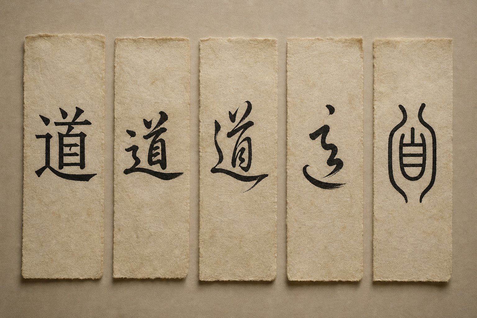
Step 2 Understand the Five Major Calligraphy Styles
Each calligraphy script carries its own personality. The same name characters that look precise and angular in one style can appear wave-like, rounded, or almost abstract in another. Chinese calligraphy evolved over roughly two thousand years, and that evolution produced five distinct chinese script styles, collectively known as 五体 (wǔ tǐ), the Five Scripts. Understanding their differences helps you choose the right visual voice for your name.
Think of it this way: these five chinese writing styles sit on a spectrum from structure to expression. On one end, you have scripts that prioritize clarity and discipline. On the other, scripts that prioritize speed, emotion, and artistic freedom. Your name can live anywhere on that spectrum depending on the occasion and your intent.
Regular and Clerical Scripts as Foundation Styles
If you are writing your name in mandarin calligraphy for the first time, Kaishu (楷书 kǎishū) is where you begin. Also called Standard or Regular Script, Kaishu emerged during the late Han Dynasty and reached its golden age in the Tang Dynasty. Its defining quality is structure. Every stroke sits upright and square within an imaginary grid, making characters immediately legible. The famous Song Dynasty calligrapher Su Shi described it well: "Standard Script is like standing." For name writing, Kaishu works on formal documents, certificates, and any context where readability matters most. It is also the basis for most modern chinese calligraphy font designs and printed typefaces you see in textbooks and apps.
Lishu (隶书 lìshū), or Clerical Script, offers a different kind of formality. Developed after Seal Script to improve writing efficiency for government scribes, Lishu flattens characters horizontally and introduces the distinctive "silkworm head, wild goose tail" (蚕头燕尾 cántóu yànwěi) stroke endings. These wave-like horizontal strokes give name characters a grounded, elegant presence. Lishu works beautifully for decorative name plaques, certificates, and formal displays where you want something more visually distinctive than Regular Script but still fully readable.
Running, Cursive, and Seal Scripts for Artistic Expression
Xingshu (行书 xíngshū), Running Script, is the calligraphy script most Chinese people use in daily handwriting. It partially connects strokes and relaxes the rigid structure of Kaishu, creating a natural, flowing rhythm. For name calligraphy, Running Script strikes a balance: it looks artistic and personal while remaining legible to most readers. If you want a mandarin calligraphy font style for signing artwork or writing gifts, Xingshu is a strong choice.
Caoshu (草书 cǎoshū), Cursive Script, pushes further into abstraction. Chinese cursive dramatically abbreviates characters, sometimes reducing a complex name character to just a few continuous strokes. Speed and emotion drive this style. It follows a codified system called 草法 (cǎofǎ), so the abbreviations are standardized rather than improvised. Caoshu is best suited for artistic name pieces where visual impact matters more than instant readability.
Zhuanshu (篆书 zhuànshū), Seal Script, is the oldest of the five and the most visually distinct. Characters appear rounded, symmetrical, and almost pictographic. Stroke thickness stays uniform throughout, with no sharp corners or dramatic pressure changes. This is the style carved into personal name seals (印章 yìnzhāng) and used for formal artwork signatures. If you plan to create a name chop, Seal Script is the traditional choice. Its ancient aesthetic also makes it popular as a chinese calligraphy typeface for logos and decorative art.
| Style | Difficulty | Best Use Cases | Visual Characteristics | Stroke Connections |
|---|---|---|---|---|
| Kaishu (楷书) Regular | Low - best for beginners | Formal documents, certificates, learning foundation | Square, upright, clear structure | None - each stroke is separate |
| Lishu (隶书) Clerical | Medium | Name plaques, decorative displays, formal art | Wide, flat, wave-like horizontal endings | Minimal - strokes mostly independent |
| Xingshu (行书) Running | Medium | Gifts, signatures, personal artwork, letters | Flowing, relaxed, slightly slanted | Partial - some strokes connect naturally |
| Caoshu (草书) Cursive | High | Expressive art pieces, wall scrolls, abstract display | Fast, abbreviated, highly fluid | Extensive - most strokes merge continuously |
| Zhuanshu (篆书) Seal | High | Personal seals, chops, logos, tattoos, ancient-style art | Rounded, symmetrical, uniform thickness | None - strokes are even and self-contained |
A useful way to remember the progression: calligraphy evolved from structure toward efficiency toward expression. Seal Script came first as structured pictographs, Clerical Script streamlined those forms for speed, Regular Script standardized them for clarity, Running Script loosened them for daily use, and Cursive Script freed them entirely for art. Your name can inhabit any point along that timeline.
Choosing a style is one decision. Executing it well depends on having the right tools in hand, and each of these five scripts demands slightly different materials to achieve its characteristic look.
Step 3 Gather Essential Calligraphy Tools and Materials
A chinese paint brush behaves nothing like a ballpoint pen. The tip flexes, the ink flows unpredictably, and the paper absorbs moisture in ways that change your strokes entirely. This is why tool selection matters so much in calligraphy. The wrong brush paired with the wrong paper can make even a skilled writer's name look clumsy, while the right combination makes each stroke feel effortless.
Traditional Chinese calligraphy revolves around four core calligraphy tools known as the Four Treasures of the Study (文房四宝 wénfáng sìbǎo): the brush (笔 bǐ), ink (墨 mò), paper (纸 zhǐ), and inkstone (砚 yàn). Each one interacts with the others, and each style of calligraphy places different demands on all four. Think of these tools as instruments in an orchestra. The style you are writing determines which instruments take the lead.
Brush Selection by Calligraphy Style
Not all brushes are created equal. The hair type, stiffness, and tip shape of your chinese brush painting tool directly determine what kind of strokes you can produce. Here is how brush choice maps to each script:
Wolf-hair brushes (狼毫 lángháo) use weasel hair and produce stiff, springy tips. They snap back into shape after each stroke, giving you precise control over angles and endpoints. This makes them ideal for Regular Script (Kaishu) and Clerical Script (Lishu), where every stroke needs a deliberate beginning and ending. When writing your name in these structured styles, a wolf-hair brush helps you nail those crisp horizontal lines and sharp turning points.
Goat-hair brushes (羊毫 yángháo) are soft and absorbent, holding large amounts of ink. They bend easily under pressure, which creates the thick-to-thin variation that Running and Cursive scripts demand. For chinese ink painting and expressive calligraphy alike, goat-hair brushes let you sweep through connected strokes without lifting. The trade-off is less precision, which is exactly what Caoshu's fluid energy requires.
Mixed-hair brushes (兼毫 jiānháo) combine both hair types, offering moderate stiffness with decent ink capacity. These are the best all-around choice for beginners who plan to practice multiple styles. If you are buying one brush to start, a medium-sized mixed-hair brush covers the most ground.
For Seal Script specifically, look for a brush with a blunt, rounded tip rather than a sharp point. Seal Script strokes maintain even thickness throughout, so a brush that naturally produces uniform lines saves you from fighting against a tapered tip.
Ink, Paper, and Practice Surface Choices
Ink consistency changes the character of your strokes more than most beginners expect. Thicker ink, ground slowly on an inkstone with minimal water, produces dense black lines with crisp edges. This works best for Seal Script and Regular Script, where stroke boundaries need to stay sharp. More diluted ink flows faster off the brush, suiting the speed of Running and Cursive scripts where you want strokes to glide without dragging.
Should you grind your own ink or use bottled? For beginners, bottled ink is perfectly fine. It saves time and delivers consistent results. As your skill develops, grinding an ink stick on a stone becomes part of the meditative preparation, and it gives you precise control over thickness. Many calligraphers treat the grinding ritual as a warm-up that focuses the mind before writing.
Paper choice matters just as much. Traditional xuan paper (宣纸) comes in two main types: raw (生宣 shēng xuān) and processed/ripe (熟宣 shú xuān). Raw xuan paper absorbs ink quickly and allows it to bleed outward, creating expressive effects suited to Cursive and Running scripts. Processed xuan paper resists absorption, giving you more control and time to adjust, which makes it ideal for Regular Script and Seal Script practice. Beginners should start with processed paper or gridded practice sheets that help maintain consistent character proportions.
For an even more affordable practice option, water-writing cloth (水写布 shuǐ xiě bù) lets you practice with plain water instead of ink. Strokes appear dark on the cloth and fade as the water evaporates, giving you unlimited reuse without any mess. This is excellent for drilling stroke order and brush control before committing to ink and paper.
Here is a beginner supply checklist organized by priority:
- Essential (start here): One medium mixed-hair brush, bottled calligraphy ink, gridded practice paper or water-writing cloth, a felt pad to place under your paper
- Recommended (add within the first month): One wolf-hair brush for Regular Script detail, processed xuan paper for finished pieces, an ink dish or small plate for ink control
- Advanced (as your skills grow): Goat-hair brush for cursive work, ink stick and inkstone for grinding, raw xuan paper for expressive styles, a brush rest and brush hanger for proper storage
You do not need everything at once. A single brush, some ink, and a stack of gridded paper will carry you through the first several weeks of practice. The important thing is matching your tools to the style you are working on, and upgrading as your technique demands more from your materials.
With the right tools laid out on your desk, the real work begins: understanding how each stroke in your name characters should be ordered, angled, and executed.
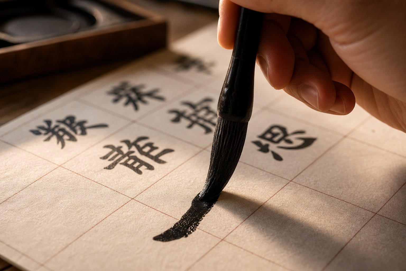
Step 4 Master Stroke Order for Common Name Characters
Every Chinese character follows a specific construction sequence. Get the sequence wrong, and the character looks off balance, even if every individual stroke is technically correct. Chinese character stroke order is not arbitrary. It reflects centuries of refinement around how the brush moves most naturally across paper, how ink flows between strokes, and how the hand maintains rhythm without awkward repositioning.
When you learn how to write chinese characters for calligraphy, stroke order becomes even more critical than in casual handwriting. Each stroke's ending position sets up the starting position of the next one. In Regular Script, this creates clean spatial relationships. In Running and Cursive scripts, it determines which strokes can merge into continuous movements. Mastering mandarin stroke order for your name characters in Regular Script first gives you the structural blueprint that all other styles modify.
Universal Stroke Order Rules for Name Characters
Eight basic strokes form the building blocks of every Chinese character. Before tackling full name characters, you need to understand how each stroke behaves under the brush. Here they are, ordered from simplest to most complex:
- Heng (横) - Horizontal: Move left to right with even pressure. Begin with a slight downward press, glide steadily, and end with a brief pause. This stroke dominates characters like 王 (Wáng), which contains three horizontals.
- Shu (竖) - Vertical: Move top to bottom with steady, controlled pressure. Keep the line straight and centered. The vertical stroke in 王 connects all three horizontals like a pillar.
- Pie (撇) - Left-falling: Start with pressure at the top right, then sweep down and left while gradually lifting. This stroke appears in 李 (Li) and in the person radical (亻) found in many given-name characters.
- Na (捺) - Right-falling: Begin lightly at the top left, increase pressure as you move down and right, and finish with a strong tapered foot. Paired with pie in characters like 木 (wood radical), it creates visual balance.
- Dian (点) - Dot: A quick press-and-release that creates a teardrop shape. The heart radical (心) uses multiple dots, and they appear throughout characters like 张 (Zhang) in its right component.
- Ti (提) - Rising: Start with pressure at the bottom left and flick upward to the right. Common in the water radical (氵), which appears in name characters like 海 (ocean) and 清 (clear).
- Gou (钩) - Hook: A sharp directional change attached to the end of another stroke. Hooks appear in the heart radical (心) and add structural anchoring to characters.
- Zhe (折) - Turning: A smooth direction change within a single continuous stroke, like the corner in 口 (mouth) or the angular bends in 张 (Zhang).
These eight strokes combine according to consistent ordering rules. When you draw mandarin characters for your name, follow these principles:
- Top before bottom: in 李, the wood radical (木) on top completes before the child component (子) below
- Left before right: in 张, the bow radical (弓) on the left finishes before the right side (长)
- Outside before inside: enclosing strokes come first, with the closing bottom stroke written last
- Horizontal before vertical: in 王, the top horizontal precedes the vertical that crosses through it
Consider the surname 王 (Wang). Many beginners write all three horizontal lines first, then add the vertical. The correct strokeorder chinese convention is: top horizontal, middle horizontal, vertical, then bottom horizontal. This sequence keeps the brush moving efficiently and produces better proportions. Similarly, 李 (Li) follows a top-to-bottom logic: the horizontal of 木 first, then its vertical, left-falling, right-falling, and finally the three strokes of 子 below.
How Stroke Order Changes Across Styles
Here is what most guides never explain: stroke order is not fixed across all five calligraphy styles. Regular Script follows the rules above strictly, with each stroke clearly separated. But as you move toward Running and Cursive scripts, strokes begin to merge, reorder, and abbreviate based on brush momentum.
In Running Script (Xingshu), the brush stays closer to the paper between strokes, creating visible connecting threads called 牵丝 (qiānsī). This means certain strokes that are separate in Kaishu become one continuous movement. For example, the three dots of the water radical (氵) in Regular Script are written as three distinct downward presses. In Running Script, they often merge into a single flowing line that curves downward, because the brush never fully lifts between them.
Cursive Script (Caoshu) takes this further. Entire radical components get replaced by standardized abbreviations. The heart radical (心) at the bottom of characters like 想 or 思 reduces to a quick horizontal sweep with a hook. The person radical (亻) might become a single curved stroke. These are not improvised shortcuts. They follow codified cursive conventions (草法) that calligraphers must memorize. If you use a chinese character recognizer tool to identify cursive characters, you will notice it relies on these same standardized abbreviations to decode what would otherwise look like abstract marks.
The wood radical (木) offers a clear example of cross-style transformation. In Regular Script, it is four distinct strokes: horizontal, vertical, left-falling, right-falling. In Running Script, the horizontal and vertical often merge into one L-shaped movement, while the two falling strokes connect at their tops. In Cursive Script, the entire radical can compress into two or three rapid strokes that suggest rather than spell out the original form.
For practical study, try this approach: write your name character in Regular Script first, paying strict attention to stroke order. Then, using a draw chinese character lookup resource or reference dictionary, find the same character in Running and Cursive forms. Trace the connections between strokes and identify which ones merged. You can also use a chinese symbol draw tool to practice writing the character in different styles and compare your results against historical examples.
This cross-style awareness is what separates someone who copies calligraphy from someone who truly understands it. When you know why a cursive abbreviation looks the way it does, because it evolved from specific strokes merging in a specific order, your brushwork carries intention rather than imitation.
With stroke order internalized for your name characters, you are ready to put brush to paper in earnest. Regular Script comes first, where every stroke stands alone and demands your full attention.
Step 5 Write Your Name in Regular Script Kaishu
Regular Script is where your name stops being an idea and becomes ink on paper. Kaishu demands that every stroke stand independently, fully formed, with a clear beginning, middle, and end. There is no hiding behind speed or artistic looseness here. Each mark reveals your control, your patience, and your understanding of the character's architecture. This is why every serious chinese calligraphy writer starts with Kaishu before attempting anything else.
Setting Up Your Writing Position and Brush Hold
Your body position affects your brushwork more than you might expect. Sit upright with both feet flat on the floor, your back straight but not rigid, and your non-writing hand resting flat on the paper to hold it steady. The paper should sit directly in front of your writing arm, not off to one side.
The brush grip in Chinese calligraphy differs fundamentally from how you hold a pen. Hold the brush vertically, perpendicular to the paper, using the five-finger method: your thumb presses from the left, your index and middle fingers press from the right, your ring finger pushes outward from inside, and your pinky supports the ring finger. The brush shaft should feel secure but not clenched. If your knuckles turn white, you are gripping too hard.
The critical technique here is the suspended wrist (悬腕 xuánwàn). Rather than resting your wrist on the table like you would with a pen, lift it so that only your elbow touches the desk surface. This feels unstable at first, but it gives your brush full range of motion in every direction. A resting wrist limits you to finger movements, which cannot produce the sweeping strokes and controlled pressure changes that Kaishu requires. For smaller characters, a slightly lowered wrist is acceptable, but for name characters at standard practice size (roughly 7-10 cm square), a suspended wrist is essential.
Writing Each Character with Correct Technique
When you write chinese characters in Kaishu, every stroke follows a three-phase pattern: enter, travel, and exit. The enter phase is where your brush tip touches down at a specific angle, often with a slight reverse movement to hide the starting point. The travel phase carries the stroke through its main body with controlled, even pressure. The exit phase lifts or pauses the brush to create a defined ending.
Take the surname 王 (Wang) as a working example. The top horizontal stroke begins with the brush tip approaching from the upper left at roughly a 45-degree angle. Press down briefly to create a small triangular head, then level the brush and glide rightward with steady, moderate pressure. At the endpoint, pause, press slightly downward, then lift cleanly. This pause-and-press at the end is what gives Kaishu horizontals their characteristic squared-off finish.
The vertical stroke in 王 uses a different entry. Touch down moving slightly leftward, then redirect straight down. Maintain consistent pressure through the middle, and at the bottom, either taper to a point (悬针 xuánzhēn, suspended needle) or round off with a slight leftward pause (垂露 chuílù, hanging dewdrop). For 王, the hanging dewdrop ending works best because it anchors the character visually.
When writing a full name, say 王文海 (Wang Wenhai), consistency becomes the challenge. Each character should occupy roughly the same visual space, even though 文 has only four strokes while 海 has ten. The key is adjusting stroke thickness and spacing within each character's imaginary square. Simpler characters like 文 use slightly thicker strokes and wider spacing to fill their square, while complex characters like 海 use thinner strokes packed more tightly. This keeps the three characters balanced when viewed as a group.
Character spacing in a name follows a simple rule: leave approximately one-half to one-third of a character width between each character. Too close and the name feels cramped. Too far apart and it reads as separate words rather than a unified name. If you practice online chinese character writing using gridded templates, the grid lines help you maintain this spacing until it becomes intuitive.
Common Beginner Mistakes in Regular Script
The most frequent error when people first chinese handwrite in Kaishu is inconsistent stroke thickness. Horizontals come out thin in one character and thick in the next, or verticals wobble because the brush angle shifts mid-stroke. The fix is simple but demanding: slow down. Kaishu is not a fast style. Each stroke should take one to two full seconds, with deliberate pauses at entry and exit points.
Another common problem is incorrect proportions within the character square. Beginners often make the top half of a character too large, leaving the bottom cramped. Or they push a left-side radical too far right, squeezing the right component. Before writing with ink, sketch the character's overall shape mentally. Identify where the visual center of gravity sits. For top-bottom characters like 李, the dividing line falls roughly at the midpoint. For left-right characters like 海, the left radical (氵) should occupy about one-third of the total width.
Rushing through pause points is the third major mistake. In Kaishu, the brief pauses at stroke beginnings and endings are not optional decorations. They are structural. These micro-pauses allow the ink to pool slightly, creating the weighted endpoints that distinguish calligraphy from ordinary handwriting. Skip them, and your characters look like they were written with a marker rather than a brush.
Regular Script requires deliberate slowness at each stroke's beginning and end. The pause is where the art lives. Rush through it, and you are writing characters. Honor it, and you are practicing calligraphy.
A practical way to check your progress is to compare your work against reference examples. Use a chinese handwriting online resource or chinese character writer online tool to generate your name in a standard Kaishu font, then place your brushwork beside it. Look for differences in proportion, stroke angle, and spacing rather than expecting a perfect match. Hand-brushed calligraphy should have life and slight variation. What you are checking is structural accuracy, not mechanical reproduction.
As experienced learners of Chinese characters have noted, rote repetition without understanding does not build lasting skill. Each time you write your name, focus on one specific element: stroke endings one session, proportions the next, spacing the session after that. Targeted practice builds muscle memory faster than mindless repetition ever could.
Regular Script gives your name clarity and discipline. But names also deserve movement and personality, qualities that emerge when you loosen your grip and let the brush begin to flow between strokes.
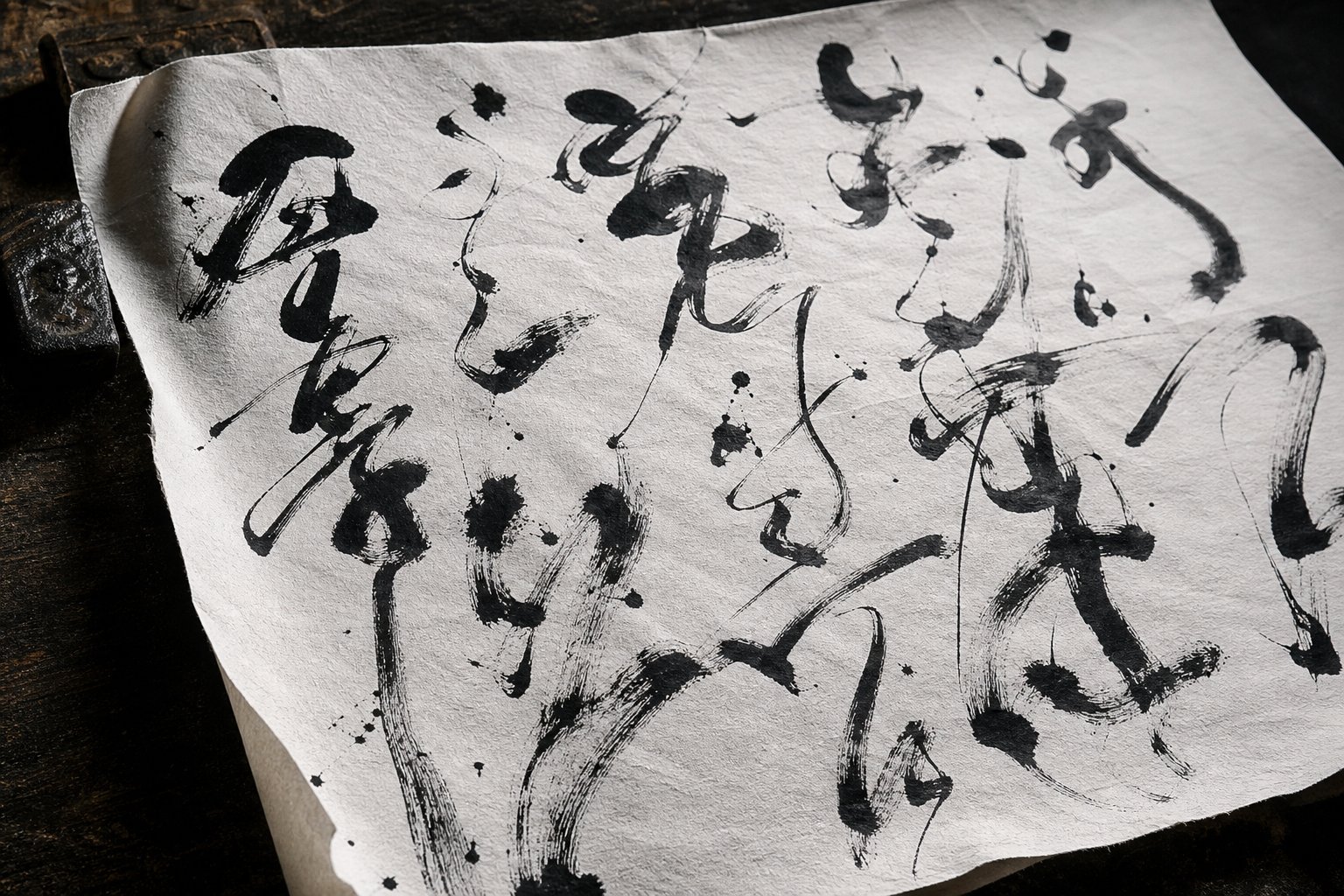
Step 6 Progress to Running and Cursive Scripts
Your name in Regular Script stands upright and still, like a person posing for a formal portrait. Running and Cursive scripts capture that same person in motion, walking gracefully or sprinting with abandon. The characters do not change, but the energy behind them transforms completely. This is where calligraphy cursive techniques turn your name from structured text into something that breathes.
Transitioning to Running Script for Everyday Elegance
Running Script (行书 xíngshū) is what happens when you relax the rules of Kaishu without abandoning them entirely. The Song Dynasty calligrapher Su Shi described it perfectly: "Running Script is like walking." Your brush moves faster, lifts less often, and allows certain strokes to flow into one another through thin connecting threads called 牵丝 (qiānsī). The result is a style that feels personal and fluid while remaining fully readable.
What changes practically when you shift from Regular to Running Script? Three things happen simultaneously:
- Speed increases: Where Kaishu demands one to two seconds per stroke, Xingshu allows you to write at roughly double that pace. The brush spends less time pausing at entry and exit points.
- Pressure lightens: Your brush touches the paper more gently overall, creating thinner baseline strokes with occasional pressure bursts for emphasis. This lighter contact is what allows the brush to glide between strokes without catching.
- Strokes connect selectively: Not every stroke links to the next. You choose which connections feel natural based on brush direction. A horizontal ending on the right might flow directly into a downward vertical that starts nearby, while strokes on opposite sides of a character remain separate.
Imagine writing the surname 王 (Wang) in Running Script. In Kaishu, you wrote three separate horizontals and one vertical, lifting your brush cleanly between each. In Xingshu, the top horizontal flows into the vertical through a visible connecting thread, and the vertical sweeps into the bottom horizontal without a full lift. The middle horizontal might shorten slightly and tilt. The character still reads clearly as 王, but it carries movement and personality that the Regular Script version lacks.
Common name radicals simplify in predictable ways. The water radical (氵) in characters like 海 shifts from three distinct dots to a single curved stroke that suggests all three in one motion. The person radical (亻) in characters like 伟 or 信 merges its two strokes into one fluid downward sweep. These simplifications follow consistent patterns across mandarin cursive traditions, so once you learn how a radical transforms, you can apply that knowledge to any character containing it.
For name calligraphy specifically, Running Script is the most versatile choice. It works for signing artwork, writing gifts, personal letters, and decorative pieces. It looks artistic without being illegible, making it ideal when you want your name to feel handcrafted rather than printed.
Exploring Cursive Script for Artistic Freedom
Cursive Script (草书 cǎoshū) is a different animal entirely. Where Running Script walks, Caoshu sprints. Characters compress into abbreviated forms, strokes merge extensively, and the brush rarely lifts from the paper. A complex name character with twelve strokes in Regular Script might reduce to four or five continuous movements in chinese cursive writing. The visual effect is dramatic: energy, rhythm, and spontaneity replace structure and precision.
Here is what surprises most learners: cursive chinese script is not improvised shorthand. It follows a codified system called 草法 (cǎofǎ), the Cursive Method, where each character has a standardized abbreviated form that must be memorized. You cannot simply connect strokes randomly and call it Caoshu. The abbreviations evolved over centuries and became fixed conventions. Many modern simplified Chinese characters actually originated from these cursive forms, which gives you a sense of how deeply embedded they are in the writing system.
The physical technique shifts significantly. In cursive mandarin calligraphy, your arm drives the movement rather than your fingers or wrist. The brush stays in near-constant contact with the paper, creating continuous flowing lines that loop, curve, and sweep across the character space. Pressure variation becomes extreme: a single character might contain hair-thin connecting lines and thick, ink-saturated power strokes within the same breath of movement. Speed is faster than any other style, but as experienced practitioners emphasize, speed without control produces chaos rather than art.
Three levels of Cursive Script exist, each progressively more abstract:
- Zhangcao (章草) - Early Cursive: More structured, retains some separation between strokes. A good starting point for learning cursive conventions.
- Jincao (今草) - Modern Cursive: More fluid and abstract, with extensive stroke merging. This is the standard form most calligraphers practice.
- Kuangcao (狂草) - Wild Cursive: Highly expressive and extremely difficult to read. Characters become almost purely gestural. This level requires years of mastery.
For name calligraphy, Modern Cursive (Jincao) offers the best balance of expressiveness and recognizability. Your name retains enough structure that a knowledgeable reader can identify it, while the visual energy makes it a striking art piece. If you are exploring a chinese cursive font for digital reference, look for fonts labeled 今草 rather than 狂草 to find forms appropriate for name writing.
The table below shows how the same common name characters transform progressively across these three styles. You will notice that each step removes structure while adding flow:
| Character | Regular Script (Kaishu) | Running Script (Xingshu) | Cursive Script (Caoshu) |
|---|---|---|---|
| 王 (Wang) | Three separate horizontals crossed by one vertical; all strokes independent | Top horizontal connects to vertical via thread; bottom horizontal sweeps with momentum | Entire character becomes two or three continuous curved strokes suggesting the grid structure |
| 海 (Ocean) | Water radical (three dots) plus each component stroke written separately; 10+ strokes total | Water radical merges into one curved line; right component partially connects; 6-7 visible movements | Water radical is a single sweep; right side abbreviates to a few looping strokes; 3-4 total movements |
| 文 (Literature) | Four distinct strokes: dot, horizontal, left-falling, right-falling | Dot flows into horizontal; falling strokes connect at their origin point | Entire character written in one or two continuous motions with minimal lifting |
| 李 (Li) | Wood radical on top (4 strokes) plus child component below (3 strokes); fully separated | Wood radical strokes partially merge; child component flows more quickly; connecting threads visible | Top and bottom components compress into a rapid sequence of 3-4 abbreviated strokes |
A practical way to begin your transition: take your name in Regular Script and write it at gradually increasing speeds. Do not try to jump directly to Cursive. First, let natural connections form as your brush moves faster. Notice which strokes your hand wants to link. These organic connections are the foundation of Running Script. Once Xingshu feels comfortable, study the codified cursive forms of your specific name characters using a reference dictionary or historical examples, then practice those standardized abbreviations until they feel as natural as the original forms.
Running and Cursive scripts give your name velocity and emotion. But calligraphy also moves in the opposite direction, toward ancient stillness and symmetry, where your name takes on the weight of history carved in stone and stamped in red ink.
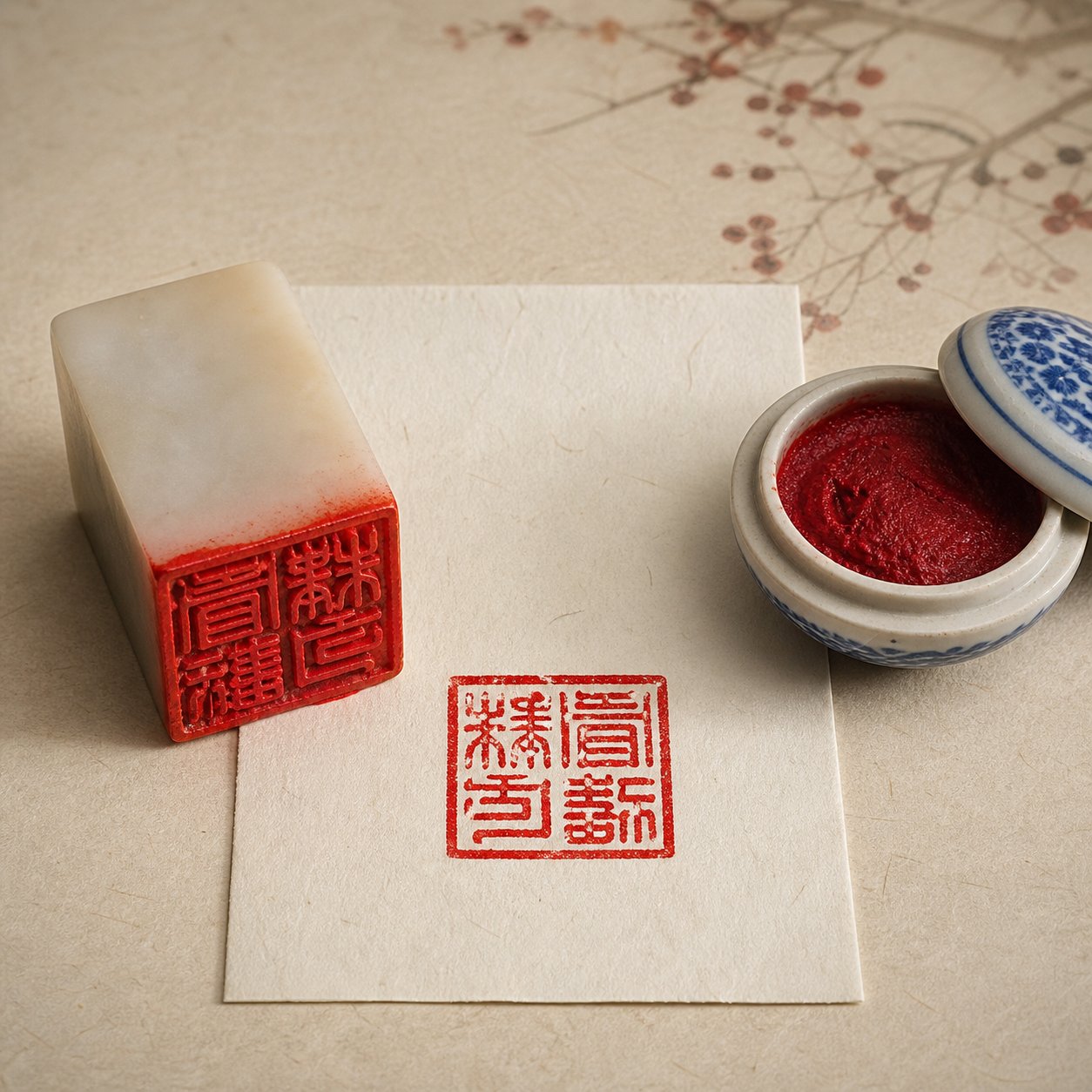
Step 7 Create Artistic Versions in Seal and Clerical Scripts
Seal and Clerical scripts move in the opposite direction from Cursive. Where Caoshu strips characters down to their kinetic essence, these two styles build them back up into something monumental. Your name in Seal Script looks like it was carved into jade two thousand years ago. In Clerical Script, it sits wide and grounded, as if etched into a stone stele meant to last centuries. Both styles transform name characters into ancient chinese symbols that feel less like handwriting and more like architecture.
These are the styles you reach for when your name needs to carry weight and permanence rather than speed and spontaneity. A personal seal stamped in red ink. A name plaque mounted above a doorway. A piece of chinese word art framed on a wall. Seal and Clerical scripts give your name the gravity those contexts demand.
Writing Your Name in Seal Script for Chops and Art
Seal Script (篆书 zhuànshū) is the oldest surviving calligraphy style, with roots stretching back over three thousand years to inscriptions on bronze vessels and oracle bones. When you write your name in this style, you are using character forms that predate the unification of China under the Qin Dynasty. The visual effect is unmistakable: rounded lines, symmetrical structures, and uniform stroke thickness that give every character a balanced, almost geometric appearance.
Two distinct forms of Seal Script exist, and the difference matters for name calligraphy:
Greater Seal Script (大篆 dàzhuàn) encompasses the older, more varied forms found on Zhou Dynasty bronzes and stone drums. Characters in this style tend to be more pictographic and less standardized. Each character retains visible traces of the object or concept it originally depicted. For name calligraphy, Greater Seal Script offers a raw, archaic aesthetic, but its lack of standardization makes it harder to find consistent reference forms for every character.
Lesser Seal Script (小篆 xiǎozhuàn) is the standardized version created under Emperor Qin Shi Huang around 220 BCE, when his advisor Li Si unified the writing system into a set of approximately 3,300 characters. This is the form most commonly used for name seals and artistic calligraphy today. Characters are more uniform, with consistent proportions and predictable structures that make them easier to learn and reproduce.
The physical technique for Seal Script differs from every other style. Your brush moves at a steady, moderate pace with consistent pressure throughout each stroke. There are no dramatic thick-to-thin transitions, no flicked endings, no sharp corners. Every line curves gently, every turn rounds smoothly, and every stroke maintains roughly the same width from start to finish. The brush tip stays centered within each stroke (中锋 zhōngfēng, center-tip technique) at all times. This even, controlled movement is what produces the characteristic ancient chinese writing appearance.
The practical application that keeps Seal Script alive today is personal seal carving (印章 yìnzhāng). A name seal, or chop, is a small stone or wood block with your name carved in mirror-image Seal Script on its face. When pressed into red seal paste (印泥 yìnní) and stamped onto paper, it leaves your name in ancient characters as a signature of authenticity. Artists stamp their seals on finished calligraphy and paintings. Business owners use company seals on contracts. Individuals use personal seals on formal correspondence and legal documents throughout East Asia.
If you plan to have a seal carved, or carve one yourself, you will need your name rendered in Lesser Seal Script specifically. A chinese seal generator tool or a seal script dictionary can show you the correct ancient forms of your name characters. Keep in mind that many modern simplified characters look dramatically different in their Seal Script forms. The character 马 (horse), for example, transforms into a form that visibly resembles a horse with legs and mane, revealing the pictographic origins hidden beneath modern simplification. A chinese seal script generator reference helps you identify these ancient forms accurately before committing them to stone.
For brush-written Seal Script name pieces (as opposed to carved seals), the layout is typically vertical, with characters stacked top to bottom. The symmetrical, rounded quality of Seal Script characters makes them particularly striking when written large, so consider practicing at a generous size, 15 cm or more per character, to fully appreciate the style's balanced beauty. An ancient chinese font reference can provide digital models to study before you attempt brush versions.
Clerical Script for Formal and Decorative Name Pieces
Clerical Script (隶书 lìshū) evolved directly from Seal Script during the Han Dynasty as government scribes needed to write faster without sacrificing formality. The transformation is dramatic: where Seal Script rounds every line, Clerical Script flattens characters horizontally and introduces angular, wave-like stroke endings that give each character a distinctive wide stance.
The signature feature of Lishu is the "silkworm head, wild goose tail" (蚕头燕尾 cántóu yànwěi) technique. Horizontal strokes begin with a rounded, bulging head (like a silkworm) and end with a sweeping, upward-flicking tail (like a goose's tail feathers spreading in flight). This creates a rhythmic visual pattern across your name characters, with each major horizontal stroke carrying this wave-like energy. Not every horizontal gets this treatment, typically only the dominant horizontal in each character receives the full silkworm-head-goose-tail ending, while secondary horizontals remain simpler.
The proportions of Clerical Script characters differ noticeably from Regular Script. Characters spread wider than they are tall, creating a stable, grounded appearance. Vertical strokes shorten relative to horizontals, and the overall center of gravity sits lower in the character space. For name calligraphy, this wide proportion gives your characters a sense of authority and permanence that works beautifully on name plaques, certificates, and formal displays.
Writing your name in Lishu requires a specific brush angle. Unlike the vertical brush hold used in Regular and Seal scripts, Clerical Script benefits from a slightly tilted brush that allows you to create the characteristic flat, broad strokes. The pace is moderate, slower than Running Script but faster than Seal Script. Each stroke has clear intention, with the wave-like endings requiring a deliberate press-and-lift motion at the end of key horizontals.
Clerical Script is particularly well-suited for names displayed at larger sizes. The wide proportions and bold stroke endings remain visually compelling even when viewed from a distance, which is why you see this style on building plaques, memorial inscriptions, and formal signage throughout China. For personal name calligraphy, Lishu offers a middle ground: more visually distinctive than Regular Script, more readable than Seal Script, and carrying a sense of classical formality that suits ceremonial contexts.
Each of these styles serves different purposes. Here are the contexts where Seal Script and Clerical Script work best for name calligraphy:
- Personal seals and chops: Seal Script (Lesser Seal Script specifically) is the traditional and expected choice for carved name seals
- Gifts and commemorative pieces: Both styles work well; Clerical Script for readability, Seal Script for ancient elegance
- Tattoo designs: Seal Script's rounded symmetry translates well to skin; its ancient appearance adds visual distinction
- Wall scrolls and hanging art: Clerical Script's wide proportions fill horizontal scrolls beautifully; Seal Script suits vertical compositions
- Formal documents and certificates: Clerical Script balances formality with legibility, making it ideal for official contexts
- Art pieces and studio signatures: Seal Script connects your name to the long tradition of artist seals stamped on finished works
- Name plaques and signage: Clerical Script's bold strokes and wide stance remain legible at distance
- Logos and branding: Both styles offer distinctive visual identities; Seal Script for heritage brands, Clerical Script for authoritative presence
Whether you choose the ancient roundness of Seal Script or the wave-like authority of Clerical Script, both styles position your name within a tradition that spans millennia. The characters themselves carry the same meaning they always did, but their visual form now speaks a different language, one of permanence, ceremony, and deliberate beauty.
A finished name piece, however, involves more than just well-written characters. The layout, orientation, spacing, and final touches like seal placement and signatures determine whether your calligraphy reads as a polished artwork or an isolated practice exercise.
Step 8 Compose a Finished Name Piece with Proper Layout
Well-written characters alone do not make a finished artwork. Layout, orientation, seal placement, and signing conventions transform isolated brushwork into a cohesive piece that follows centuries of presentation tradition. Think of it like framing a photograph: the image matters, but how you mount and present it determines whether viewers see a snapshot or a portrait.
Whether your name piece is destined for a wall, a gift, or even a reference for chinese writing tattoos, these formatting decisions shape how the final work reads and feels.
Vertical Versus Horizontal Layout Conventions
Traditional Chinese calligraphy reads vertically, top to bottom, with columns progressing from right to left. This orientation dominated for over two thousand years and remains the standard for formal calligraphy pieces, hanging scrolls, and artistic displays. For a name written in Seal Script or Clerical Script, vertical orientation feels natural and historically appropriate. The tall, stacked arrangement gives each character room to breathe and creates a visual rhythm that draws the eye downward.
Horizontal layout, reading left to right, is a modern convention that became standard in mainland China during the twentieth century. It works well for name pieces in Regular Script or Running Script, particularly when the piece will hang in a contemporary setting or serve as a chinese signature on modern documents. Horizontal orientation also suits wider display spaces like mantels, desk frames, or name plaques mounted above doorways.
How do you choose? Match the orientation to both the style and the context:
- Vertical (top to bottom, right to left): Seal Script, Clerical Script, formal art pieces, hanging scrolls, traditional chinese tattoos references, and any piece meant to evoke classical aesthetics
- Horizontal (left to right): Regular Script, Running Script, modern displays, desk pieces, certificates, and contemporary wall art
- Either direction: Cursive Script, which follows the artist's compositional intent rather than strict convention
Spacing between characters in a name follows proportional rules rather than fixed measurements. For a two-character name, leave roughly one-third to one-half of a character width between them. For a three-character name, keep the spacing consistent between all characters, typically one-quarter to one-third of a character width. Tighter spacing creates unity, reading the characters as a single name rather than separate words. Too much space and the name fragments visually.
Margins matter as well. Leave at least one full character width of empty space above the first character and below the last in a vertical piece. This breathing room, called 留白 (liúbái, leaving white), is not wasted space. It frames the calligraphy and gives the ink visual weight against the surrounding emptiness. For those designing tattoo chinese writing or chinese tattoo characters, this principle of balanced negative space translates directly: the skin around the characters is part of the composition.
Adding Seals and Signatures to Complete Your Piece
A red seal stamp is the traditional finishing mark on any calligraphy piece. It serves the same function as a painter's signature on a canvas, authenticating the work and adding a visual accent. The contrast between red seal ink and black brush ink creates a striking color balance that has defined East Asian art for centuries.
Seal placement follows specific conventions based on your layout. On a vertical piece, the seal typically goes in the lower left corner, below and slightly to the left of the final character. On a horizontal piece, it sits at the lower right. The seal should never overlap the main calligraphy characters. Leave at least one character width of space between your last written character and the seal impression. If you are creating a piece that references calligraphy tattoo fonts or a chinese sign tattoo design, note that the seal element often gets incorporated as part of the overall composition rather than placed in a corner.
Applying the seal requires a specific technique. Press the carved face of your seal evenly into red seal paste (印泥 yìnní), rocking it gently to ensure full coverage. Then position it on the paper and press straight down with firm, even pressure. Do not twist or slide. Hold for two to three seconds, then lift cleanly in one motion. The impression should be crisp and complete. Practice on scrap paper first, as uneven pressure produces blotchy or partial stamps.
If you want to add a written signature alongside the seal, use a smaller brush and write in a reduced size, roughly one-third the height of your main name characters. Traditional signatures include the date (often in the Chinese lunar calendar format), the calligrapher's name or studio name, and occasionally a brief inscription noting the occasion or recipient. Position this smaller text to the left of a vertical piece or below a horizontal one.
For mounting and display, several options suit different environments. Framed mounting with a mat protects the paper from dust and humidity while providing a polished presentation for homes and offices. Traditional scroll mounting on silk backing creates an elegant hanging piece that can be rolled for storage. Raw mounting with bamboo rods at top and bottom offers a minimal, contemporary look at low cost. For higher-value pieces, consider museum glass or UV-filtering plexiglass to prevent ink degradation over time.
Here is your complete checklist for taking a name calligraphy piece from blank paper to finished artwork:
- Select your paper size and type based on the calligraphy style (processed xuan for Regular and Seal scripts, raw xuan for Cursive and Running scripts)
- Determine orientation (vertical or horizontal) based on style and display context
- Mark light pencil guidelines for character placement, spacing, and margins if needed
- Prepare your ink to the correct consistency and warm up with practice strokes on scrap paper
- Write your name characters in the chosen style, maintaining consistent size and spacing
- Allow the ink to dry completely, at least fifteen to twenty minutes for standard xuan paper
- Add your written signature and date in smaller script to the appropriate position
- Apply your personal seal in red ink at the correct location relative to the main text
- Let the seal paste dry fully before handling, typically thirty minutes or more
- Choose a mounting method (frame, scroll, or raw mount) suited to your display environment
- Mount or frame the piece, ensuring the paper lies flat without creases or bubbles
- Display in a location away from direct sunlight and excessive humidity to preserve the work
Each piece you complete builds on the last. Your first attempt captures where you are right now as a calligrapher. Your tenth reveals how far you have come. The beauty of name calligraphy is that the subject never changes, only your skill and expression evolve, giving you a built-in measure of growth with every new piece you create.
Frequently Asked Questions About Writing Chinese Names in Calligraphy
1. What is the easiest Chinese calligraphy style for beginners to write their name?
Regular Script (Kaishu) is the best starting point for beginners. Each stroke is written separately with clear beginnings and endings, making it the most structured and readable style. Kaishu teaches fundamental brush control, proper pressure techniques, and correct stroke order that serve as the foundation for all other calligraphy styles. Most calligraphy teachers recommend spending several weeks on Kaishu before attempting Running or Cursive scripts.
2. How do I choose a Chinese name if I am not Chinese?
You have two main approaches: phonetic transliteration or meaning-based selection. Phonetic transliteration matches the sounds of your existing name to Chinese characters using standardized mapping tables. Meaning-based selection lets you choose characters with desirable meanings and visually appealing structures. Many people combine both methods, selecting characters that approximate their name's sound while also carrying positive meanings. For calligraphy purposes, aim for two or three characters with varied stroke counts to create dynamic visual compositions.
3. Which calligraphy style is best for a Chinese name seal or chop?
Lesser Seal Script (Xiaozhuàn) is the traditional and expected choice for personal name seals. Its rounded, symmetrical strokes and uniform line thickness translate perfectly to carved stone surfaces. This style dates back to the Qin Dynasty standardization around 220 BCE and remains the standard for authentication seals used on artwork, formal documents, and business contracts throughout East Asia. When having a seal carved, you will need your name characters rendered specifically in Lesser Seal Script forms, which often look dramatically different from their modern equivalents.
4. What brush should I use for Chinese name calligraphy?
Brush choice depends on the calligraphy style you are writing. Wolf-hair brushes offer stiff, springy tips ideal for Regular Script and Clerical Script where precise stroke control matters. Goat-hair brushes are soft and absorbent, perfect for the flowing movements of Running and Cursive scripts. Mixed-hair brushes combine both types and work as the best all-purpose option for beginners practicing multiple styles. For Seal Script, choose a brush with a blunt, rounded tip that naturally produces uniform-width lines.
5. Can the same Chinese name look completely different across calligraphy styles?
Yes, the transformation is dramatic. A name written in Regular Script appears structured and angular with every stroke clearly separated. The same characters in Running Script gain flowing connections and a relaxed rhythm. In Cursive Script, complex characters may reduce from twelve strokes to just three or four continuous movements. Seal Script renders the name in rounded, symmetrical ancient forms that can look almost unrecognizable compared to modern versions. This visual range is what makes multi-style name calligraphy such a compelling art form.