What Running Script Calligraphy Is and Why It Endures
Imagine watching someone write Chinese characters with a brush. The strokes flow quickly, each one connected to the next by a subtle thread of ink, yet every character remains perfectly readable. That fluid, natural movement is the hallmark of running script calligraphy, a style that has dominated everyday writing across East Asia for nearly two thousand years.
What Is Running Script Calligraphy
Running script calligraphy (行書, xingshū) is the semi-cursive style of Chinese calligraphy that sits between the formal precision of regular script (楷書, kaishu) and the abstract speed of cursive script (草書, caoshu). It prioritizes fluidity and natural rhythm without sacrificing legibility, making it the most widely used calligraphic form for personal and professional writing throughout Chinese history.
So what is running script calligraphy in practical terms? Think of it as the handwriting sweet spot. In regular script, every stroke is isolated, deliberate, and architecturally precise. In cursive script, strokes merge so aggressively that only trained readers can decipher the result. Xingshu semi-cursive Chinese calligraphy occupies the space between these extremes. Individual strokes are sometimes condensed or linked together, but the overall structure of each character stays intact and recognizable.
The Smithsonian's National Museum of Asian Art describes it succinctly: in running script, individual strokes are sometimes eliminated or condensed, and separate characters are joined by linking strokes. Due to its ease, convenience, and legibility, it quickly became the most popular form of Chinese freehand writing in everyday use and retains that status today.
Why Running Script Remains the Most Practical Style
You'll notice something interesting when you look at historical Chinese documents: letters between scholars, official memos, personal journals, poetry drafts. The vast majority are written in running script. There is a simple reason for this. Regular script is beautiful but slow. Cursive script is fast but hard to read. Running hand script gives writers the speed they need for daily communication while keeping their words legible to any educated reader.
This practicality made it the most practical Chinese calligraphy style for over 1,800 years. Government officials used it for correspondence. Poets drafted verses in it. Physicians wrote prescriptions with it. It was, and still is, the natural way educated people write by hand across China, Japan, and Korea.
Its relevance has not faded. Walk through any East Asian city and you will encounter running script on shop signs, restaurant menus, and commemorative plaques. Pick up a handwritten note from a Chinese, Japanese, or Korean speaker, and the writing will almost certainly reflect running script principles, even if the writer has never formally studied calligraphy. The style is so deeply embedded in handwriting culture that people adopt its shortcuts instinctively.
This guide covers the full landscape of the art form, from its historical origins and master practitioners to the brush techniques that bring it to life. Whether you want to appreciate it in a museum, recognize it on a scroll, or pick up a brush yourself, the journey starts with understanding how this style earned its place at the center of East Asian written culture.
Historical Masters Who Shaped Running Script
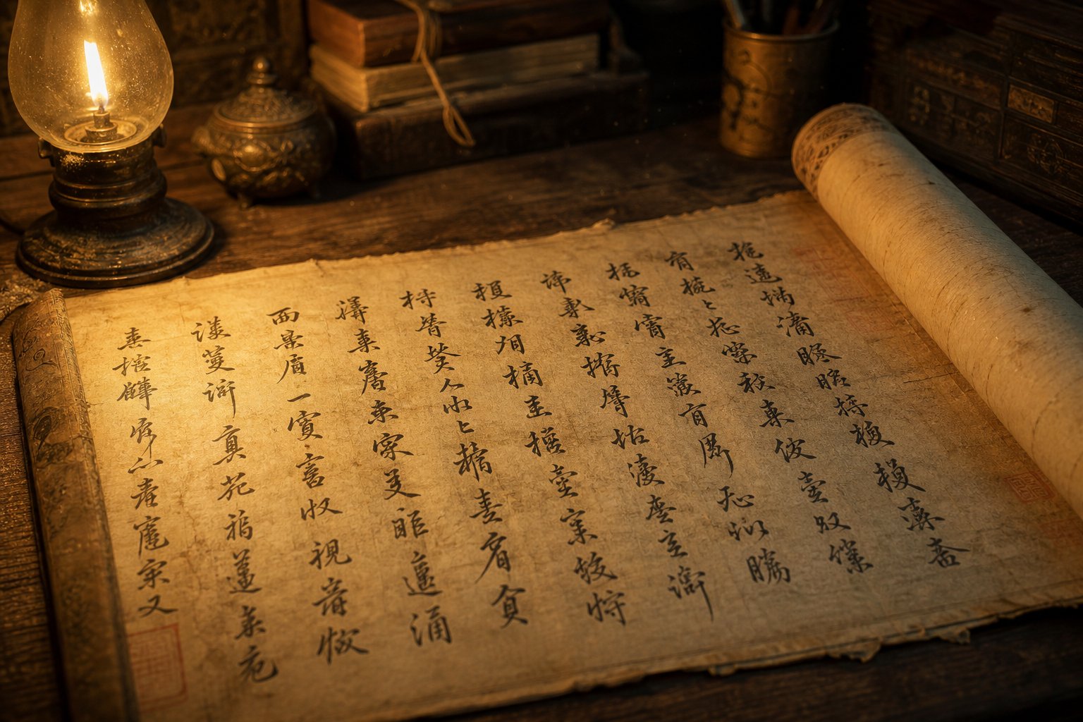
Every calligraphic style has a lineage, a chain of hands passing knowledge from one generation to the next. The history of running script calligraphy stretches back nearly two millennia, shaped by individual masters who each pushed the form in new directions. Tracing that lineage reveals how a practical writing shortcut evolved into one of the most celebrated art forms in East Asian culture.
Origins in the Eastern Han Dynasty
The story begins in the second century CE. Liu Desheng (劉德升, Liu Desheng) from Yingchuan is widely credited as the originator of running script during the Eastern Han dynasty. As the Tang dynasty calligraphy critic Zhang Huaiguan later wrote in his Commentary on Calligraphy, Liu Desheng created a writing form that was "a variation of regular script, easy and convenient to write," and because the brush movement sometimes resembled flowing water, it earned the name running script.
What drove this innovation? Practicality. The formal scripts of the Han period, clerical script (隸書, lishu) and early regular script, demanded slow, deliberate execution. Officials and scholars needed something faster for daily correspondence without resorting to the near-illegible cursive forms already in circulation. Liu Desheng's contribution was finding that middle ground, a style that retained the basic structure of formal characters while allowing strokes to link and simplify naturally.
The style gained momentum quickly. By the Wei and Jin eras (220-420 CE), running script had become popular among the educated class, setting the stage for its greatest practitioner.
Wang Xizhi and the Golden Age of Running Script
If Liu Desheng planted the seed, Wang Xizhi (王羲之, Wang Xizhi, 303-361) made it bloom. Known as the "Sage of Calligraphy" (書聖, Shusheng), this Eastern Jin aristocrat elevated running script from a convenient shorthand into a high art form. He studied widely, mastering clerical, cursive, regular, and running scripts before synthesizing them into a personal style that abandoned the heavier traits of earlier dynasties and achieved what critics describe as unprecedented elegance and fluidity.
His masterpiece is the Preface to the Orchid Pavilion (蘭亭集序, Lantingji Xu), composed in 353 CE during a spring gathering at Lanting in present-day Shaoxing, Zhejiang Province. Forty-two literati gathered along a winding stream for a poetry and wine contest, and Wang wrote the preface to their collected poems on the spot, reportedly in a state of mild intoxication. The result was 324 characters in 28 columns of running script so extraordinary that Wang himself could never replicate it.
What makes this Preface to the Orchid Pavilion calligraphy so remarkable? Consider one detail: the character 之 (zhi) appears twenty times throughout the text, yet Wang wrote it differently each time, never repeating a single form. That kind of spontaneous variation within structural consistency is the essence of running script mastery. The strokes are elegant and fluent, carried by a coherent spirit from the first column to the last.
The original was lost, likely buried with Emperor Taizong of Tang (598-649), who was so obsessed with Wang's calligraphy that he collected over two thousand of his works and had the Lantingji Xu entombed alongside him. What survives are meticulous copies by Tang court calligraphers, the most faithful being the Shenlong version attributed to Feng Chengsu (617-672), now preserved at the Palace Museum in Beijing.
Wang Xizhi's influence was amplified by imperial patronage across multiple dynasties. Emperor Wu of Liang (464-549), Emperor Taizong of Tang (599-649), and Emperor Taizong of Song (939-997) each promoted massive waves of emulation, cementing Wang's status as the supreme running script master for all time.
Running Script Through the Tang, Song, and Beyond
Wang Xizhi cast a long shadow, but later masters found ways to innovate within his legacy. The following timeline traces the key figures who expanded the art form across successive dynasties:
- Yan Zhenqing (顏真卿, Yan Zhenqing, 708-784), Tang dynasty - Known primarily for his powerful regular script, Yan created one of the "Three Great Running Script Works" in history: the Draft Elegy to Nephew Ming (祭姪文稿, Ji Zhi Wengao). Written in raw grief after his nephew's death in the An Lushan Rebellion, this piece broke from Wang Xizhi's refined elegance with its emotional intensity, visible corrections, and unpolished energy.
- Ouyang Xun (歐陽詢, Ouyang Xun, 557-641), Tang dynasty - A master of structural precision, Ouyang produced celebrated copies of the Lantingji Xu and developed a running script style noted for its architectural clarity and disciplined stroke connections.
- Su Shi (蘇軾, Su Shi, 1037-1101), Song dynasty - His Cold Food Observance (寒食帖, Hanshi Tie) is considered the third of the "Three Great Running Script Works." Su brought literary personality into his brushwork, favoring bold, fleshy strokes and a relaxed rhythm that reflected his philosophy of writing as self-expression rather than technical display.
- Mi Fu (米芾, Mi Fu, 1051-1107), Song dynasty - Famous for his eccentric personality and dynamic brush technique, Mi Fu pushed running script toward greater speed and tilt, creating characters that seem to lean and dance across the page. His style influenced countless later practitioners.
- Zhao Mengfu (趙孟頫, Zhao Mengfu, 1254-1322), Yuan dynasty - A deliberate revivalist, Zhao returned to Wang Xizhi's classical elegance after centuries of Song dynasty experimentation. His running script copies of the Lantingji Xu helped reestablish the Wang tradition as the orthodox standard.
- Dong Qichang (董其昌, Dong Qichang, 1555-1636), Ming dynasty - A painter-calligrapher who emphasized lightness and spatial openness in his running script, Dong's work influenced the aesthetic direction of late imperial calligraphy and reinforced the connection between painting and writing.
Each of these calligraphers responded to the same fundamental tension within running script: how to balance personal expression against inherited structure. Yan Zhenqing and Su Shi leaned toward raw emotion. Zhao Mengfu and Dong Qichang pulled back toward classical restraint. That ongoing dialogue between freedom and discipline is what kept the style evolving across eighteen centuries.
The result is a tradition rich enough to accommodate wildly different temperaments, from Wang Xizhi's serene grace to Yan Zhenqing's anguished power to Mi Fu's playful unpredictability. Understanding these masters gives you a framework for recognizing the range of expression possible within a single calligraphic style, and it raises a natural question: how does running script actually differ, stroke by stroke, from the other major scripts it sits alongside?
How Running Script Compares to the Five Core Calligraphy Styles
Knowing the history behind running script is one thing. Seeing exactly where it sits among the other Chinese calligraphy scripts explained side by side is another. Chinese calligraphy has five core styles, each born in a different era and serving a different purpose. The Song dynasty calligrapher Su Shi (蘇軾) captured their relationship in a famous analogy: "Standard Script is like standing, Running Script is like walking, and Cursive Script is like running." That metaphor hints at speed and posture, but the full picture involves legibility, structure, and artistic intent.
The Five Scripts at a Glance
The following five styles of Chinese calligraphy comparison covers their origins, visual traits, difficulty, and how you are likely to encounter each one today.
| Script Name | Era of Origin | Key Characteristics | Writing Speed | Legibility | Difficulty | Modern Use |
|---|---|---|---|---|---|---|
| Seal Script (篆書, zhuanshu) | Shang dynasty onward (c. 1200 BCE) | Pictographic, symmetrical curves, no sharp corners, resembles drawings | Very slow | Low (difficult even for native speakers) | Moderate (simple strokes but archaic forms) | Seals, stamps, decorative art, logos |
| Clerical Script (隸書, lishu) | Warring States to Qin/Han (c. 3rd century BCE) | Flattened characters, wave-like horizontal strokes, "silkworm head and goose tail" endings | Slow | Moderate | Moderate | Formal inscriptions, signage, decorative headers |
| Regular Script (楷書, kaishu) | Late Eastern Han, matured in Tang (c. 2nd-7th century CE) | Square, upright, each stroke clearly separated, highly structured | Slow to moderate | Very high | High (demands precise stroke order and proportion) | Printed text, textbooks, official documents, standard fonts |
| Running Script (行書, xingshu) | Eastern Han, matured in Eastern Jin (c. 2nd-4th century CE) | Strokes linked or condensed, fluid rhythm, character structure preserved, natural speed variation | Moderate to fast | High | Very high (requires mastery of regular script plus improvisational control) | Everyday handwriting, personal correspondence, artistic calligraphy, signage |
| Cursive Script (草書, caoshu) | Han dynasty (c. 2nd century BCE) | Extreme abbreviation, strokes merged across characters, highly expressive and emotional | Very fast | Low (requires specialized training to read) | Very high (must memorize conventional cursive forms) | Artistic expression, calligraphy exhibitions, some simplified character origins |
A few patterns emerge from this comparison. Speed and legibility pull in opposite directions: the faster a script is written, the harder it becomes to read. Difficulty does not follow a simple linear path either. Regular script is demanding because of its precision requirements. Cursive script is demanding because of its memorization load. Running script is arguably the most technically challenging because it requires both, plus the ability to improvise fluidly between them.
Where Running Script Fits in the Spectrum
The difference between running script and cursive script comes down to a single principle: legibility. Cursive script (草書) follows a codified system of radical abbreviations called caofa (草法) that a reader must memorize separately. Without that training, even native Chinese speakers cannot decipher it. Running script, by contrast, preserves enough of each character's skeletal structure that any literate reader can follow along.
The running script vs regular script differences are equally clear but work in the opposite direction. Regular script (楷書) isolates every stroke. Each dot, horizontal, vertical, and hook stands alone with visible white space between it and the next. Running script relaxes those boundaries. Strokes begin to connect through trailing ink threads. Angles soften into curves. Some minor strokes disappear entirely, absorbed into the momentum of the brush. Yet the proportions, the radical positions, and the center of gravity of each character remain intact.
This is why the Skritter Blog describes running script as "the script most commonly used in daily life" and notes that its flexibility has led to many distinct personal styles, making it a favorite among famous calligraphers. It occupies the sweet spot where expressiveness and readability coexist. A writer can speed up toward cursive territory or slow down toward regular script territory within a single piece, adjusting on the fly to match the emotional weight of the content.
That built-in flexibility is precisely what makes running script so difficult to master. It is not one fixed style but a spectrum within a spectrum, ranging from the structured running-regular (行楷, xingkai) to the looser running-cursive (行草, xingcao). Understanding those two substyles is the next step toward grasping how this art form actually works in practice.
Running-Regular Versus Running-Cursive Substyles Explained
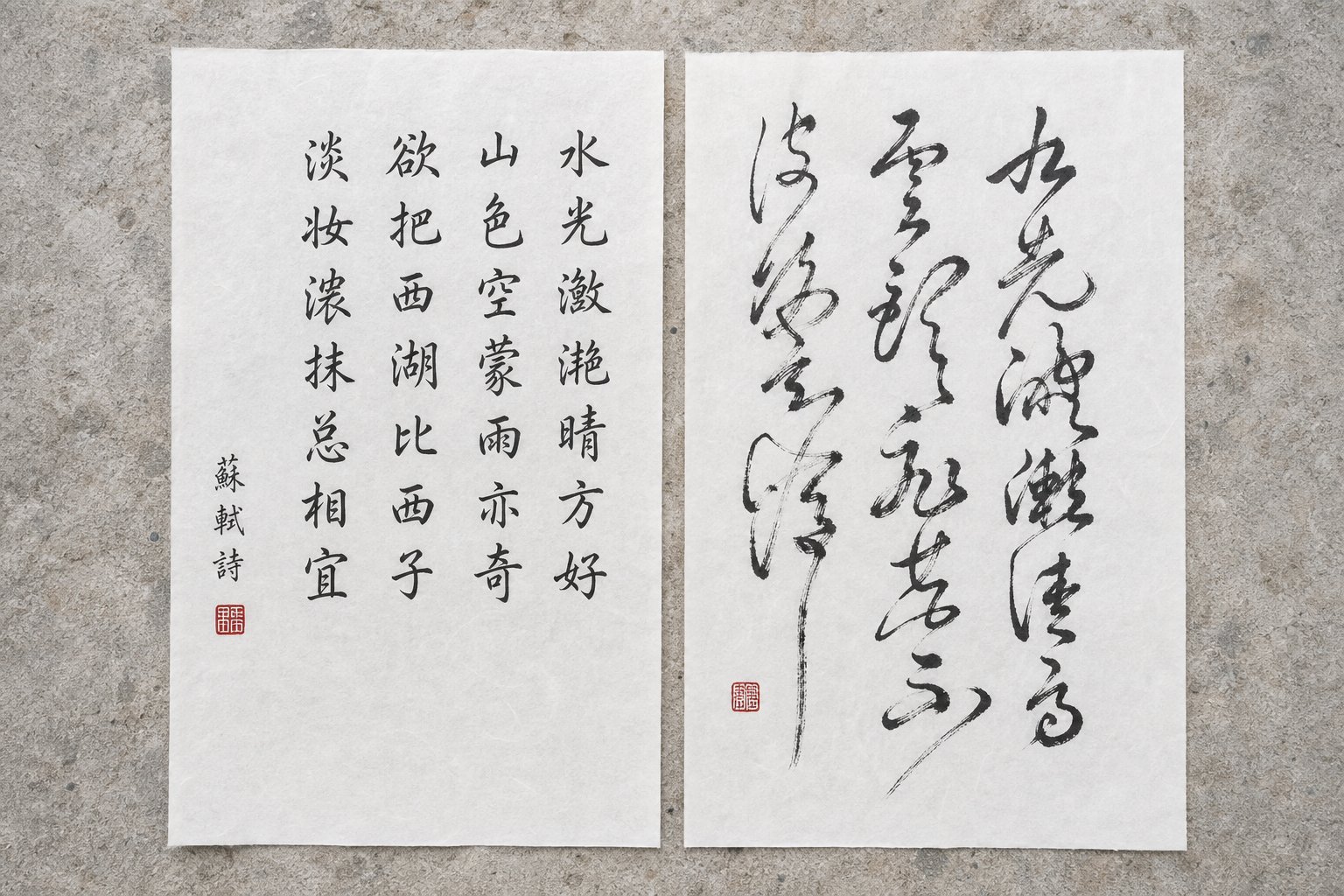
Running script is not a single, uniform style. It spans a range, and calligraphers have long recognized two distinct substyles within that range. Think of them as two neighborhoods on the same street: one closer to the orderly precision of regular script, the other leaning toward the expressive abstraction of cursive. Knowing the difference between xingkai and xingcao helps you identify what you are looking at on a scroll, a signboard, or a practice sheet, and it clarifies which direction your own brush should move.
Running-Regular Xingkai and Its Structured Fluidity
Running-regular (行楷, xingkai) is the substyle that stays closest to standard script. It simplifies the strokes of regular script to increase writing speed while maintaining legibility through adjusted stroke order and increased connectivity. The result is a style that feels natural and unhurried, like a brisk walk rather than a jog. Wang Xizhi's Letter on Clearing After Snowfall (快雪時晴帖, Kuaixue Shiqing Tie) is a classic example of this xingkai running-regular calligraphy substyle, executed with dignified and elegant brushwork that never strays far from regular script foundations.
What makes xingkai recognizable? Look for these visual markers:
- Most strokes remain individually distinguishable, with clear beginnings and endings visible in each horizontal, vertical, and dot.
- Connections between strokes appear as thin trailing threads (牽絲, qiansi) rather than full mergers. The linking is suggested, not forced.
- Character proportions stay close to regular script. Radicals sit in their expected positions, and the overall square frame of each character is preserved.
- Stroke count decreases only slightly. Minor strokes may merge with adjacent ones, but the reduction is subtle enough that readers barely notice.
- Brush entry and exit points are relaxed. Unlike regular script, xingkai does not demand reversed-tip entry (逆鋒, nifeng) or heavy pausing at stroke endings. The brush moves smoothly in and out.
Imagine writing the character 風 (feng, wind). In regular script, every stroke is isolated: the outer frame, the interior hook, the crossing strokes inside. In xingkai, the outer frame softens at its corners, the interior strokes connect through light trailing ink, but you can still count each component and identify the character instantly. The structure holds; only the rigidity dissolves.
Running-Cursive Xingcao and Expressive Freedom
Move further along the spectrum and you reach running-cursive (行草, xingcao). Here, the brush borrows heavily from grass script conventions: strokes merge aggressively, entire radicals compress into single gestures, and speed becomes a defining feature. The xingcao running-cursive calligraphy explained in classical texts is often described as "seeking movement within stillness," breaking away from structural stability to create dynamic visual energy.
Identifying xingcao involves a different set of visual markers:
- Multiple strokes within a character merge into continuous movements. A sequence of three or four separate strokes in regular script becomes one unbroken line.
- Stroke count drops noticeably. Characters appear simpler and more compact than their standard forms.
- Connections between characters sometimes appear, not just between strokes within a single character. The brush may link the tail of one character to the head of the next.
- Angles disappear. Turning strokes that would be sharp corners in regular script become smooth arcs or loops.
- Character shapes tilt and vary in size. Unlike xingkai's consistent framing, xingcao characters lean, stretch, and compress according to the writer's rhythm.
Take that same character 風 in xingcao. The outer frame collapses into a single sweeping curve. The interior strokes reduce to one or two quick marks. The character is still recognizable to a trained eye, but a reader unfamiliar with running script conventions might hesitate. That trade-off, speed and expressiveness gained at the cost of immediate readability, is the defining characteristic of this substyle.
In practice, most calligraphers do not write exclusively in one substyle. A single piece of running script calligraphy might open with xingkai clarity, shift into xingcao energy during an emotionally charged passage, and return to structured forms at the close. This running script substyles comparison is not about rigid categories but about understanding the two poles between which the brush naturally moves. The real skill lies in controlling that movement, knowing when to tighten structure and when to let the brush run free, which brings us to the specific stroke techniques that make such control possible.
Essential Brush Techniques for Running Script
Knowing the substyles gives you a map. But the brush does not move in categories. It moves in strokes, and those strokes behave differently in running script than in any other style. The techniques that separate a stiff, mechanical attempt from a living piece of calligraphy come down to a handful of specific modifications, each one a deliberate departure from the rules of regular script.
Stroke Connection and Simplification Techniques
The most visible difference between regular script and running script is connectivity. In regular script, the brush lifts cleanly between every stroke. In running script, the brush stays close to the paper, creating visible or implied links between movements. This is the lianbi stroke linking technique explained in classical manuals as 連筆 (lianbi), literally "connected brush." It is not random. Each connection follows the natural path the brush would travel between two strokes if it never left the surface.
Here are five specific stroke modifications that define running script brush techniques for beginners and experienced practitioners alike:
1. Dots become launching points. In regular script, a dot (點, dian) is a self-contained mark. In running script, the dot connects directly to the following stroke through a trailing thread of ink. The character 宇 (yu, universe) demonstrates this clearly: the dot above the roof radical flows into the first horizontal stroke without the brush lifting.
2. Horizontal strokes lose their formal endings. Regular script horizontals demand a deliberate pause and reversal at the end (回鋒, huifeng). Running script drops that formality. The brush simply trails off or curves directly into the next stroke, saving time without losing the stroke's structural role.
3. Turning strokes round their corners. Where regular script uses a sharp angular turn (折, zhe) with a visible pause and direction change, running script softens these into smooth arcs. The character 口 (kou, mouth) becomes almost oval rather than rectangular.
4. Multiple strokes merge into single gestures. The three dots of the water radical (氵, sanzidianshui) in regular script require three separate brush lifts. In running script, they compress into one continuous downward sweep, sometimes resembling a single curved line.
5. Hook strokes absorb their neighbors. A vertical stroke followed by a hook and then a turn (as in 乙, yi) becomes one fluid motion. The hook does not pause at its apex but carries momentum directly into whatever follows.
These are not shortcuts born from laziness. Each modification follows the logic of stroke connection methods in Chinese calligraphy that preserve the character's skeletal structure while eliminating unnecessary stops. The character remains legible because its proportions and radical positions hold steady, even as individual strokes simplify.
Rhythm, Speed, and Ink Flow in Running Script
Stroke connection is only half the picture. What brings running script to life is the dynamic variation in how those connected strokes are executed. Three forces interact constantly: brush speed, downward pressure, and ink saturation. Their interplay creates the visual rhythm that distinguishes a masterful piece from a flat one.
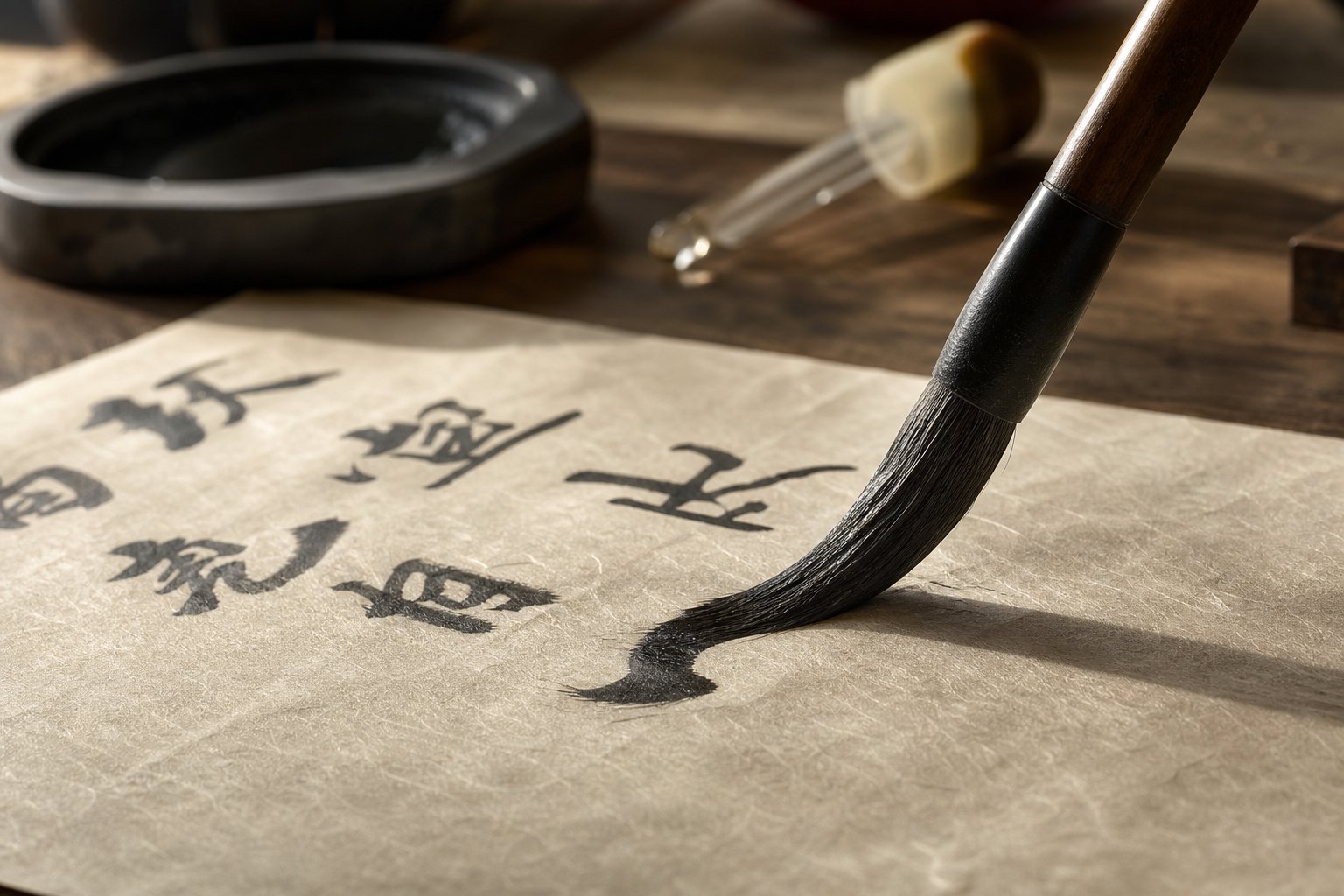
Speed in running script is never constant. The brush accelerates through simple connective strokes and decelerates at structural anchor points, the main verticals, the dominant horizontals, the strokes that carry a character's visual weight. This variation is what classical texts call the rhythm of lifting and pressing (提按, ti an). When the brush lifts (提, ti), it moves faster and produces thinner, lighter lines. When it presses (按, an), it slows and produces thicker, darker marks. The alternation between these two states creates a pulse that runs through every character.
Ink flow responds to both speed and pressure. A fast, light stroke pulls less ink from the brush, producing a drier, more textured line. A slow, heavy stroke deposits more ink, creating rich, saturated marks. Skilled calligraphers use this relationship deliberately. They might load the brush heavily at the start of a line and allow it to gradually dry as they write, creating a natural progression from wet density to dry texture called 枯潤 (kurun, dry and moist). That progression gives a visual sense of time passing, of energy being spent across the page.
Understanding how to control ink flow in running script means managing all three variables simultaneously. Here are the core brush technique principles that govern this interaction:
- Lift and press alternation (提按, ti an) - Vary vertical pressure continuously. Never maintain uniform weight across an entire character.
- Speed variation (疾澀, jise) - Alternate between swift movement (疾, ji) and deliberate friction (澀, se). Fast strokes create energy; slow strokes create gravity.
- Stroke linking (連筆, lianbi) - Connect strokes through trailing ink threads, but vary the visibility of those connections. Some should be bold; others should be barely perceptible.
- Ink saturation control (枯潤, kurun) - Allow natural ink depletion to create texture. Re-ink the brush at structural pauses, not mid-character.
- Wrist-driven momentum (腕力, wanli) - Generate movement from the wrist and forearm rather than the fingers. Finger-only control produces stiff, mechanical connections.
- Breath rhythm (氣韻, qiyun) - Let natural breathing pace your writing. Inhale during pauses; exhale during continuous movement. This prevents rushing and creates organic rhythm.
When these principles work together, the result is what classical critics call 氣韻生動 (qiyun shengdong), "spirit resonance and life movement." The characters appear to breathe. Thick strokes anchor them to the page while thin connecting threads lift them into motion. Wet passages feel dense and grounded; dry passages feel airy and swift. That dynamic contrast is what separates running script from a merely connected version of regular script.
The techniques themselves are not difficult to understand intellectually. The challenge is physical: training your hand to vary pressure, speed, and ink load simultaneously while maintaining structural accuracy. That training process has its own set of pitfalls, and the materials you practice with matter more than most beginners realize.
Common Beginner Mistakes and the Right Materials for Practice
Picking up a brush and attempting to write fluidly after months or years of regular script practice sounds straightforward. The strokes are familiar. The characters are the same. You just need to speed up and connect things, right? Not quite. The most common mistakes learning running script calligraphy stem from exactly that assumption, that running script is simply regular script written faster. It is not. It is a different mode of thinking with the brush, and the transition requires unlearning certain habits before building new ones.
Mistakes to Avoid When Learning Running Script
If you are wondering how to transition from regular to running script without developing bad habits, start by recognizing these frequent errors:
- Writing at uniform speed. Regular script trains you to move the brush at a steady, controlled pace. Beginners carry that evenness into running script, producing flat, lifeless characters. The fix: deliberately exaggerate speed variation. Slow down on anchor strokes (main verticals and horizontals) and accelerate through connections. The contrast will feel awkward at first, but it creates the rhythmic pulse that defines the style.
- Connecting strokes mechanically. New practitioners often link every stroke to the next in a rigid sequence, treating connections as mandatory rather than expressive. This produces characters that look like they were drawn with a single piece of wire. The fix: study model works and notice which strokes connect and which do not. Connections should follow structural logic, linking strokes that naturally flow into each other while leaving deliberate gaps where the eye needs a resting point.
- Losing character proportions when simplifying. When beginners start merging and abbreviating strokes, the spatial relationships between radicals often collapse. A left-right structured character (like 語, yu) might end up with both halves crammed together or one side disproportionately large. The fix: maintain the same center of gravity and radical positioning as regular script. Simplify the strokes, not the architecture.
- Gripping the brush too tightly. Regular script rewards firm control. Running script punishes it. A tight grip restricts wrist movement and makes smooth curves impossible. The fix: hold the brush with enough pressure to maintain control but loose enough that someone could pull it from your fingers with gentle force. Let the wrist and forearm drive the motion.
- Skipping regular script foundations. Some learners jump directly into running script because it looks more exciting. Without internalized knowledge of correct stroke order and character structure, the resulting work lacks the skeletal integrity that keeps running script legible. The fix: spend time with regular script first. You need to know the rules before you can bend them intelligently.
Choosing the Right Brush, Ink, and Paper
Materials matter more in running script than in regular script because the style demands responsiveness. A brush that works perfectly for kaishu may fight against you when you attempt fluid connections and speed variation. Here is what to look for in your running script calligraphy materials and supplies.
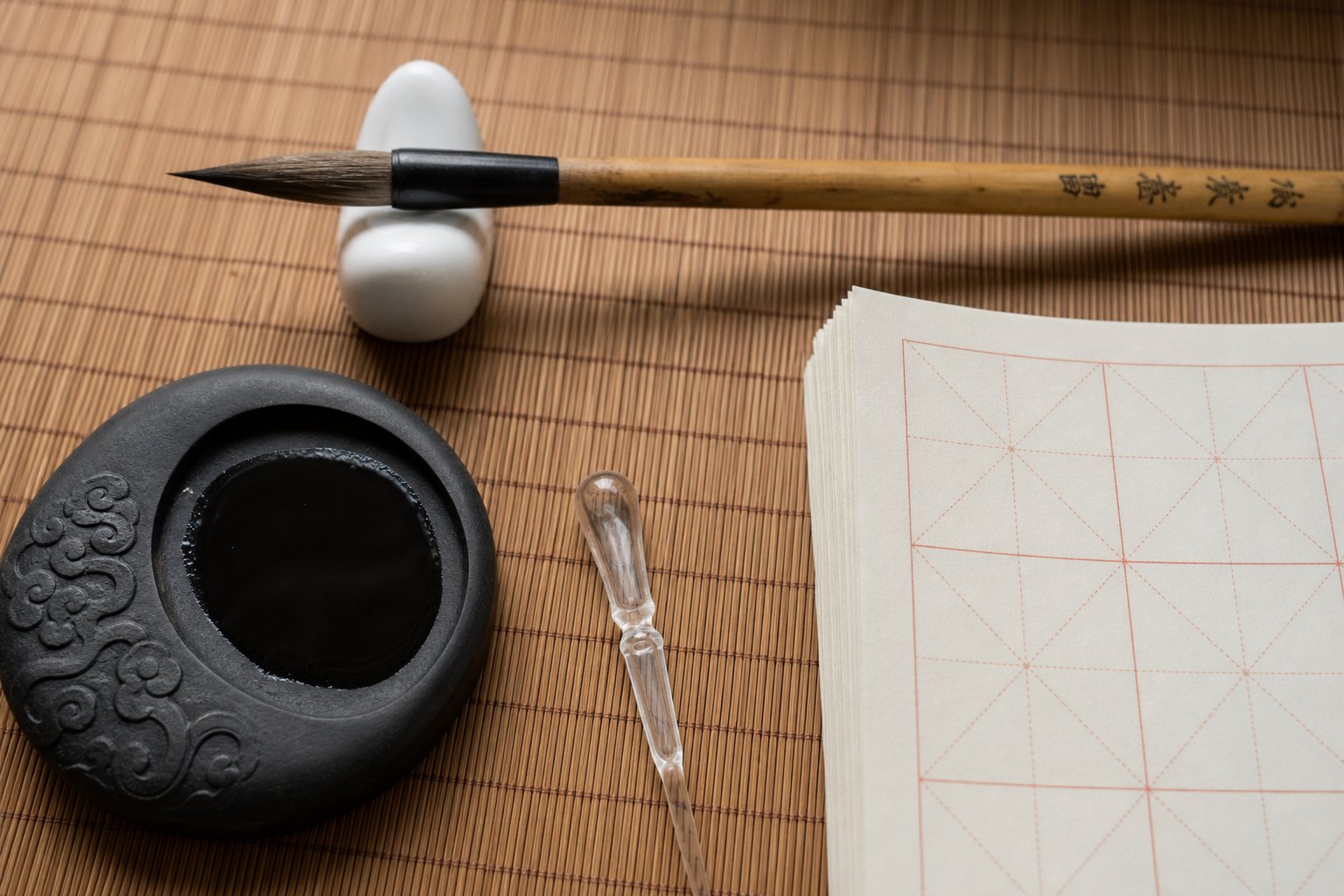
Brush selection. The best brush for running script practice has a softer tip than what you would use for regular script. A mixed-hair brush (兼毫, jianhao) combining goat hair for softness with weasel hair for spring gives you the flexibility to produce thin trailing threads on light strokes and thick saturated marks on heavy ones. Tip length should be moderate to long, roughly 4 to 5 centimeters, allowing the brush to hold enough ink for several connected strokes without re-inking mid-character.
Ink consistency. Regular script uses relatively thick ink for crisp, defined edges. Running script benefits from slightly thinner ink that flows more freely from the brush tip. If you grind your own ink, stop a few minutes earlier than you would for kaishu. If you use bottled ink, add a small amount of water, roughly a 4:1 ink-to-water ratio, until the ink flows smoothly off the brush without spreading uncontrollably on the paper.
Paper choice. Semi-absorbent practice paper (半生熟宣, banshengshuxuan) is ideal. Fully absorbent raw xuan paper (生宣, shengxuan) bleeds too aggressively for beginners, obscuring the speed variations you are trying to develop. Fully sized paper (熟宣, shuxuan) resists ink so completely that trailing connections disappear. Semi-absorbent paper reveals your brush speed honestly: fast strokes show drier texture, slow strokes show richer saturation, and you can see exactly where your rhythm succeeds or falters.
For daily practice, gridded paper with larger squares (roughly 7 to 9 centimeters) gives you room to write at a natural scale while maintaining structural awareness. As your control improves, transition to blank paper to develop compositional instincts without the grid as a crutch.
Getting the materials right removes unnecessary friction from the learning process. With a responsive brush, flowing ink, and honest paper, your practice sessions reveal exactly what needs attention, and the style begins to feel less like a struggle against your tools and more like a conversation with them. That same principle of adaptation, adjusting technique to context, played out on a much larger scale as running script traveled beyond China's borders and took root in neighboring calligraphic traditions.
Running Script Across East Asian Calligraphy Traditions
Running script did not stay within China's borders. As Chinese characters spread across East Asia, so did the calligraphic traditions built around them. Japan and Korea each absorbed the principles of semi-cursive writing and reshaped them according to their own literary cultures, creating distinct traditions that still share a common root. This East Asian calligraphy styles comparison reveals how a single technique can evolve differently under different aesthetic pressures.
Running Script in Japanese Shodo Tradition
Japan first encountered Chinese characters through the Korean kingdom of Baekje in the fifth century. It took several more centuries before a mature calligraphic culture emerged. During the Nara period (710-794) and early Heian period (794-1185), Japanese calligraphers like Kukai (空海, 774-835) and Saga Tenno (嵯峨天皇, 786-842) studied Chinese models intensively. The influence of Chinese running script on Japanese calligraphy was direct: these early masters imitated the handwriting of Chinese calligraphers, particularly those of the Tang dynasty, which gave rise to a style known as Japanese aesthetics in brush writing.
By the mid-Heian period, calligraphers like Ono Michikaze (小野道風, 894-967), one of the "Three Great Calligraphers" of his era, began blending Chinese running and cursive techniques with native sensibilities. His work featured concise structure and smooth strokes that balanced grandeur with elegance. Running script in Japanese shodo calligraphy gradually developed its own character: lighter pressure, more open spacing, and a preference for asymmetrical composition that reflected broader Japanese aesthetic values like ma (間, negative space). In 2020, the Japanese government recognized Shodo as a national art project for international cultural exchange, confirming its enduring significance.
Korean Adaptations and the Scholarly Tradition
Korea's relationship with Chinese calligraphy runs even deeper chronologically. Chinese characters arrived around the second or third century, and the Korean seoye running script tradition developed alongside them. Even after the creation of the Korean alphabet (Hangul) in 1446, Chinese characters remained the official writing system until the late nineteenth century, meaning educated Koreans practiced calligraphy for over 1,500 years.
Early Korean masters like Kim Saeng (金生, 711-791) and Choi Chi-won (崔志遠, 857-?) followed the styles of Tang dynasty calligraphers such as Ouyang Xun and Yu Shinan. Running script served as the primary medium for scholarly correspondence, poetry exchange, and personal journals, much as it did in China. Korean calligraphers maintained the structural principles of Chinese models while developing a preference for restrained elegance and careful spacing that reflected Confucian ideals of discipline and modesty.
The twentieth century brought disruption. During Japanese colonial rule (1910-1945), Korean calligraphy absorbed Japanese stylistic features: looser strokes, more natural structure, and flexible composition. After the 1960s, a shift toward writing in Hangul reduced the practice of traditional character-based calligraphy. The artist Sohn Jaehyuung (孫在馨, 1903-1981) responded by naming the tradition "Seoye" (書藝, the art of writing) to distinguish it as a uniquely Korean cultural form.
What connects all three traditions, Chinese, Japanese, and Korean, is a shared foundation: the principle that strokes can link and simplify without destroying legibility. Whether you pick up a handwritten note in Tokyo, Seoul, or Beijing, the handwriting you encounter almost certainly reflects running script logic. Stroke connections, softened angles, and natural abbreviations appear instinctively in everyday penmanship across all three languages. The historical calligraphy lives on not just in museums but in the way millions of people write by hand every day, which raises a practical question: how do you actually read and appreciate this style when you encounter it in the world around you?
How to Read and Appreciate Running Script as a Viewer
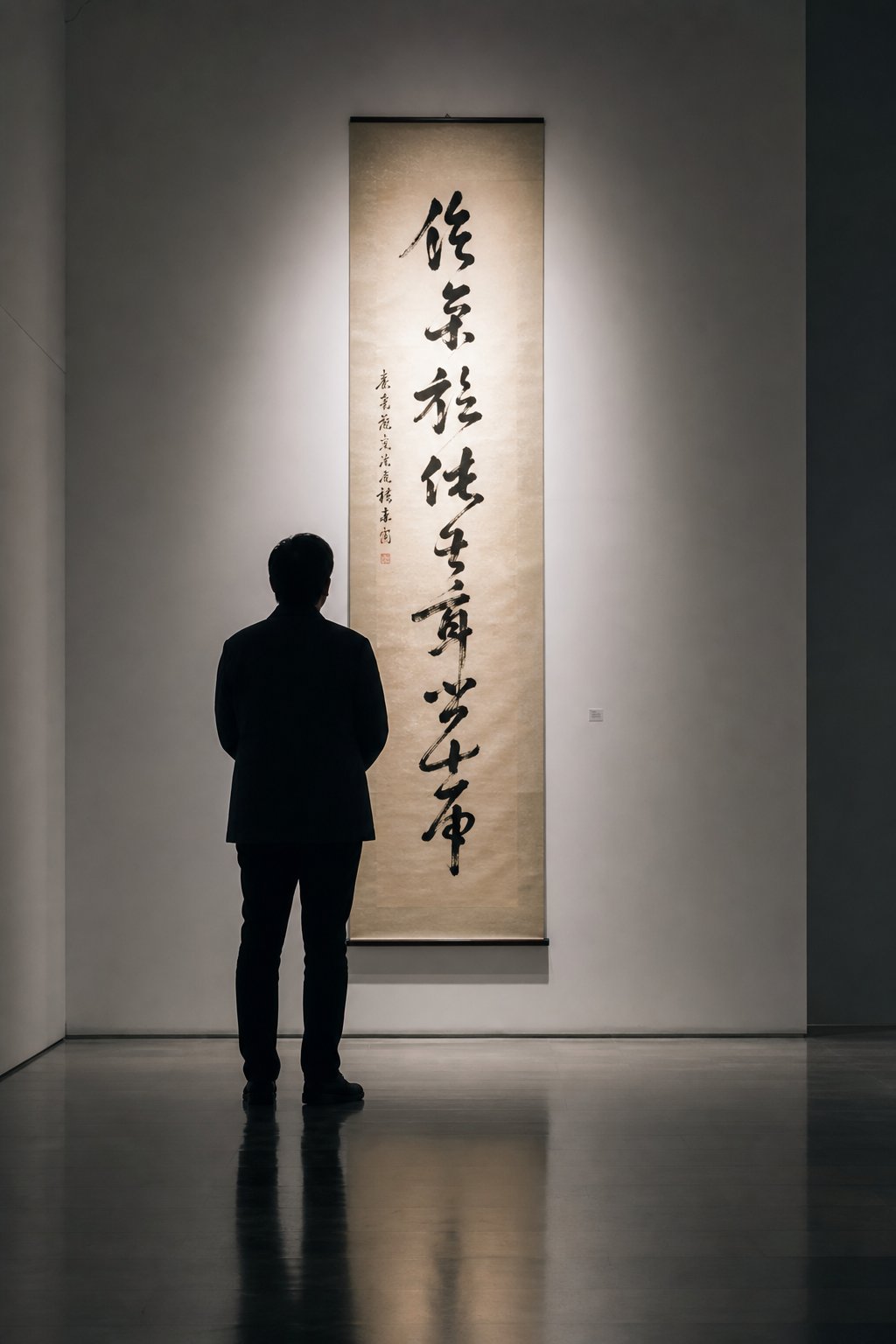
You are standing in a museum gallery, facing a hanging scroll covered in ink characters. The strokes flow and connect, clearly handwritten with energy and intention, but you cannot read Chinese. Does that mean the work has nothing to offer you? Not at all. Learning how to read running script calligraphy does not require literacy in Chinese. It requires knowing what to look for.
Reading Running Script in Museums and Public Spaces
The first step is recognition. To identify running script in museums, look for characters that appear individually distinct yet connected by subtle ink threads. If every stroke is rigidly separated with sharp, angular endings, you are likely looking at regular script. If the characters dissolve into abstract, nearly illegible tangles, that is cursive script. Running script sits between: you can see individual characters clearly, but strokes within them link and flow.
Once you have identified the style, shift your attention from reading to seeing. Three structural principles keep running script legible, and those same principles create its visual beauty:
- Center of gravity. Each character maintains a stable visual weight, even when strokes simplify. Look for how the densest part of each character anchors it to an invisible vertical axis.
- Radical consistency. Even when strokes merge, the major components (radicals) stay in their expected positions, left-right, top-bottom. This spatial logic holds the composition together.
- Rhythmic variation. Notice how character sizes shift, how ink transitions from wet and dark to dry and textured, and how spacing between characters expands and contracts. That variation is deliberate, creating a visual pulse across the entire piece.
As calligraphy educator Xiang Li Art suggests, asking simple questions transforms your experience: Does it feel balanced? Do the strokes feel strong or hesitant? Is there rhythm in how the lines move? These questions work whether or not you can decode the meaning of the text.
You do not need to read the words to appreciate running script. The rhythm of thick and thin strokes, the dance between wet ink and dry texture, the balance of each character on its invisible axis, these are visual experiences available to any viewer willing to slow down and look.
Digital Tools and Running Script in Modern Design
Running script in modern graphic design appears more often than you might expect. Brand logos, book covers, restaurant signage, film titles, and packaging across East Asia frequently use semi-cursive calligraphic forms to convey tradition, elegance, or artisanal quality. Designers choose it because it carries cultural weight without the illegibility of full cursive.
Digital running script fonts and tools have made the style accessible to designers who do not practice calligraphy themselves. Font libraries now include typefaces modeled on historical masters, from Wang Xizhi-inspired styles to more contemporary interpretations. Online calligraphy generators let users input characters and view them rendered in various running script forms, useful for comparing how different masters handled the same character.
These digital tools serve a dual purpose. For designers, they provide production-ready assets. For learners and appreciators, they offer a way to explore the visual range of the style without picking up a brush. You can type a character, see it in running script, and compare it to its regular script form, building visual literacy one character at a time.
Whether you encounter running script on a museum wall, a city street sign, or a screen, the appreciation process is the same: look for rhythm, look for structure, and let the energy of the brush speak on its own terms. That capacity to communicate beyond literal meaning is what keeps this centuries-old style relevant, and it is what makes the art form rewarding at every level of engagement.
Getting Started With Running Script at Any Level
Running script rewards attention at every depth. You can spend a lifetime with a brush in hand or simply pause longer the next time you pass a hanging scroll in a gallery. Either way, the style meets you where you are. The question is not whether this art form has something to offer you. It does. The question is what kind of engagement fits your life right now.
Your Path Into Running Script Calligraphy
How to start learning running script calligraphy depends entirely on your goals. Here is a running script practice guide for beginners and beyond, organized by the level of involvement that suits you:
- If you want to appreciate: Visit museum collections with East Asian calligraphy holdings and practice identifying running script by its connected strokes and readable structure. Study reproductions of Wang Xizhi's Lantingji Xu online, paying attention to rhythm, ink variation, and how each character balances on its center of gravity. Use digital calligraphy generators to compare characters across styles and build your visual literacy without needing a brush.
- If you want to practice: Begin with regular script foundations. Spend several months internalizing correct stroke order and character proportions before attempting semi-cursive forms. When you are ready, the best way to study Chinese calligraphy running script is through copybook practice (臨摹, linmo), starting with the Lantingji Xu and working character by character. Invest in a mixed-hair brush, semi-absorbent paper, and slightly thinned ink. Write slowly at first, focusing on where strokes connect and where they separate.
- If you are pursuing deeper study: Work through multiple historical masters sequentially. Start with Wang Xizhi for classical elegance, move to Yan Zhenqing for emotional intensity, then explore Mi Fu for dynamic energy. Compare how each master handles the same characters differently. Seek running script calligraphy resources for self-study such as annotated copybooks with stroke-order guides, and if possible, find a teacher or community for feedback. Record your practice sessions to review brush speed and pressure patterns you cannot feel in the moment.
Patience matters more than talent here. As one experienced practitioner notes, it is common to spend a year or more on a single copybook before moving forward, and the transition from regular to semi-cursive script alone can take five or six years of steady work. That timeline is not discouraging. It is liberating. There is no rush, and every session builds something.
Why Running Script Rewards a Lifetime of Practice
What makes this style endure across nearly two thousand years is a paradox at its core: discipline and freedom are not opposites here. They are the same thing. You need deep structural knowledge to simplify a character without destroying it. You need physical control to vary speed and pressure fluidly. And you need personal expression to make the work alive rather than mechanical. Running script asks for all three simultaneously.
That combination means you never finish learning. A beginner discovers how strokes connect. An intermediate practitioner learns to vary rhythm. An advanced calligrapher spends decades refining the invisible qualities, the spirit resonance (氣韻, qiyun) that separates competent writing from art. Wang Xizhi himself could not replicate his greatest work. The style lives in the moment of its creation, responsive to mood, breath, and the particular way ink meets paper on a given day.
Whether you pick up a brush tomorrow or simply look more carefully at the next piece of calligraphy you encounter, you are engaging with a tradition that connects you to eighteen centuries of writers who found in this style the same thing: a way to be both precise and free, both legible and personal, both disciplined and alive.
Frequently Asked Questions About Running Script Calligraphy
1. What is running script calligraphy and how does it differ from regular script?
Running script calligraphy (xingshu) is the semi-cursive style of Chinese calligraphy that links and simplifies strokes for faster writing while keeping characters readable. Unlike regular script, where every stroke is isolated with clear beginnings and endings, running script allows strokes to connect through trailing ink threads, softens angular turns into curves, and merges minor strokes into single gestures. The key distinction is that running script preserves each character's proportions and radical positions, so any literate reader can still follow along, while gaining significant speed and expressive fluidity.
2. How long does it take to learn running script calligraphy?
Learning running script is a gradual process that builds on regular script foundations. Most practitioners spend at least one to two years mastering regular script before attempting semi-cursive forms. The transition from regular to running script itself can take five to six years of consistent practice. However, basic competency in producing connected, rhythmic characters can develop within several months of focused copybook practice. The timeline depends on practice frequency, quality of instruction, and whether you work from historical model texts like Wang Xizhi's Preface to the Orchid Pavilion.
3. What brush and materials are best for practicing running script?
A mixed-hair brush (jianhao) combining goat hair for softness with weasel hair for spring works best, with a tip length of 4 to 5 centimeters. Ink should be slightly thinner than what you would use for regular script, roughly a 4:1 ink-to-water ratio if diluting bottled ink. Semi-absorbent practice paper (banshengshuxuan) is ideal because it reveals speed variations honestly without excessive bleeding. Gridded paper with 7 to 9 centimeter squares helps beginners maintain structural awareness during practice.
4. What is the difference between xingkai and xingcao substyles?
Xingkai (running-regular) stays close to standard script, keeping most strokes individually distinguishable with only subtle trailing connections between them. Character proportions and the square frame of each character remain largely intact. Xingcao (running-cursive) borrows heavily from grass script conventions, merging multiple strokes into continuous movements, reducing stroke count noticeably, and sometimes linking characters to each other. Xingkai prioritizes legibility with gentle fluidity, while xingcao prioritizes expressive energy and speed at the cost of immediate readability.
5. Can you appreciate running script calligraphy without reading Chinese?
Yes. Running script communicates visually through rhythm, balance, and dynamic contrast independent of literal meaning. When viewing a piece, focus on how thick and thin strokes alternate, how ink transitions from wet and saturated to dry and textured, and how each character balances on its center of gravity. Notice the variation in character sizes, the spacing between elements, and the overall energy of the composition. These visual qualities are accessible to any viewer who takes time to observe the interplay of brush speed, pressure, and ink flow across the work.